Spatial UI (VisionOS)
Designed for spatial computing with floating glass panels, depth effects, and gaze-based interactions.
Live demo
Immersive meditation for Vision Pro
Forest Sanctuary
20 min
Ocean Depths
15 min
Mountain Peak
25 min
Night Sky
30 min
Ready to begin?
Put on your headset and enter a world of calm
About Spatial UI (VisionOS)
Designed for spatial computing with floating glass panels, depth effects, and gaze-based interactions.
Era / origin
2024 Spatial Era
Key characteristics
- Glass
- Depth
- Immersion
- Spatial
- Translucent
- Gesture
- Apple
- Vision Pro
When to use Spatial UI (VisionOS)
- Spatial computing apps
- VR/AR interfaces
- Immersive media
- Futuristic dashboards
When to avoid it
- Text-heavy documents
- High-contrast requirements
- Low-powered devices
Common industries
- SaaS
- Entertainment & Media
- Gaming
Spatial UI (VisionOS) color palette
- rgba(255,255,255,0.2)
- #FFFFFF
- #007AFF
- #30D158
- #FF9F0A
How to build Spatial UI (VisionOS) in CSS
Effects: Pointer-tracked lighting highlight, gaze-hover lift and subtle scale on small cards, brighter glass edge on focus, layered depth shadows
:root {
  --glass: rgba(255,255,255,0.2);
  --white: #FFFFFF;
  --blue: #007AFF;
  --green: #30D158;
  --orange: #FF9F0A;
  --text-muted: rgb(255 255 255 / 0.8);
}

/* Deep backdrop with blurred colour orbs for the glass to refract */
body {
  min-height: 100vh;
  background:
    radial-gradient(circle at 25% 25%, rgb(168 85 247 / 0.25), transparent 35%),
    radial-gradient(circle at 75% 75%, rgb(59 130 246 / 0.25), transparent 35%),
    linear-gradient(135deg, #1A1A2E 0%, #16213E 50%, #0F3460 100%);
  color: var(--white);
  font-family: -apple-system, BlinkMacSystemFont, "SF Pro Display", "Segoe UI", sans-serif;
}

h1 { font-size: clamp(2rem, 5vw, 3rem); }

/* Lighting response: set --mx/--my (px) from pointermove on the panel; the highlight follows the pointer */
.panel {
  position: relative;
  padding: 1.5rem;
  border: 1px solid var(--glass);
  border-radius: 1.5rem;
  background:
    radial-gradient(18rem circle at var(--mx, 30%) var(--my, 0%), rgb(255 255 255 / 0.12), transparent 70%),
    rgb(255 255 255 / 0.1);
  -webkit-backdrop-filter: blur(40px) saturate(180%);
  backdrop-filter: blur(40px) saturate(180%);
  box-shadow: 0 24px 48px rgb(0 0 0 / 0.25);
  transition: transform 300ms ease, box-shadow 300ms ease, border-color 200ms ease;
}

/* Large panels: brighten the edge instead of scaling */
.panel:focus-within { border-color: rgb(255 255 255 / 0.5); }

/* Gaze-hover depth: only small cards lift and scale */
.card:hover {
  transform: translateY(-4px) scale(1.02);
  box-shadow: 0 32px 64px rgb(0 0 0 / 0.35);
}

.panel p { color: var(--text-muted); }

.button {
  padding: 1rem 2rem;
  border: 1px solid rgb(255 255 255 / 0.3);
  border-radius: 9999px;
  background: var(--glass);
  -webkit-backdrop-filter: blur(20px);
  backdrop-filter: blur(20px);
  color: var(--white);
  font-weight: 500;
  transition: background 200ms ease, transform 200ms ease;
}

.button:hover {
  background: rgb(255 255 255 / 0.3);
  transform: scale(1.04);
}

.button:focus-visible {
  outline: 3px solid var(--white);
  outline-offset: 4px;
}

@media (prefers-reduced-motion: reduce) {
  .panel,
  .button { transition: none; }

  .card:hover,
  .button:hover { transform: none; }
}Use Spatial UI (VisionOS) with an AI coding agent
Paste this into Claude Code, Cursor, v0, Lovable or any coding agent to restyle a page in Spatial UI (VisionOS).
Apply the Spatial UI (VisionOS) style to this interface.

What it is: Designed for spatial computing with floating glass panels, depth effects, and gaze-based interactions.
Look and feel: Glass, Depth, Immersion, Spatial, Translucent, Gesture, Apple, Vision Pro.
Colors: primary rgba(255,255,255,0.2), #FFFFFF; secondary #007AFF, #30D158, #FF9F0A.
Effects and motion: Pointer-tracked lighting highlight, gaze-hover lift and subtle scale on small cards, brighter glass edge on focus, layered depth shadows.

Reference CSS (put these class names on the matching elements, or map them onto existing components and class names; avoid long structural selectors):
```css
:root {
  --glass: rgba(255,255,255,0.2);
  --white: #FFFFFF;
  --blue: #007AFF;
  --green: #30D158;
  --orange: #FF9F0A;
  --text-muted: rgb(255 255 255 / 0.8);
}

/* Deep backdrop with blurred colour orbs for the glass to refract */
body {
  min-height: 100vh;
  background:
    radial-gradient(circle at 25% 25%, rgb(168 85 247 / 0.25), transparent 35%),
    radial-gradient(circle at 75% 75%, rgb(59 130 246 / 0.25), transparent 35%),
    linear-gradient(135deg, #1A1A2E 0%, #16213E 50%, #0F3460 100%);
  color: var(--white);
  font-family: -apple-system, BlinkMacSystemFont, "SF Pro Display", "Segoe UI", sans-serif;
}

h1 { font-size: clamp(2rem, 5vw, 3rem); }

/* Lighting response: set --mx/--my (px) from pointermove on the panel; the highlight follows the pointer */
.panel {
  position: relative;
  padding: 1.5rem;
  border: 1px solid var(--glass);
  border-radius: 1.5rem;
  background:
    radial-gradient(18rem circle at var(--mx, 30%) var(--my, 0%), rgb(255 255 255 / 0.12), transparent 70%),
    rgb(255 255 255 / 0.1);
  -webkit-backdrop-filter: blur(40px) saturate(180%);
  backdrop-filter: blur(40px) saturate(180%);
  box-shadow: 0 24px 48px rgb(0 0 0 / 0.25);
  transition: transform 300ms ease, box-shadow 300ms ease, border-color 200ms ease;
}

/* Large panels: brighten the edge instead of scaling */
.panel:focus-within { border-color: rgb(255 255 255 / 0.5); }

/* Gaze-hover depth: only small cards lift and scale */
.card:hover {
  transform: translateY(-4px) scale(1.02);
  box-shadow: 0 32px 64px rgb(0 0 0 / 0.35);
}

.panel p { color: var(--text-muted); }

.button {
  padding: 1rem 2rem;
  border: 1px solid rgb(255 255 255 / 0.3);
  border-radius: 9999px;
  background: var(--glass);
  -webkit-backdrop-filter: blur(20px);
  backdrop-filter: blur(20px);
  color: var(--white);
  font-weight: 500;
  transition: background 200ms ease, transform 200ms ease;
}

.button:hover {
  background: rgb(255 255 255 / 0.3);
  transform: scale(1.04);
}

.button:focus-visible {
  outline: 3px solid var(--white);
  outline-offset: 4px;
}

@media (prefers-reduced-motion: reduce) {
  .panel,
  .button { transition: none; }

  .card:hover,
  .button:hover { transform: none; }
}
```

Works best for: Spatial computing apps, VR/AR interfaces, Immersive media, Futuristic dashboards.
Avoid it for: Text-heavy documents, High-contrast requirements, Low-powered devices. If this product falls into one of those, say so before restyling.

Change the visual design only: keep the existing layout, content and behaviour.
Meet WCAG AA contrast: where a palette color is too light or bright for text, keep it for backgrounds, borders and large display type and use a darker text color, rather than darkening the whole design. Keep visible focus states, give icon-only controls an accessible name (aria-label) and respect prefers-reduced-motion.Rolling AI coding agents out across a team? Farad Labs runs hands-on AI training.
Styles like Spatial UI (VisionOS)
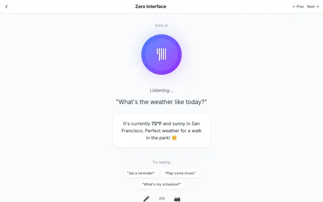
Zero Interface
The interface disappears, leaving only content and context-aware interactions. Uses AI, voice, and gestures to anticipate user needs.
Futuristic & Tech
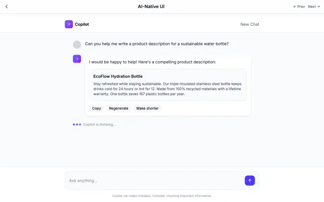
AI-Native UI
Designed specifically for AI interactions. Features conversational layouts, streaming text, and minimal interface chrome.
Futuristic & Tech
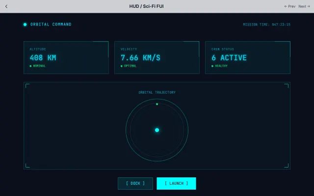
HUD / Sci-Fi FUI
Inspired by movie FUI (Fantasy User Interfaces). Features thin lines, neon colors, and technical data visualization.
Futuristic & Tech
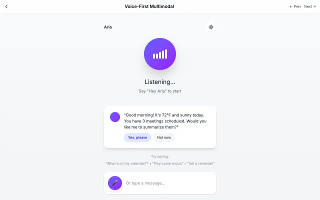
Voice-First Multimodal
Designed for voice-first interactions with visual feedback for speaking, listening, and processing states.
Futuristic & Tech