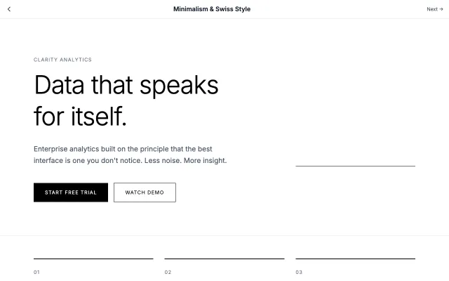
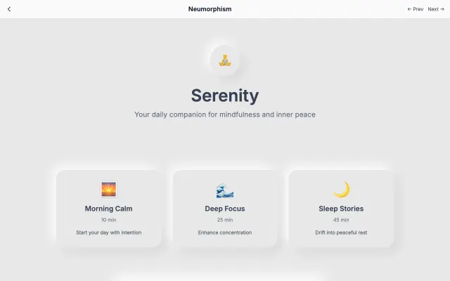
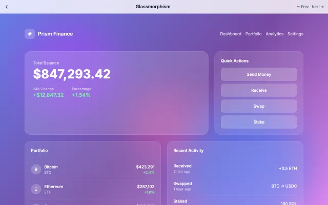
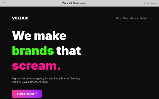
Paste this into Claude Code, Cursor, v0, Lovable or any coding agent to restyle a page in Bento Grids.
AI prompt · 132 lines Apply the Bento Grids style to this interface.
What it is: Apple-inspired modular grid of rounded cards in mixed sizes, with soft shadows, bold accent tiles and clean typography.
Look and feel: Apple-style, Modular, Cards, Organized, Clean, Hierarchy, Rounded, Soft.
Colors: primary #F5F5F7, #FFFFFF, #1D1D1F; secondary #007AFF, #34C759.
Effects and motion: Hover scale (1.02) on linked tiles, soft shadow expansion, staggered content reveal.
Reference CSS (put these class names on the matching elements, or map them onto existing components and class names; avoid long structural selectors):
```css
:root {
  --canvas: #F5F5F7;
  --tile: #FFFFFF;
  --ink: #1D1D1F;
  --blue: #007AFF; /* focus rings and icons; tiles with white text use #0066CC */
  --blue-tile: #0066CC;
  --green: #34C759;
  --text-muted: #4B5563;
}

body {
  background: var(--canvas);
  color: var(--ink);
  font-family: -apple-system, BlinkMacSystemFont, "SF Pro Display", "Segoe UI", sans-serif;
}

.grid {
  display: grid;
  grid-template-columns: repeat(4, 1fr);
  grid-auto-rows: minmax(140px, auto);
  gap: 1rem;
  max-width: 64rem;
  margin: 0 auto;
}

.tile {
  display: flex;
  flex-direction: column;
  justify-content: space-between;
  padding: 1.5rem;
  border-radius: 1.5rem;
  background: var(--tile);
  color: var(--text-muted);
  box-shadow: 0 1px 2px 0 rgb(0 0 0 / 0.05);
  transition: transform 200ms ease, box-shadow 200ms ease;
}

/* Only tiles that link somewhere lift on hover */
a.tile:hover,
.tile:has(a, button):hover {
  transform: scale(1.02);
  box-shadow: 0 10px 30px rgb(0 0 0 / 0.08);
}

a.tile:focus-visible,
.tile a:focus-visible {
  outline: 3px solid var(--blue);
  outline-offset: 3px;
}

.tile--wide {
  grid-column: span 2;
}

/* Featured tile: 2x2 with a bold gradient */
.tile--feature {
  grid-column: span 2;
  grid-row: span 2;
  padding: 2rem;
  background: linear-gradient(135deg, #7C3AED, #6D28D9);
  color: #FFFFFF;
}

.tile--blue {
  background: var(--blue-tile);
  color: #FFFFFF;
}

.tile--green {
  background: var(--green);
  color: var(--ink);
}

.tile--dark {
  background: var(--ink);
  color: #FFFFFF;
}

.tile h3 {
  font-size: 1.5rem;
  font-weight: 600;
  color: inherit;
}

@media (max-width: 640px) {
  .grid {
    grid-template-columns: repeat(2, 1fr);
    grid-auto-rows: minmax(120px, auto);
    gap: 0.75rem;
  }
}

/* Content reveal: tiles rise in one after another */
@media (prefers-reduced-motion: no-preference) {
  .tile {
    animation: reveal 500ms ease-out backwards;
  }

  .tile:nth-child(2) { animation-delay: 60ms; }
  .tile:nth-child(3) { animation-delay: 120ms; }
  .tile:nth-child(4) { animation-delay: 180ms; }
  .tile:nth-child(n + 5) { animation-delay: 240ms; }
}

@keyframes reveal {
  from {
    opacity: 0;
    transform: translateY(16px);
  }
}

@media (prefers-reduced-motion: reduce) {
  .tile {
    transition: none;
  }
}
```
Works best for: Product features, Dashboards, Personal sites, Marketing summaries, Galleries.
Avoid it for: Long-form reading, Data tables, Complex forms. If this product falls into one of those, say so before restyling.
Restructure the layout where this style calls for it, keeping the existing content and behaviour. Use only content already on the page: if a step needs testimonials, pricing, data, images or media that don't exist, skip that step instead of adding placeholders or inventing it.
Meet WCAG AA contrast: where a palette color is too light or bright for text, keep it for backgrounds, borders and large display type and use a darker text color, rather than darkening the whole design. Keep visible focus states, give icon-only controls an accessible name (aria-label) and respect prefers-reduced-motion.