Organic Biophilic
Brings nature indoors through organic shapes, natural colors, and flowing elements. Creates a calming, sustainable aesthetic.
Live demo
with nature
Track your sustainable journey, grow your own food, and connect with a community that cares about our planet.
Grow Tracker
Monitor your plants from seed to harvest with personalized care tips.
Seasonal Recipes
Cook with what is fresh and in season in your garden.
Impact Score
See the positive impact of your sustainable choices.
This Week's Challenge
Plant 3 pollinator-friendly flowers and help support local bee populations!
About Organic Biophilic
Brings nature indoors through organic shapes, natural colors, and flowing elements. Creates a calming, sustainable aesthetic.
Era / origin
2020s Sustainable
Key characteristics
- Nature
- Organic shapes
- Green
- Sustainable
- Rounded
- Flowing
- Earthy
When to use Organic Biophilic
- Wellness apps
- Sustainability brands
- Eco products
- Health apps
- Meditation
When to avoid it
- Tech-focused products
- Gaming
- Industrial
- Urban brands
Common industries
- Healthcare
- Food & Restaurant
- Fitness & Wellness
- Nonprofit & Government
Organic Biophilic color palette
- #228B22
- #8B4513
- #87CEEB
- #F5F5DC
- #6B8E23
- #DAA520
How to build Organic Biophilic in CSS
Effects: Rounded corners (16-24px), organic curves, natural shadows, flowing SVG shapes
:root {
  --forest: #228B22;
  --bark: #8B4513;
  --sky: #87CEEB;
  --linen: #F5F5DC;
  --olive: #6B8E23;
  --goldenrod: #DAA520; /* sunny accent fills and icons, never text */
  --leaf-ink: #14532D;
  --leaf-text: #166534;
}

body {
  background: var(--linen);
  color: var(--leaf-text);
  font-family: system-ui, sans-serif;
}

h1,
h2,
h3 {
  color: var(--leaf-ink);
  font-family: Georgia, "Times New Roman", serif;
  font-weight: 400;
  line-height: 1.15;
}

.card {
  padding: 2rem;
  border-radius: 24px;
  background: rgba(34, 139, 34, 0.1);
}

.card--earth {
  background: rgba(139, 69, 19, 0.1);
}

/* Uneven radii read as a pebble or leaf. Decorative blobs sit in empty margins or frame an
   image, never behind translucent cards or text */
.blob {
  border-radius: 60% 40% 55% 45% / 50% 60% 40% 50%;
  background: linear-gradient(135deg, var(--olive), var(--forest));
}

/* Flowing SVG wave between sections instead of a straight edge */
.wave {
  height: 4rem;
  background: url("data:image/svg+xml,%3Csvg xmlns='http://www.w3.org/2000/svg' viewBox='0 0 1440 80' preserveAspectRatio='none'%3E%3Cpath d='M0 40C240 0 480 80 720 40S1200 0 1440 40V80H0Z' fill='%23228B22' fill-opacity='0.12'/%3E%3C/svg%3E") center / 100% 100% no-repeat;
}

/* White on --forest passes only as large text (19px bold); smaller buttons use --leaf-text */
.button {
  padding: 1rem 2rem;
  border: 2px solid var(--forest);
  border-radius: 9999px;
  background: var(--forest);
  color: #FFFFFF;
  font-size: 1.1875rem;
  font-weight: 700;
  box-shadow: 0 10px 30px rgba(34, 139, 34, 0.3);
  transition: background-color 150ms ease, color 150ms ease;
}

.button--outline {
  border-color: var(--leaf-text);
  background: transparent;
  color: var(--leaf-text);
  box-shadow: none;
}

.button:hover,
.button--outline:hover {
  background: var(--leaf-text);
  color: #FFFFFF;
}

.button:focus-visible {
  outline: 3px solid var(--leaf-ink);
  outline-offset: 3px;
}

@media (prefers-reduced-motion: reduce) {
  .button {
    transition: none;
  }
}Use Organic Biophilic with an AI coding agent
Paste this into Claude Code, Cursor, v0, Lovable or any coding agent to restyle a page in Organic Biophilic.
Apply the Organic Biophilic style to this interface.

What it is: Brings nature indoors through organic shapes, natural colors, and flowing elements. Creates a calming, sustainable aesthetic.
Look and feel: Nature, Organic shapes, Green, Sustainable, Rounded, Flowing, Earthy.
Colors: primary #228B22, #8B4513, #87CEEB, #F5F5DC; secondary #6B8E23, #DAA520.
Effects and motion: Rounded corners (16-24px), organic curves, natural shadows, flowing SVG shapes.

Reference CSS (put these class names on the matching elements, or map them onto existing components and class names; avoid long structural selectors):
```css
:root {
  --forest: #228B22;
  --bark: #8B4513;
  --sky: #87CEEB;
  --linen: #F5F5DC;
  --olive: #6B8E23;
  --goldenrod: #DAA520; /* sunny accent fills and icons, never text */
  --leaf-ink: #14532D;
  --leaf-text: #166534;
}

body {
  background: var(--linen);
  color: var(--leaf-text);
  font-family: system-ui, sans-serif;
}

h1,
h2,
h3 {
  color: var(--leaf-ink);
  font-family: Georgia, "Times New Roman", serif;
  font-weight: 400;
  line-height: 1.15;
}

.card {
  padding: 2rem;
  border-radius: 24px;
  background: rgba(34, 139, 34, 0.1);
}

.card--earth {
  background: rgba(139, 69, 19, 0.1);
}

/* Uneven radii read as a pebble or leaf. Decorative blobs sit in empty margins or frame an
   image, never behind translucent cards or text */
.blob {
  border-radius: 60% 40% 55% 45% / 50% 60% 40% 50%;
  background: linear-gradient(135deg, var(--olive), var(--forest));
}

/* Flowing SVG wave between sections instead of a straight edge */
.wave {
  height: 4rem;
  background: url("data:image/svg+xml,%3Csvg xmlns='http://www.w3.org/2000/svg' viewBox='0 0 1440 80' preserveAspectRatio='none'%3E%3Cpath d='M0 40C240 0 480 80 720 40S1200 0 1440 40V80H0Z' fill='%23228B22' fill-opacity='0.12'/%3E%3C/svg%3E") center / 100% 100% no-repeat;
}

/* White on --forest passes only as large text (19px bold); smaller buttons use --leaf-text */
.button {
  padding: 1rem 2rem;
  border: 2px solid var(--forest);
  border-radius: 9999px;
  background: var(--forest);
  color: #FFFFFF;
  font-size: 1.1875rem;
  font-weight: 700;
  box-shadow: 0 10px 30px rgba(34, 139, 34, 0.3);
  transition: background-color 150ms ease, color 150ms ease;
}

.button--outline {
  border-color: var(--leaf-text);
  background: transparent;
  color: var(--leaf-text);
  box-shadow: none;
}

.button:hover,
.button--outline:hover {
  background: var(--leaf-text);
  color: #FFFFFF;
}

.button:focus-visible {
  outline: 3px solid var(--leaf-ink);
  outline-offset: 3px;
}

@media (prefers-reduced-motion: reduce) {
  .button {
    transition: none;
  }
}
```

Works best for: Wellness apps, Sustainability brands, Eco products, Health apps, Meditation.
Avoid it for: Tech-focused products, Gaming, Industrial, Urban brands. If this product falls into one of those, say so before restyling.

Change the visual design only: keep the existing layout, content and behaviour.
Meet WCAG AA contrast: where a palette color is too light or bright for text, keep it for backgrounds, borders and large display type and use a darker text color, rather than darkening the whole design. Keep visible focus states, give icon-only controls an accessible name (aria-label) and respect prefers-reduced-motion.Rolling AI coding agents out across a team? Farad Labs runs hands-on AI training.
Styles like Organic Biophilic
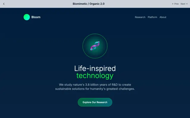
Biomimetic / Organic 2.0
Takes organic design further with growing cells, breathing animations, and bio-inspired patterns.
Nature & Organic
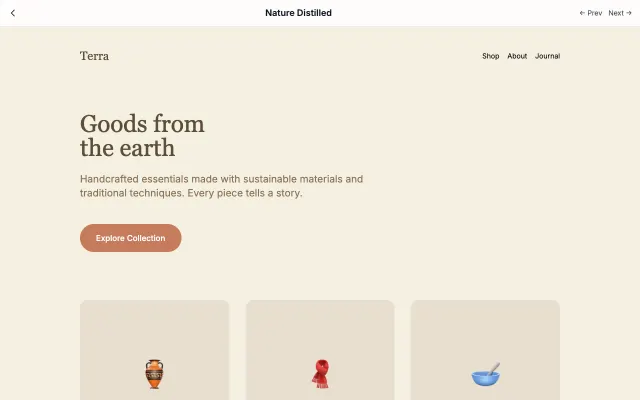
Nature Distilled
Distills nature into its essence with earthy colors, organic materials, and handmade warmth.
Nature & Organic
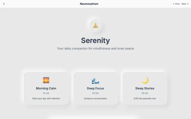
Neumorphism
A modern evolution of skeuomorphism that creates soft, extruded plastic-like interfaces. Uses subtle shadows and highlights to simulate depth while maintaining a minimal aesthetic.
Modern SaaS
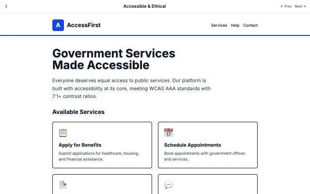
Accessible & Ethical
Prioritizes accessibility and ethical considerations above all else. Ensures everyone can use the interface regardless of ability or device.
Accessibility & Ethical