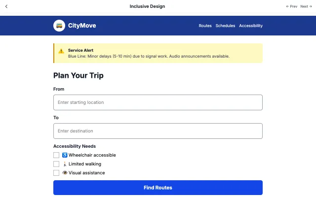
Everyone deserves equal access to public services. Our platform is built with accessibility at its core, meeting WCAG AAA standards with 7:1+ contrast ratios.
Paste this into Claude Code, Cursor, v0, Lovable or any coding agent to restyle a page in Accessible & Ethical.
AI prompt · 92 lines
Apply the Accessible & Ethical style to this interface.
What it is: Prioritizes accessibility and ethical considerations above all else. Ensures everyone can use the interface regardless of ability or device.
Look and feel: High contrast, Large text, Keyboard navigation, Screen reader friendly, WCAG compliant.
Colors: primary #000000, #FFFFFF; secondary #1E40AF, #166534.
Effects and motion: AAA text contrast (7:1), clear focus rings (3-4px), ARIA labels, skip links, 44x44px touch targets.
Reference CSS (put these class names on the matching elements, or map them onto existing components and class names; avoid long structural selectors):
```css
:root {
  --a11y-black: #000000;
  --a11y-white: #FFFFFF;
  --a11y-blue: #1E40AF;
  --a11y-green: #166534;
  --a11y-ink: #111827;
  --a11y-text: #374151;
}

/* Target AAA: every text pair here is 7:1 or better */
html {
  font-size: 100%;
}

body {
  background: var(--a11y-white);
  color: var(--a11y-ink);
  font-family: system-ui, sans-serif;
  font-size: 1.125rem;
  line-height: 1.6;
}

a {
  color: var(--a11y-blue);
  text-decoration: underline;
  text-underline-offset: 0.2em;
}

.skip-link {
  position: absolute;
  top: -100px;
  left: 1rem;
  padding: 0.75rem 1rem;
  background: var(--a11y-blue);
  color: var(--a11y-white);
}

.skip-link:focus {
  top: 1rem;
}

.card {
  display: block;
  padding: 1.5rem;
  border: 2px solid var(--a11y-ink);
  border-radius: 0.5rem;
  color: var(--a11y-text);
}

.button,
input {
  min-height: 44px;
  padding: 1rem 2rem;
  border: 2px solid var(--a11y-blue);
  border-radius: 0.5rem;
  font-size: 1.125rem;
}

.button {
  background: var(--a11y-blue);
  color: var(--a11y-white);
  font-weight: 600;
}

/* Two-tone ring stays visible on light and dark backgrounds */
:focus-visible {
  outline: 4px solid var(--a11y-blue);
  outline-offset: 2px;
  box-shadow: 0 0 0 8px var(--a11y-white);
}

@media (prefers-reduced-motion: reduce) {
  * {
    animation: none !important;
    transition: none !important;
  }
}
```
Works best for: Government, Healthcare, Education, Inclusive products, Public services.
Change the visual design only: keep the existing layout, content and behaviour.
Meet WCAG AA contrast: where a palette color is too light or bright for text, keep it for backgrounds, borders and large display type and use a darker text color, rather than darkening the whole design. Keep visible focus states, give icon-only controls an accessible name (aria-label) and respect prefers-reduced-motion.