Gradient Mesh / Aurora Evolved
Advanced gradient techniques creating flowing, aurora-like color transitions with holographic effects.
Live demo
everything
We craft visual experiences that captivate, engage, and inspire. Let's paint something beautiful together.
Brand Identity
50+ projects
Web Design
80+ sites
Motion
30+ videos
About Gradient Mesh / Aurora Evolved
Advanced gradient techniques creating flowing, aurora-like color transitions with holographic effects.
Era / origin
2025+ Gradient Evolution
Key characteristics
- Complex gradients
- Mesh gradients
- Multi-color blend
- Aurora effect
- Iridescent
- Holographic
When to use Gradient Mesh / Aurora Evolved
- Hero sections
- Backgrounds
- Creative brands
- Music platforms
- Fashion
When to avoid it
- Data interfaces
- Text-heavy content
- Accessibility-critical
- Conservative brands
Common industries
- Entertainment & Media
- Creative & Portfolio
- Startup & Tech
- Luxury & Premium
Gradient Mesh / Aurora Evolved color palette
- #00FFFF
- #FF00FF
- #FFFF00
- #0066FF
- #00FF66
- #FF6B6B
- #4ECDC4
How to build Gradient Mesh / Aurora Evolved in CSS
Effects: Layered multi-colour gradients blurred into a mesh, slow background-position drift, frosted glass panels over the colour
:root {
  --cyan: #00FFFF;
  --magenta: #FF00FF;
  --yellow: #FFFF00;
  --blue: #0066FF;
  --green: #00FF66;
  --coral: #FF6B6B;
  --teal: #4ECDC4;
}

/* Mesh: overlapping radial blooms over a blue base, drifting slowly */
.hero {
  position: relative;
  isolation: isolate;
  overflow: hidden;
  color: #FFFFFF;
  font-weight: 500;
  text-shadow: 0 1px 3px rgba(0, 0, 0, 0.3);
  background-color: var(--blue);
  background-image:
    radial-gradient(at 15% 20%, var(--magenta) 0, transparent 50%),
    radial-gradient(at 85% 10%, var(--cyan) 0, transparent 50%),
    radial-gradient(at 80% 85%, var(--yellow) 0, transparent 45%),
    radial-gradient(at 10% 90%, var(--green) 0, transparent 45%),
    radial-gradient(at 50% 50%, var(--coral) 0, transparent 55%);
  background-size: 200% 200%;
  animation: aurora-drift 20s ease-in-out infinite;
}

/* Light veil melts the blooms together. Keep it at or below 0.3:
   never darken the whole background, the neon colour is the point. */
.hero::before {
  content: "";
  position: absolute;
  inset: 0;
  z-index: -1;
  background: radial-gradient(circle at 30% 20%, rgba(255, 255, 255, 0.25), transparent 60%), rgba(17, 24, 39, 0.25);
  backdrop-filter: blur(64px);
  -webkit-backdrop-filter: blur(64px);
}

.hero h1 {
  font-weight: 700;
  text-shadow: 0 4px 12px rgba(0, 0, 0, 0.25);
}

.card {
  border-radius: 1.5rem;
  padding: 2rem;
  background: rgba(255, 255, 255, 0.15);
  border: 1px solid rgba(255, 255, 255, 0.2);
  backdrop-filter: blur(8px);
  -webkit-backdrop-filter: blur(8px);
}

.button {
  border: 0;
  border-radius: 9999px;
  padding: 1rem 2rem;
  background: #FFFFFF;
  color: #111827;
  font-weight: 600;
  text-shadow: none;
  box-shadow: 0 20px 25px -5px rgba(0, 0, 0, 0.1), 0 8px 10px -6px rgba(0, 0, 0, 0.1);
  transition: transform 0.15s ease;
}

.button:hover {
  transform: scale(1.05);
}

/* Two-tone ring stays visible over both bright and deep parts of the mesh */
.button:focus-visible {
  outline: 3px solid #FFFFFF;
  outline-offset: 3px;
  box-shadow: 0 0 0 6px #111827;
}

@keyframes aurora-drift {
  0%, 100% { background-position: 0% 0%; }
  50% { background-position: 100% 100%; }
}

@media (prefers-reduced-motion: reduce) {
  .hero {
    animation: none;
  }

  .button:hover {
    transform: none;
  }
}Use Gradient Mesh / Aurora Evolved with an AI coding agent
Paste this into Claude Code, Cursor, v0, Lovable or any coding agent to restyle a page in Gradient Mesh / Aurora Evolved.
Apply the Gradient Mesh / Aurora Evolved style to this interface.

What it is: Advanced gradient techniques creating flowing, aurora-like color transitions with holographic effects.
Look and feel: Complex gradients, Mesh gradients, Multi-color blend, Aurora effect, Iridescent, Holographic.
Colors: primary #00FFFF, #FF00FF, #FFFF00, #0066FF, #00FF66; secondary #FF6B6B, #4ECDC4.
Effects and motion: Layered multi-colour gradients blurred into a mesh, slow background-position drift, frosted glass panels over the colour.

Reference CSS (put these class names on the matching elements, or map them onto existing components and class names; avoid long structural selectors):
```css
:root {
  --cyan: #00FFFF;
  --magenta: #FF00FF;
  --yellow: #FFFF00;
  --blue: #0066FF;
  --green: #00FF66;
  --coral: #FF6B6B;
  --teal: #4ECDC4;
}

/* Mesh: overlapping radial blooms over a blue base, drifting slowly */
.hero {
  position: relative;
  isolation: isolate;
  overflow: hidden;
  color: #FFFFFF;
  font-weight: 500;
  text-shadow: 0 1px 3px rgba(0, 0, 0, 0.3);
  background-color: var(--blue);
  background-image:
    radial-gradient(at 15% 20%, var(--magenta) 0, transparent 50%),
    radial-gradient(at 85% 10%, var(--cyan) 0, transparent 50%),
    radial-gradient(at 80% 85%, var(--yellow) 0, transparent 45%),
    radial-gradient(at 10% 90%, var(--green) 0, transparent 45%),
    radial-gradient(at 50% 50%, var(--coral) 0, transparent 55%);
  background-size: 200% 200%;
  animation: aurora-drift 20s ease-in-out infinite;
}

/* Light veil melts the blooms together. Keep it at or below 0.3:
   never darken the whole background, the neon colour is the point. */
.hero::before {
  content: "";
  position: absolute;
  inset: 0;
  z-index: -1;
  background: radial-gradient(circle at 30% 20%, rgba(255, 255, 255, 0.25), transparent 60%), rgba(17, 24, 39, 0.25);
  backdrop-filter: blur(64px);
  -webkit-backdrop-filter: blur(64px);
}

.hero h1 {
  font-weight: 700;
  text-shadow: 0 4px 12px rgba(0, 0, 0, 0.25);
}

.card {
  border-radius: 1.5rem;
  padding: 2rem;
  background: rgba(255, 255, 255, 0.15);
  border: 1px solid rgba(255, 255, 255, 0.2);
  backdrop-filter: blur(8px);
  -webkit-backdrop-filter: blur(8px);
}

.button {
  border: 0;
  border-radius: 9999px;
  padding: 1rem 2rem;
  background: #FFFFFF;
  color: #111827;
  font-weight: 600;
  text-shadow: none;
  box-shadow: 0 20px 25px -5px rgba(0, 0, 0, 0.1), 0 8px 10px -6px rgba(0, 0, 0, 0.1);
  transition: transform 0.15s ease;
}

.button:hover {
  transform: scale(1.05);
}

/* Two-tone ring stays visible over both bright and deep parts of the mesh */
.button:focus-visible {
  outline: 3px solid #FFFFFF;
  outline-offset: 3px;
  box-shadow: 0 0 0 6px #111827;
}

@keyframes aurora-drift {
  0%, 100% { background-position: 0% 0%; }
  50% { background-position: 100% 100%; }
}

@media (prefers-reduced-motion: reduce) {
  .hero {
    animation: none;
  }

  .button:hover {
    transform: none;
  }
}
```

Works best for: Hero sections, Backgrounds, Creative brands, Music platforms, Fashion.
Avoid it for: Data interfaces, Text-heavy content, Accessibility-critical, Conservative brands. If this product falls into one of those, say so before restyling.

Change the visual design only: keep the existing layout, content and behaviour.
Keep visible focus states, give icon-only controls an accessible name (aria-label) and respect prefers-reduced-motion.Rolling AI coding agents out across a team? Farad Labs runs hands-on AI training.
Styles like Gradient Mesh / Aurora Evolved
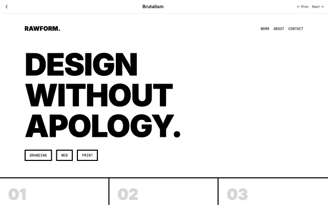
Brutalism
Inspired by Brutalist architecture, this style embraces raw, honest aesthetics. Features intentionally "ugly" design with default fonts, visible borders, and a rejection of conventional beauty.
Experimental & Artistic
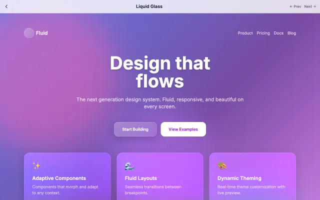
Liquid Glass
Advanced glassmorphism with flowing, morphing animations. Creates a liquid-like feel with chromatic aberration and iridescent effects.
Experimental & Artistic
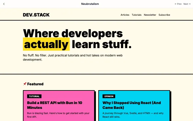
Neubrutalism
A modern, playful take on brutalism. Combines raw aesthetics with bright colors and bold shadows. Think Gumroad and Figma's marketing pages.
Experimental & Artistic
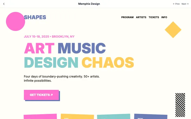
Memphis Design
Inspired by the 1980s Memphis Group, featuring bold geometric shapes, clashing colors, and playful patterns.
Experimental & Artistic