Brutalism
Inspired by Brutalist architecture, this style embraces raw, honest aesthetics. Features intentionally "ugly" design with default fonts, visible borders, and a rejection of conventional beauty.
Live demo
Without
Apology.
BRAND IDENTITY
Logos, guidelines, and visual systems that refuse to blend in.
WEB DESIGN
Websites that load fast and hit hard. No frameworks, no bloat.
PRINT DESIGN
Posters, zines, and editorial that demands physical presence.
Selected Work
LOUD COFFEE CO.
PUNK RECORDS
MONO GALLERY
STREET ZINE
Got a project?
Let's talk.
hello@rawform.studioAbout Brutalism
Inspired by Brutalist architecture, this style embraces raw, honest aesthetics. Features intentionally "ugly" design with default fonts, visible borders, and a rejection of conventional beauty.
Era / origin
1950s Brutalist
Key characteristics
- Raw
- Unpolished
- Stark
- High contrast
- Plain text
- Anti-design
When to use Brutalism
- Design portfolios
- Artistic projects
- Counter-culture brands
- Tech blogs
When to avoid it
- Corporate environments
- Conservative industries
- Customer-facing professional
Common industries
- Creative & Portfolio
Brutalism color palette
- #FF0000
- #0000FF
- #FFFF00
- #000000
- #FFFFFF
- #00FF00
- #FF00FF
How to build Brutalism in CSS
Effects: Instant state changes with no transitions, sharp 0px corners, heavy black type, thick borders and hard offset shadows
:root {
  --brut-red: #FF0000;
  --brut-blue: #0000FF;
  --brut-yellow: #FFFF00;
  --brut-black: #000000;
  --brut-white: #FFFFFF;
  --brut-green: #00FF00;
  --brut-magenta: #FF00FF;
}

* {
  border-radius: 0;
  transition: none;
}

body {
  background: var(--brut-white);
  color: var(--brut-black);
  font-family: Arial, Helvetica, sans-serif;
}

h1 {
  font-size: clamp(2.5rem, 9vw, 7rem);
}

h1,
h2,
h3 {
  font-weight: 900;
  text-transform: uppercase;
  line-height: 1;
  letter-spacing: -0.025em;
}

.mono {
  font-family: "Courier New", Courier, monospace;
  font-weight: 400;
}

/* Black text on yellow, green, magenta and red fills; white text only on blue and black */
.card--red { background: var(--brut-red); color: var(--brut-black); }
.card--magenta { background: var(--brut-magenta); color: var(--brut-black); }
.card--blue { background: var(--brut-blue); color: var(--brut-white); }
.card--black { background: var(--brut-black); color: var(--brut-white); }

/* Even columns so a short last row never strands one card */
.grid {
  display: grid;
  grid-template-columns: repeat(2, 1fr);
  gap: 2rem;
}

@media (max-width: 640px) {
  .grid {
    grid-template-columns: 1fr;
  }
}

.card {
  padding: 2rem;
  border: 4px solid var(--brut-black);
  background: var(--brut-yellow);
  box-shadow: 8px 8px 0 var(--brut-black);
}

.button {
  padding: 0.5rem 1.5rem;
  border: 4px solid var(--brut-black);
  background: var(--brut-white);
  color: var(--brut-black);
  font-weight: 700;
  text-transform: uppercase;
  box-shadow: 4px 4px 0 var(--brut-black);
}

/* Instant press: the button drops onto its hard shadow */
.button:active {
  transform: translate(4px, 4px);
  box-shadow: none;
}

.button:focus-visible {
  outline: 4px solid var(--brut-blue);
  outline-offset: 4px;
}

.nav a:hover {
  text-decoration: line-through;
}Use Brutalism with an AI coding agent
Paste this into Claude Code, Cursor, v0, Lovable or any coding agent to restyle a page in Brutalism.
Apply the Brutalism style to this interface.

What it is: Inspired by Brutalist architecture, this style embraces raw, honest aesthetics. Features intentionally "ugly" design with default fonts, visible borders, and a rejection of conventional beauty.
Look and feel: Raw, Unpolished, Stark, High contrast, Plain text, Anti-design.
Colors: primary #FF0000, #0000FF, #FFFF00, #000000, #FFFFFF; secondary #00FF00, #FF00FF.
Effects and motion: Instant state changes with no transitions, sharp 0px corners, heavy black type, thick borders and hard offset shadows.

Reference CSS (put these class names on the matching elements, or map them onto existing components and class names; avoid long structural selectors):
```css
:root {
  --brut-red: #FF0000;
  --brut-blue: #0000FF;
  --brut-yellow: #FFFF00;
  --brut-black: #000000;
  --brut-white: #FFFFFF;
  --brut-green: #00FF00;
  --brut-magenta: #FF00FF;
}

* {
  border-radius: 0;
  transition: none;
}

body {
  background: var(--brut-white);
  color: var(--brut-black);
  font-family: Arial, Helvetica, sans-serif;
}

h1 {
  font-size: clamp(2.5rem, 9vw, 7rem);
}

h1,
h2,
h3 {
  font-weight: 900;
  text-transform: uppercase;
  line-height: 1;
  letter-spacing: -0.025em;
}

.mono {
  font-family: "Courier New", Courier, monospace;
  font-weight: 400;
}

/* Black text on yellow, green, magenta and red fills; white text only on blue and black */
.card--red { background: var(--brut-red); color: var(--brut-black); }
.card--magenta { background: var(--brut-magenta); color: var(--brut-black); }
.card--blue { background: var(--brut-blue); color: var(--brut-white); }
.card--black { background: var(--brut-black); color: var(--brut-white); }

/* Even columns so a short last row never strands one card */
.grid {
  display: grid;
  grid-template-columns: repeat(2, 1fr);
  gap: 2rem;
}

@media (max-width: 640px) {
  .grid {
    grid-template-columns: 1fr;
  }
}

.card {
  padding: 2rem;
  border: 4px solid var(--brut-black);
  background: var(--brut-yellow);
  box-shadow: 8px 8px 0 var(--brut-black);
}

.button {
  padding: 0.5rem 1.5rem;
  border: 4px solid var(--brut-black);
  background: var(--brut-white);
  color: var(--brut-black);
  font-weight: 700;
  text-transform: uppercase;
  box-shadow: 4px 4px 0 var(--brut-black);
}

/* Instant press: the button drops onto its hard shadow */
.button:active {
  transform: translate(4px, 4px);
  box-shadow: none;
}

.button:focus-visible {
  outline: 4px solid var(--brut-blue);
  outline-offset: 4px;
}

.nav a:hover {
  text-decoration: line-through;
}
```

Works best for: Design portfolios, Artistic projects, Counter-culture brands, Tech blogs.
Avoid it for: Corporate environments, Conservative industries, Customer-facing professional. If this product falls into one of those, say so before restyling.

Change the visual design only: keep the existing layout, content and behaviour.
Meet WCAG AA contrast: where a palette color is too light or bright for text, keep it for backgrounds, borders and large display type and use a darker text color, rather than darkening the whole design. Keep visible focus states, give icon-only controls an accessible name (aria-label) and respect prefers-reduced-motion.Rolling AI coding agents out across a team? Farad Labs runs hands-on AI training.
Styles like Brutalism
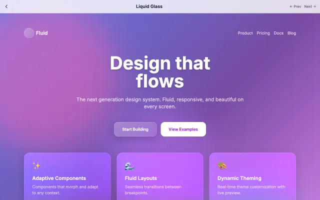
Liquid Glass
Advanced glassmorphism with flowing, morphing animations. Creates a liquid-like feel with chromatic aberration and iridescent effects.
Experimental & Artistic
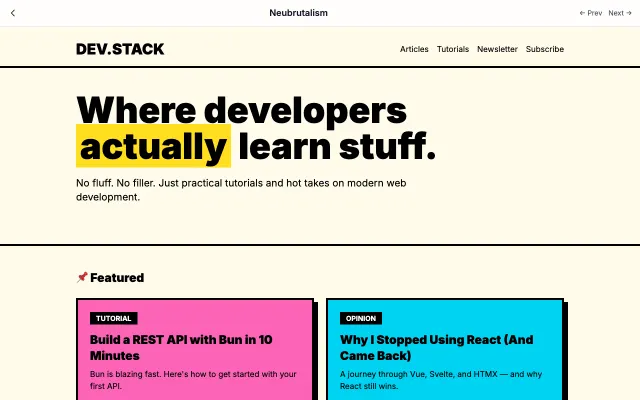
Neubrutalism
A modern, playful take on brutalism. Combines raw aesthetics with bright colors and bold shadows. Think Gumroad and Figma's marketing pages.
Experimental & Artistic
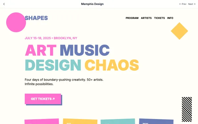
Memphis Design
Inspired by the 1980s Memphis Group, featuring bold geometric shapes, clashing colors, and playful patterns.
Experimental & Artistic
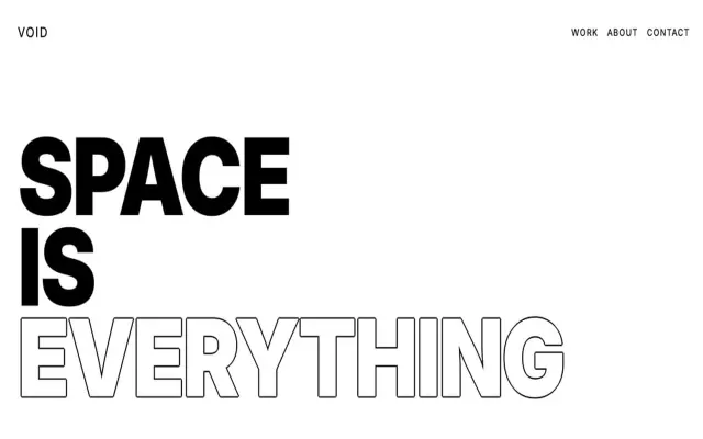
Exaggerated Minimalism
Takes minimalism to the extreme with oversized typography, dramatic white space, and bold statements.
Experimental & Artistic