The Future of Design is Already Here—We Just Don't See It
How emerging technologies are quietly reshaping the creative industry, and why most designers are missing the revolution.
Marcus Chen
December 15, 2025 • 12 min read
Brings print magazine aesthetics to the web with asymmetric grids, pull quotes, and editorial typography.
Live demo
How emerging technologies are quietly reshaping the creative industry, and why most designers are missing the revolution.
Marcus Chen
December 15, 2025 • 12 min read
Sofia Rivera
James Liu
Elena Park
Brings print magazine aesthetics to the web with asymmetric grids, pull quotes, and editorial typography.
2020s Editorial Digital
Effects: Smooth scroll, headlines that rise into view on scroll, hairline column rules, serif display headlines
:root {
  --ink: #000000;
  --paper: #FFFFFF;
  --accent: #DC2626;
  --muted: #6B7280;
  --display: "Playfair Display", Georgia, "Times New Roman", serif;
}

body {
  background: var(--paper);
  color: var(--ink);
  font-family: system-ui, "Helvetica Neue", Arial, sans-serif;
}

.grid {
  display: grid;
  grid-template-columns: repeat(12, minmax(0, 1fr));
  gap: 2rem;
  border-top: 2px solid var(--ink);
  padding-top: 2rem;
}

.grid > .feature {
  grid-column: span 8;
}

/* Hairline column rule between the lead story and the sidebar */
.grid > aside {
  grid-column: span 4;
  border-left: 1px solid var(--ink);
  padding-left: 2rem;
}

.kicker {
  color: var(--accent);
  font-size: 0.875rem;
  font-weight: 700;
  text-transform: uppercase;
}

/* High-contrast serif display face for headlines */
h1,
h2 {
  font-family: var(--display);
  font-weight: 900;
  line-height: 1.1;
  letter-spacing: -0.02em;
}

/* Long-form body text only. Without an article body, skip the columns, drop cap
   and pull quote; never put a drop cap on a short standfirst or deck. */
.article-body {
  column-count: 2;
  column-gap: 2rem;
  font-family: Georgia, "Times New Roman", serif;
  line-height: 1.7;
}

.article-body > p:first-of-type::first-letter {
  float: left;
  font-family: var(--display);
  font-size: 4.5em;
  line-height: 0.8;
  font-weight: 900;
  padding-right: 0.5rem;
}

.pull-quote {
  margin: 2rem 0;
  border-top: 2px solid var(--ink);
  border-bottom: 2px solid var(--ink);
  padding: 1rem 0;
  font-family: var(--display);
  font-size: 1.75rem;
  font-weight: 700;
}

a:focus-visible {
  outline: 2px solid var(--accent);
  outline-offset: 2px;
}

/* Smooth scroll and headlines that rise into view, where supported */
@media (prefers-reduced-motion: no-preference) {
  html {
    scroll-behavior: smooth;
  }

  @supports (animation-timeline: view()) {
    .reveal {
      animation: rise linear both;
      animation-timeline: view();
      animation-range: entry 0% entry 40%;
    }
  }
}

@keyframes rise {
  from {
    opacity: 0;
    transform: translateY(1.5rem);
  }
}

@media (max-width: 768px) {
  .grid > .feature,
  .grid > aside {
    grid-column: 1 / -1;
  }

  .grid > aside {
    border-left: 0;
    padding-left: 0;
  }

  .article-body {
    column-count: 1;
  }
}Paste this into Claude Code, Cursor, v0, Lovable or any coding agent to restyle a page in Editorial Grid / Magazine.
Apply the Editorial Grid / Magazine style to this interface.

What it is: Brings print magazine aesthetics to the web with asymmetric grids, pull quotes, and editorial typography.
Look and feel: Magazine layout, Asymmetric grid, Editorial typography, Pull quotes, Drop caps, Column layout.
Colors: primary #000000, #FFFFFF; secondary #DC2626, #6B7280.
Effects and motion: Smooth scroll, headlines that rise into view on scroll, hairline column rules, serif display headlines.

Reference CSS (put these class names on the matching elements, or map them onto existing components and class names; avoid long structural selectors):
```css
:root {
  --ink: #000000;
  --paper: #FFFFFF;
  --accent: #DC2626;
  --muted: #6B7280;
  --display: "Playfair Display", Georgia, "Times New Roman", serif;
}

body {
  background: var(--paper);
  color: var(--ink);
  font-family: system-ui, "Helvetica Neue", Arial, sans-serif;
}

.grid {
  display: grid;
  grid-template-columns: repeat(12, minmax(0, 1fr));
  gap: 2rem;
  border-top: 2px solid var(--ink);
  padding-top: 2rem;
}

.grid > .feature {
  grid-column: span 8;
}

/* Hairline column rule between the lead story and the sidebar */
.grid > aside {
  grid-column: span 4;
  border-left: 1px solid var(--ink);
  padding-left: 2rem;
}

.kicker {
  color: var(--accent);
  font-size: 0.875rem;
  font-weight: 700;
  text-transform: uppercase;
}

/* High-contrast serif display face for headlines */
h1,
h2 {
  font-family: var(--display);
  font-weight: 900;
  line-height: 1.1;
  letter-spacing: -0.02em;
}

/* Long-form body text only. Without an article body, skip the columns, drop cap
   and pull quote; never put a drop cap on a short standfirst or deck. */
.article-body {
  column-count: 2;
  column-gap: 2rem;
  font-family: Georgia, "Times New Roman", serif;
  line-height: 1.7;
}

.article-body > p:first-of-type::first-letter {
  float: left;
  font-family: var(--display);
  font-size: 4.5em;
  line-height: 0.8;
  font-weight: 900;
  padding-right: 0.5rem;
}

.pull-quote {
  margin: 2rem 0;
  border-top: 2px solid var(--ink);
  border-bottom: 2px solid var(--ink);
  padding: 1rem 0;
  font-family: var(--display);
  font-size: 1.75rem;
  font-weight: 700;
}

a:focus-visible {
  outline: 2px solid var(--accent);
  outline-offset: 2px;
}

/* Smooth scroll and headlines that rise into view, where supported */
@media (prefers-reduced-motion: no-preference) {
  html {
    scroll-behavior: smooth;
  }

  @supports (animation-timeline: view()) {
    .reveal {
      animation: rise linear both;
      animation-timeline: view();
      animation-range: entry 0% entry 40%;
    }
  }
}

@keyframes rise {
  from {
    opacity: 0;
    transform: translateY(1.5rem);
  }
}

@media (max-width: 768px) {
  .grid > .feature,
  .grid > aside {
    grid-column: 1 / -1;
  }

  .grid > aside {
    border-left: 0;
    padding-left: 0;
  }

  .article-body {
    column-count: 1;
  }
}
```

Works best for: News sites, Blogs, Magazines, Editorial content, Long-form articles, Publishing.
Avoid it for: Dashboards, Apps, E-commerce catalogs, Real-time data, Short-form content. If this product falls into one of those, say so before restyling.

Restructure the layout where this style calls for it, keeping the existing content and behaviour. Use only content already on the page: if a step needs testimonials, pricing, data, images or media that don't exist, skip that step instead of adding placeholders or inventing it.
Meet WCAG AA contrast: where a palette color is too light or bright for text, keep it for backgrounds, borders and large display type and use a darker text color, rather than darkening the whole design. Keep visible focus states, give icon-only controls an accessible name (aria-label) and respect prefers-reduced-motion.Rolling AI coding agents out across a team? Farad Labs runs hands-on AI training.
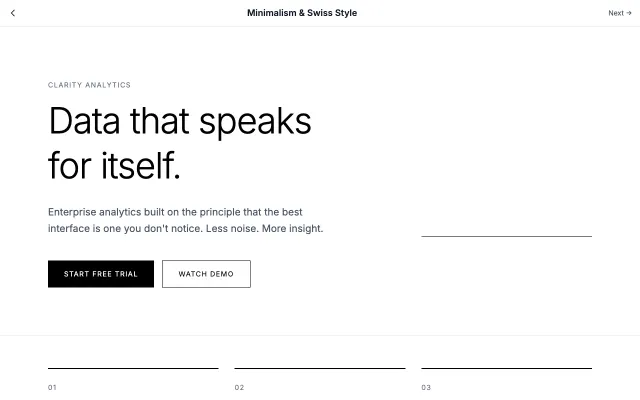
Rooted in the Swiss International Style of the 1950s, this approach emphasizes clarity, readability, and objectivity. Uses grid-based layouts, sans-serif typography, and generous white space to create functional, timeless designs.
Modern SaaS
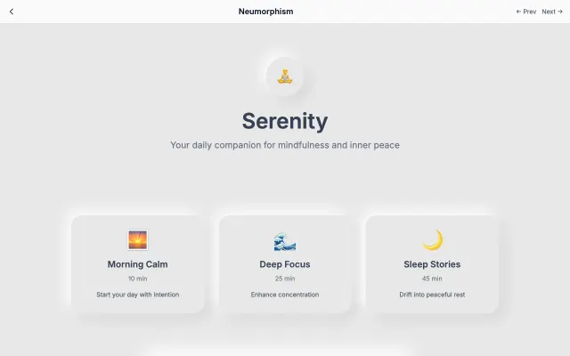
A modern evolution of skeuomorphism that creates soft, extruded plastic-like interfaces. Uses subtle shadows and highlights to simulate depth while maintaining a minimal aesthetic.
Modern SaaS
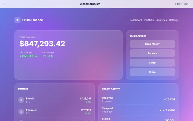
Inspired by frosted glass, this style creates depth through transparency and blur effects. Perfect for layered interfaces where content hierarchy is important.
Modern SaaS
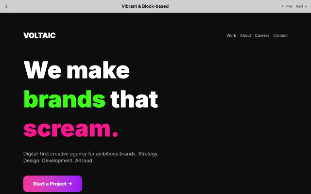
High-energy design with bold color blocks, geometric shapes, and vibrant palettes. Creates excitement and draws attention through visual contrast.
Modern SaaS