Memphis Design
Inspired by the 1980s Memphis Group, featuring bold geometric shapes, clashing colors, and playful patterns.
Live demo
JULY 15-18, 2025 • BROOKLYN, NY
ART MUSIC
DESIGN CHAOS
Four days of boundary-pushing creativity. 50+ artists. Infinite possibilities.
FRI
Opening Night
SAT
Main Stage
SUN
Workshops
MON
Closing Party
EARLY BIRD SPECIAL ★
Save 30% when you buy before May 1st!
$149 → $99About Memphis Design
Inspired by the 1980s Memphis Group, featuring bold geometric shapes, clashing colors, and playful patterns.
Era / origin
1980s Postmodern
Key characteristics
- 80s
- Geometric
- Playful
- Postmodern
- Shapes
- Patterns
- Squiggles
- Bold
When to use Memphis Design
- Creative agencies
- Music sites
- Youth brands
- Event promotion
- Artistic portfolios
When to avoid it
- Corporate finance
- Healthcare
- Legal
- Elderly users
Common industries
- Entertainment & Media
- Creative & Portfolio
- Kids & Family
Memphis Design color palette
- #FF71CE
- #FFCE5C
- #86CCCA
- #6A7BB4
- #FF6B6B
- #4ECDC4
How to build Memphis Design in CSS
Effects: Rotated cards, hard offset shadows, clip-path triangles and squiggles, repeating stripe and dot patterns
:root {
  --memphis-pink: #FF71CE;
  --memphis-yellow: #FFCE5C;
  --memphis-teal: #86CCCA;
  --memphis-periwinkle: #6A7BB4;
  --memphis-coral: #FF6B6B;
  --memphis-aqua: #4ECDC4;
  --memphis-paper: #FFFEF7;
}

body {
  background-color: var(--memphis-paper);
  /* Confetti dot pattern */
  background-image: radial-gradient(var(--memphis-periwinkle) 2px, transparent 2px);
  background-size: 32px 32px;
  color: #111111;
  /* Futura ships only on Apple systems: load Jost (or League Spartan) from Google Fonts for everyone else */
  font-family: "Futura", "Jost", "League Spartan", "Avenir Next", sans-serif;
}

h1,
h2 {
  font-weight: 900;
  line-height: 1;
  text-transform: uppercase;
}

.card {
  padding: 1.5rem;
  border: 4px solid #000000;
  background: var(--memphis-yellow);
  box-shadow: 12px 12px 0 #000000;
  transform: rotate(-2deg);
}

.card:nth-child(even) {
  background: var(--memphis-teal);
  transform: rotate(2deg);
}

.button {
  padding: 1.25rem 2.5rem;
  border: 3px solid #000000;
  background: var(--memphis-pink);
  color: #000000;
  font-weight: 900;
  font-size: 1.25rem;
  box-shadow: 8px 8px 0 var(--memphis-periwinkle);
  transition: transform 100ms ease, box-shadow 100ms ease;
}

.button:active {
  transform: translate(4px, 4px);
  box-shadow: 4px 4px 0 var(--memphis-periwinkle);
}

.button:focus-visible {
  outline: 4px dashed #000000;
  outline-offset: 6px;
}

.shape-triangle {
  width: 80px;
  height: 70px;
  background: var(--memphis-aqua);
  clip-path: polygon(50% 0, 100% 100%, 0 100%);
}

.shape-stripes {
  width: 64px;
  height: 160px;
  background: repeating-linear-gradient(45deg, #000000 0 5px, transparent 5px 10px);
}Use Memphis Design with an AI coding agent
Paste this into Claude Code, Cursor, v0, Lovable or any coding agent to restyle a page in Memphis Design.
Apply the Memphis Design style to this interface.

What it is: Inspired by the 1980s Memphis Group, featuring bold geometric shapes, clashing colors, and playful patterns.
Look and feel: 80s, Geometric, Playful, Postmodern, Shapes, Patterns, Squiggles, Bold.
Colors: primary #FF71CE, #FFCE5C, #86CCCA, #6A7BB4; secondary #FF6B6B, #4ECDC4.
Effects and motion: Rotated cards, hard offset shadows, clip-path triangles and squiggles, repeating stripe and dot patterns.

Reference CSS (put these class names on the matching elements, or map them onto existing components and class names; avoid long structural selectors):
```css
:root {
  --memphis-pink: #FF71CE;
  --memphis-yellow: #FFCE5C;
  --memphis-teal: #86CCCA;
  --memphis-periwinkle: #6A7BB4;
  --memphis-coral: #FF6B6B;
  --memphis-aqua: #4ECDC4;
  --memphis-paper: #FFFEF7;
}

body {
  background-color: var(--memphis-paper);
  /* Confetti dot pattern */
  background-image: radial-gradient(var(--memphis-periwinkle) 2px, transparent 2px);
  background-size: 32px 32px;
  color: #111111;
  /* Futura ships only on Apple systems: load Jost (or League Spartan) from Google Fonts for everyone else */
  font-family: "Futura", "Jost", "League Spartan", "Avenir Next", sans-serif;
}

h1,
h2 {
  font-weight: 900;
  line-height: 1;
  text-transform: uppercase;
}

.card {
  padding: 1.5rem;
  border: 4px solid #000000;
  background: var(--memphis-yellow);
  box-shadow: 12px 12px 0 #000000;
  transform: rotate(-2deg);
}

.card:nth-child(even) {
  background: var(--memphis-teal);
  transform: rotate(2deg);
}

.button {
  padding: 1.25rem 2.5rem;
  border: 3px solid #000000;
  background: var(--memphis-pink);
  color: #000000;
  font-weight: 900;
  font-size: 1.25rem;
  box-shadow: 8px 8px 0 var(--memphis-periwinkle);
  transition: transform 100ms ease, box-shadow 100ms ease;
}

.button:active {
  transform: translate(4px, 4px);
  box-shadow: 4px 4px 0 var(--memphis-periwinkle);
}

.button:focus-visible {
  outline: 4px dashed #000000;
  outline-offset: 6px;
}

.shape-triangle {
  width: 80px;
  height: 70px;
  background: var(--memphis-aqua);
  clip-path: polygon(50% 0, 100% 100%, 0 100%);
}

.shape-stripes {
  width: 64px;
  height: 160px;
  background: repeating-linear-gradient(45deg, #000000 0 5px, transparent 5px 10px);
}
```

Works best for: Creative agencies, Music sites, Youth brands, Event promotion, Artistic portfolios.
Avoid it for: Corporate finance, Healthcare, Legal, Elderly users. If this product falls into one of those, say so before restyling.

Change the visual design only: keep the existing layout, content and behaviour.
Meet WCAG AA contrast: where a palette color is too light or bright for text, keep it for backgrounds, borders and large display type and use a darker text color, rather than darkening the whole design. Keep visible focus states, give icon-only controls an accessible name (aria-label) and respect prefers-reduced-motion.Rolling AI coding agents out across a team? Farad Labs runs hands-on AI training.
Styles like Memphis Design
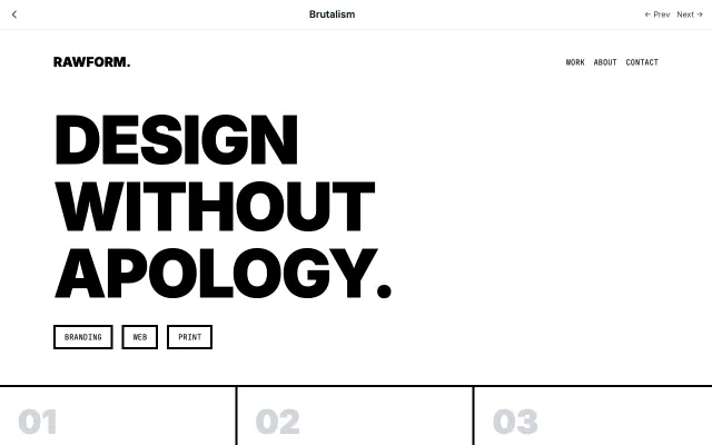
Brutalism
Inspired by Brutalist architecture, this style embraces raw, honest aesthetics. Features intentionally "ugly" design with default fonts, visible borders, and a rejection of conventional beauty.
Experimental & Artistic
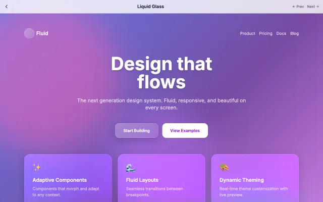
Liquid Glass
Advanced glassmorphism with flowing, morphing animations. Creates a liquid-like feel with chromatic aberration and iridescent effects.
Experimental & Artistic
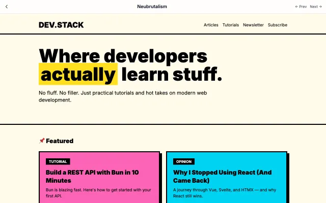
Neubrutalism
A modern, playful take on brutalism. Combines raw aesthetics with bright colors and bold shadows. Think Gumroad and Figma's marketing pages.
Experimental & Artistic
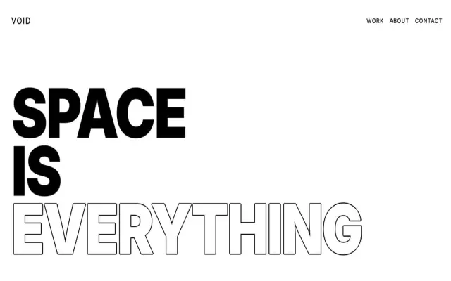
Exaggerated Minimalism
Takes minimalism to the extreme with oversized typography, dramatic white space, and bold statements.
Experimental & Artistic