Liquid Glass
Advanced glassmorphism with flowing, morphing animations. Creates a liquid-like feel with chromatic aberration and iridescent effects.
Live demo
flows
The next generation design system. Fluid, responsive, and beautiful on every screen.
Adaptive Components
Components that morph and adapt to any context.
Fluid Layouts
Seamless transitions between breakpoints.
Dynamic Theming
Real-time theme customization with live preview.
See it in action
Watch how Fluid transforms your workflow with intelligent, context-aware design tools.
About Liquid Glass
Advanced glassmorphism with flowing, morphing animations. Creates a liquid-like feel with chromatic aberration and iridescent effects.
Era / origin
2020s Modern
Key characteristics
- Flowing glass
- Morphing
- Smooth transitions
- Fluid effects
- Iridescent
When to use Liquid Glass
- Premium SaaS
- High-end e-commerce
- Creative platforms
- Luxury portfolios
When to avoid it
- Performance-limited
- Critical accessibility
- Complex data
- Budget projects
Common industries
- SaaS
- E-commerce
- Creative & Portfolio
- Luxury & Premium
Liquid Glass color palette
- #667EEA
- #764BA2
- #F093FB
- #FF6B6B
- #4ECDC4
- #95E1D3
How to build Liquid Glass in CSS
Effects: Morphing blobs (SVG/CSS), fluid animations (400-600ms), dynamic blur, iridescent glass edges, chromatic split on large headings
:root {
  --lg-indigo: #667EEA;
  --lg-purple: #764BA2;
  --lg-pink: #F093FB;
  --lg-coral: #FF6B6B;
  --lg-teal: #4ECDC4;
  --lg-mint: #95E1D3;
}

/* Keep the gradient vivid: no dark scrims over the page. A soft shadow keeps white text legible */
body {
  min-height: 100vh;
  background: linear-gradient(135deg, var(--lg-indigo), var(--lg-purple), var(--lg-pink));
  color: #FFFFFF;
  text-shadow: 0 1px 2px rgba(40, 20, 90, 0.35);
}

/* Soft colour blobs that slowly morph behind the glass */
.blob {
  position: absolute;
  width: 32rem;
  height: 32rem;
  background: var(--lg-pink);
  filter: blur(64px);
  opacity: 0.5;
  animation: liquid-morph 12s ease-in-out infinite;
}

@keyframes liquid-morph {
  0%, 100% { border-radius: 42% 58% 70% 30% / 45% 45% 55% 55%; transform: translate(0, 0) scale(1); }
  50% { border-radius: 70% 30% 46% 54% / 30% 39% 61% 70%; transform: translate(4%, -3%) scale(1.08); }
}

.glass {
  position: relative;
  padding: 2rem;
  border-radius: 1.5rem;
  background: linear-gradient(135deg, rgba(255, 255, 255, 0.2), rgba(255, 255, 255, 0.05));
  -webkit-backdrop-filter: blur(20px) saturate(180%);
  backdrop-filter: blur(20px) saturate(180%);
  box-shadow: 0 8px 32px rgba(0, 0, 0, 0.15), inset 0 1px 0 rgba(255, 255, 255, 0.35);
}

/* Iridescent 1px edge: a conic gradient masked down to the border */
.glass::before {
  content: "";
  position: absolute;
  inset: 0;
  padding: 1px;
  border-radius: inherit;
  background: conic-gradient(from 120deg, var(--lg-mint), var(--lg-pink), var(--lg-coral), var(--lg-teal), var(--lg-mint));
  -webkit-mask: linear-gradient(#000 0 0) content-box, linear-gradient(#000 0 0);
  -webkit-mask-composite: xor;
  mask-composite: exclude;
  pointer-events: none;
}

/* Chromatic aberration for large headings only */
.chromatic { text-shadow: -2px 0 rgba(255, 107, 107, 0.6), 2px 0 rgba(78, 205, 196, 0.6); }

.button {
  padding: 1rem 2rem;
  border: 1px solid rgba(255, 255, 255, 0.3);
  border-radius: 1rem;
  background: linear-gradient(135deg, rgba(255, 255, 255, 0.25), rgba(255, 255, 255, 0.1));
  -webkit-backdrop-filter: blur(20px);
  backdrop-filter: blur(20px);
  color: #FFFFFF;
  font-weight: 600;
  box-shadow: 0 8px 32px rgba(0, 0, 0, 0.2);
  transition: transform 400ms cubic-bezier(0.22, 1, 0.36, 1), background 400ms ease;
}

/* Primary action: an opaque pearl pill so it stands apart from the clear glass secondary */
.button--primary {
  background: linear-gradient(135deg, #FFFFFF, #F5E8FF);
  color: #4C1D95;
  text-shadow: none;
}

.button:hover { background: linear-gradient(135deg, rgba(255, 255, 255, 0.35), rgba(255, 255, 255, 0.15)); transform: scale(1.03); }
.button--primary:hover { background: #FFFFFF; }
.button:active { transform: scale(0.98); }

/* Dark inner ring plus white outer ring stays visible over every part of the gradient */
.button:focus-visible {
  outline: 3px solid #2E1A66;
  box-shadow: 0 0 0 6px #FFFFFF, 0 8px 32px rgba(0, 0, 0, 0.2);
}

@media (prefers-reduced-motion: reduce) {
  .blob { animation: none; }
  .button { transition: none; }
}Use Liquid Glass with an AI coding agent
Paste this into Claude Code, Cursor, v0, Lovable or any coding agent to restyle a page in Liquid Glass.
Apply the Liquid Glass style to this interface.

What it is: Advanced glassmorphism with flowing, morphing animations. Creates a liquid-like feel with chromatic aberration and iridescent effects.
Look and feel: Flowing glass, Morphing, Smooth transitions, Fluid effects, Iridescent.
Colors: primary #667EEA, #764BA2, #F093FB; secondary #FF6B6B, #4ECDC4, #95E1D3.
Effects and motion: Morphing blobs (SVG/CSS), fluid animations (400-600ms), dynamic blur, iridescent glass edges, chromatic split on large headings.

Reference CSS (put these class names on the matching elements, or map them onto existing components and class names; avoid long structural selectors):
```css
:root {
  --lg-indigo: #667EEA;
  --lg-purple: #764BA2;
  --lg-pink: #F093FB;
  --lg-coral: #FF6B6B;
  --lg-teal: #4ECDC4;
  --lg-mint: #95E1D3;
}

/* Keep the gradient vivid: no dark scrims over the page. A soft shadow keeps white text legible */
body {
  min-height: 100vh;
  background: linear-gradient(135deg, var(--lg-indigo), var(--lg-purple), var(--lg-pink));
  color: #FFFFFF;
  text-shadow: 0 1px 2px rgba(40, 20, 90, 0.35);
}

/* Soft colour blobs that slowly morph behind the glass */
.blob {
  position: absolute;
  width: 32rem;
  height: 32rem;
  background: var(--lg-pink);
  filter: blur(64px);
  opacity: 0.5;
  animation: liquid-morph 12s ease-in-out infinite;
}

@keyframes liquid-morph {
  0%, 100% { border-radius: 42% 58% 70% 30% / 45% 45% 55% 55%; transform: translate(0, 0) scale(1); }
  50% { border-radius: 70% 30% 46% 54% / 30% 39% 61% 70%; transform: translate(4%, -3%) scale(1.08); }
}

.glass {
  position: relative;
  padding: 2rem;
  border-radius: 1.5rem;
  background: linear-gradient(135deg, rgba(255, 255, 255, 0.2), rgba(255, 255, 255, 0.05));
  -webkit-backdrop-filter: blur(20px) saturate(180%);
  backdrop-filter: blur(20px) saturate(180%);
  box-shadow: 0 8px 32px rgba(0, 0, 0, 0.15), inset 0 1px 0 rgba(255, 255, 255, 0.35);
}

/* Iridescent 1px edge: a conic gradient masked down to the border */
.glass::before {
  content: "";
  position: absolute;
  inset: 0;
  padding: 1px;
  border-radius: inherit;
  background: conic-gradient(from 120deg, var(--lg-mint), var(--lg-pink), var(--lg-coral), var(--lg-teal), var(--lg-mint));
  -webkit-mask: linear-gradient(#000 0 0) content-box, linear-gradient(#000 0 0);
  -webkit-mask-composite: xor;
  mask-composite: exclude;
  pointer-events: none;
}

/* Chromatic aberration for large headings only */
.chromatic { text-shadow: -2px 0 rgba(255, 107, 107, 0.6), 2px 0 rgba(78, 205, 196, 0.6); }

.button {
  padding: 1rem 2rem;
  border: 1px solid rgba(255, 255, 255, 0.3);
  border-radius: 1rem;
  background: linear-gradient(135deg, rgba(255, 255, 255, 0.25), rgba(255, 255, 255, 0.1));
  -webkit-backdrop-filter: blur(20px);
  backdrop-filter: blur(20px);
  color: #FFFFFF;
  font-weight: 600;
  box-shadow: 0 8px 32px rgba(0, 0, 0, 0.2);
  transition: transform 400ms cubic-bezier(0.22, 1, 0.36, 1), background 400ms ease;
}

/* Primary action: an opaque pearl pill so it stands apart from the clear glass secondary */
.button--primary {
  background: linear-gradient(135deg, #FFFFFF, #F5E8FF);
  color: #4C1D95;
  text-shadow: none;
}

.button:hover { background: linear-gradient(135deg, rgba(255, 255, 255, 0.35), rgba(255, 255, 255, 0.15)); transform: scale(1.03); }
.button--primary:hover { background: #FFFFFF; }
.button:active { transform: scale(0.98); }

/* Dark inner ring plus white outer ring stays visible over every part of the gradient */
.button:focus-visible {
  outline: 3px solid #2E1A66;
  box-shadow: 0 0 0 6px #FFFFFF, 0 8px 32px rgba(0, 0, 0, 0.2);
}

@media (prefers-reduced-motion: reduce) {
  .blob { animation: none; }
  .button { transition: none; }
}
```

Works best for: Premium SaaS, High-end e-commerce, Creative platforms, Luxury portfolios.
Avoid it for: Performance-limited, Critical accessibility, Complex data, Budget projects. If this product falls into one of those, say so before restyling.

Change the visual design only: keep the existing layout, content and behaviour.
Keep visible focus states, give icon-only controls an accessible name (aria-label) and respect prefers-reduced-motion.Rolling AI coding agents out across a team? Farad Labs runs hands-on AI training.
Styles like Liquid Glass
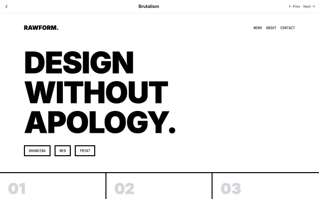
Brutalism
Inspired by Brutalist architecture, this style embraces raw, honest aesthetics. Features intentionally "ugly" design with default fonts, visible borders, and a rejection of conventional beauty.
Experimental & Artistic
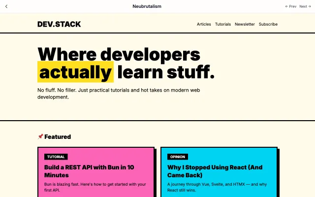
Neubrutalism
A modern, playful take on brutalism. Combines raw aesthetics with bright colors and bold shadows. Think Gumroad and Figma's marketing pages.
Experimental & Artistic
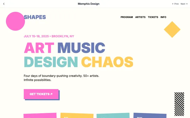
Memphis Design
Inspired by the 1980s Memphis Group, featuring bold geometric shapes, clashing colors, and playful patterns.
Experimental & Artistic
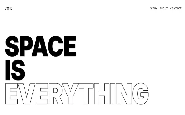
Exaggerated Minimalism
Takes minimalism to the extreme with oversized typography, dramatic white space, and bold statements.
Experimental & Artistic