Chromatic Aberration / RGB Split
Recreates the chromatic aberration effect from cameras and VHS tapes with RGB channel splitting.
Live demo
NEW RELEASE
SYSTEM
ERROR
The debut album from VOID_WALKER. 12 tracks of pure electronic chaos.
LATEST RELEASES
Digital Decay
CIRCUIT_BREAKER
Neon Nights
SYNTH_GHOST
Data Stream
PIXEL_WITCH
About Chromatic Aberration / RGB Split
Recreates the chromatic aberration effect from cameras and VHS tapes with RGB channel splitting.
Era / origin
2020s Retro-Tech
Key characteristics
- RGB split
- Color fringing
- Glitch
- Retro tech
- VHS
- Analog error
- Distortion
When to use Chromatic Aberration / RGB Split
- Music platforms
- Gaming
- Tech brands
- Creative portfolios
- Nightlife
- Video
When to avoid it
- Corporate
- Healthcare
- Finance
- Accessibility-critical
- Elderly users
Common industries
- Entertainment & Media
- Gaming
- Creative & Portfolio
Chromatic Aberration / RGB Split color palette
- #FF0000
- #00FF00
- #0000FF
- #000000
- #00FFFF
- #FF00FF
How to build Chromatic Aberration / RGB Split in CSS
Effects: Steady red/cyan RGB split on display type with a brief channel-swap burst every few seconds, hover glitch jitter, faint drifting scanlines on media only (never over text), slow subtle noise flicker under 3 per second
:root {
  --red: #FF0000;
  --green: #00FF00;
  --blue: #0000FF;
  --black: #000000;
  --cyan: #00FFFF;
  --magenta: #FF00FF;
  --surface: #0A0A0A;
}

body {
  background: var(--surface);
  color: #9CA3AF;
  font-family: system-ui, sans-serif;
}

/* Red and cyan copies of the glyphs offset sideways = the RGB split */
.rgb-text {
  color: #FFFFFF;
  font-weight: 900;
  text-shadow: -2px 0 var(--red), 2px 0 var(--cyan);
  /* Split holds steady; channels swap in a brief burst every 3s */
  animation: rgb-split 3s steps(1) infinite;
}

.button {
  border: 1px solid #FFFFFF;
  border-radius: 0;
  padding: 1rem 2rem;
  background: transparent;
  color: #FFFFFF;
  font-weight: 700;
  text-transform: uppercase;
  text-shadow: -1px 0 var(--red), 1px 0 var(--cyan);
}

.button:hover {
  animation: glitch 0.3s infinite;
}

.button:focus-visible {
  outline: 2px solid var(--cyan);
  outline-offset: 3px;
}

.media {
  position: relative;
  overflow: hidden;
  background: linear-gradient(45deg, var(--red), var(--green), var(--blue));
  animation: flicker 4s steps(1) infinite;
}

/* Faint drifting scanlines on media only, never over text */
.media::after {
  content: "";
  position: absolute;
  inset: 0;
  pointer-events: none;
  background: repeating-linear-gradient(0deg, rgba(0, 0, 0, 0.12) 0 1px, transparent 1px 3px);
  animation: scan 8s linear infinite;
}

@keyframes rgb-split {
  0%, 100% { text-shadow: -2px 0 var(--red), 2px 0 var(--cyan); }
  94% { text-shadow: 3px 0 var(--red), -3px 0 var(--cyan); }
  97% { text-shadow: -2px 0 var(--red), 2px 0 var(--cyan); }
}

@keyframes scan { to { background-position: 0 60px; } }

/* Subtle noise flicker: two small dips per 4s, well under 3 flashes/s */
@keyframes flicker {
  0%, 100% { opacity: 1; }
  48% { opacity: 0.92; }
  52% { opacity: 1; }
}

@keyframes glitch {
  0%, 90%, 100% { transform: translate(0); }
  93% { transform: translate(-2px, 1px); }
  97% { transform: translate(2px, -1px); }
}

@media (prefers-reduced-motion: reduce) {
  .rgb-text,
  .button:hover,
  .media,
  .media::after {
    animation: none;
  }
}Use Chromatic Aberration / RGB Split with an AI coding agent
Paste this into Claude Code, Cursor, v0, Lovable or any coding agent to restyle a page in Chromatic Aberration / RGB Split.
Apply the Chromatic Aberration / RGB Split style to this interface.

What it is: Recreates the chromatic aberration effect from cameras and VHS tapes with RGB channel splitting.
Look and feel: RGB split, Color fringing, Glitch, Retro tech, VHS, Analog error, Distortion.
Colors: primary #FF0000, #00FF00, #0000FF, #000000; secondary #00FFFF, #FF00FF.
Effects and motion: Steady red/cyan RGB split on display type with a brief channel-swap burst every few seconds, hover glitch jitter, faint drifting scanlines on media only (never over text), slow subtle noise flicker under 3 per second.

Reference CSS (put these class names on the matching elements, or map them onto existing components and class names; avoid long structural selectors):
```css
:root {
  --red: #FF0000;
  --green: #00FF00;
  --blue: #0000FF;
  --black: #000000;
  --cyan: #00FFFF;
  --magenta: #FF00FF;
  --surface: #0A0A0A;
}

body {
  background: var(--surface);
  color: #9CA3AF;
  font-family: system-ui, sans-serif;
}

/* Red and cyan copies of the glyphs offset sideways = the RGB split */
.rgb-text {
  color: #FFFFFF;
  font-weight: 900;
  text-shadow: -2px 0 var(--red), 2px 0 var(--cyan);
  /* Split holds steady; channels swap in a brief burst every 3s */
  animation: rgb-split 3s steps(1) infinite;
}

.button {
  border: 1px solid #FFFFFF;
  border-radius: 0;
  padding: 1rem 2rem;
  background: transparent;
  color: #FFFFFF;
  font-weight: 700;
  text-transform: uppercase;
  text-shadow: -1px 0 var(--red), 1px 0 var(--cyan);
}

.button:hover {
  animation: glitch 0.3s infinite;
}

.button:focus-visible {
  outline: 2px solid var(--cyan);
  outline-offset: 3px;
}

.media {
  position: relative;
  overflow: hidden;
  background: linear-gradient(45deg, var(--red), var(--green), var(--blue));
  animation: flicker 4s steps(1) infinite;
}

/* Faint drifting scanlines on media only, never over text */
.media::after {
  content: "";
  position: absolute;
  inset: 0;
  pointer-events: none;
  background: repeating-linear-gradient(0deg, rgba(0, 0, 0, 0.12) 0 1px, transparent 1px 3px);
  animation: scan 8s linear infinite;
}

@keyframes rgb-split {
  0%, 100% { text-shadow: -2px 0 var(--red), 2px 0 var(--cyan); }
  94% { text-shadow: 3px 0 var(--red), -3px 0 var(--cyan); }
  97% { text-shadow: -2px 0 var(--red), 2px 0 var(--cyan); }
}

@keyframes scan { to { background-position: 0 60px; } }

/* Subtle noise flicker: two small dips per 4s, well under 3 flashes/s */
@keyframes flicker {
  0%, 100% { opacity: 1; }
  48% { opacity: 0.92; }
  52% { opacity: 1; }
}

@keyframes glitch {
  0%, 90%, 100% { transform: translate(0); }
  93% { transform: translate(-2px, 1px); }
  97% { transform: translate(2px, -1px); }
}

@media (prefers-reduced-motion: reduce) {
  .rgb-text,
  .button:hover,
  .media,
  .media::after {
    animation: none;
  }
}
```

Works best for: Music platforms, Gaming, Tech brands, Creative portfolios, Nightlife, Video.
Avoid it for: Corporate, Healthcare, Finance, Accessibility-critical, Elderly users. If this product falls into one of those, say so before restyling.

Change the visual design only: keep the existing layout, content and behaviour.
Keep visible focus states, give icon-only controls an accessible name (aria-label) and respect prefers-reduced-motion.Rolling AI coding agents out across a team? Farad Labs runs hands-on AI training.
Styles like Chromatic Aberration / RGB Split
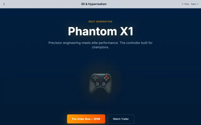
3D & Hyperrealism
Creates immersive experiences through realistic 3D rendering, complex textures, and spatial depth. Best suited for showcasing products or creating game-like interfaces.
Gaming & Entertainment
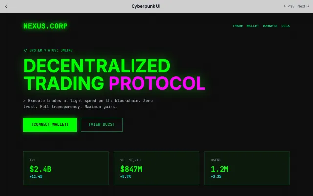
Cyberpunk UI
Dark, neon-lit interfaces inspired by cyberpunk fiction. Features terminal aesthetics, glitch effects, and dystopian vibes.
Gaming & Entertainment
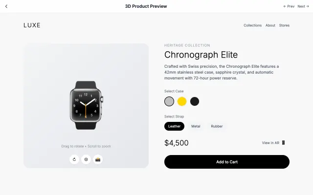
3D Product Preview
Interactive 3D product visualization with rotation, zoom, and AR capabilities.
Gaming & Entertainment
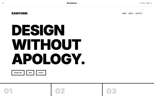
Brutalism
Inspired by Brutalist architecture, this style embraces raw, honest aesthetics. Features intentionally "ugly" design with default fonts, visible borders, and a rejection of conventional beauty.
Experimental & Artistic