Storytelling-Driven
Takes visitors on a journey. Uses narrative structure and emotional design to connect with audiences on a deeper level.
Live demo
Chapter 1
23 acres
of forest disappear.
Climate change, deforestation, and habitat loss threaten our planet's future. But there's hope — and you can be part of it.
Chapter 2
We plant trees.
Lots of them.
50M+
Trees Planted
120
Countries
100K+
Supporters
Chapter 3
Meet Maria.
"Evergreen helped my village plant 10,000 trees. Now we have clean water, shade for our crops, and hope for the future."
— Maria Santos, Brazil
Your Chapter
Plant your first tree.
Just $1.
Join 100,000+ supporters who are reforesting our planet, one tree at a time.
About Storytelling-Driven
Takes visitors on a journey. Uses narrative structure and emotional design to connect with audiences on a deeper level.
Era / origin
2020s Brand Marketing
Key characteristics
- Narrative flow
- Scroll story
- Emotional journey
- Brand story
- Mission-driven
- Impact focus
When to use Storytelling-Driven
- Brands with stories
- Nonprofits
- Mission-driven companies
- Agencies
- Personal brands
When to avoid it
- Quick conversions
- E-commerce
- Technical products
- Impatient audiences
Common industries
- Creative & Portfolio
- Travel & Tourism
- Nonprofit & Government
Storytelling-Driven color palette
- #0F172A
- #FFFFFF
- #059669
- #064E3B
- #34D399
- #F5F5F5
How to build Storytelling-Driven
Effects: Scroll-triggered reveals, parallax storytelling, chapter navigation, background video where the page has one
- Split the page into full-height chapter <section> elements, each with a small uppercase "Chapter N" eyebrow and a large clamp() headline
- Order chapters as problem, solution with proof numbers, a personal story, then a closing call to action
- Alternate dark #0F172A and light #F5F5F5 chapters; eyebrows #34D399 on dark, #064E3B on light, #059669 for rules and fills
- Use scroll-snap-type: y proximity and an optional sticky chapter nav for orientation
- Reveal text with IntersectionObserver or animation-timeline: view(); keep it visible without JS and under prefers-reduced-motion
- Keep parallax layers absolutely positioned behind content; if the page has background video, give it a poster, muted autoplay and pause control
Use Storytelling-Driven with an AI coding agent
Paste this into Claude Code, Cursor, v0, Lovable or any coding agent to restyle a page in Storytelling-Driven.
Apply the Storytelling-Driven style to this interface.

What it is: Takes visitors on a journey. Uses narrative structure and emotional design to connect with audiences on a deeper level.
Look and feel: Narrative flow, Scroll story, Emotional journey, Brand story, Mission-driven, Impact focus.
Colors: primary #0F172A, #FFFFFF, #059669; secondary #064E3B, #34D399, #F5F5F5.
Effects and motion: Scroll-triggered reveals, parallax storytelling, chapter navigation, background video where the page has one.

How to build it:
- Split the page into full-height chapter <section> elements, each with a small uppercase "Chapter N" eyebrow and a large clamp() headline
- Order chapters as problem, solution with proof numbers, a personal story, then a closing call to action
- Alternate dark #0F172A and light #F5F5F5 chapters; eyebrows #34D399 on dark, #064E3B on light, #059669 for rules and fills
- Use scroll-snap-type: y proximity and an optional sticky chapter nav for orientation
- Reveal text with IntersectionObserver or animation-timeline: view(); keep it visible without JS and under prefers-reduced-motion
- Keep parallax layers absolutely positioned behind content; if the page has background video, give it a poster, muted autoplay and pause control

Works best for: Brands with stories, Nonprofits, Mission-driven companies, Agencies, Personal brands.
Avoid it for: Quick conversions, E-commerce, Technical products, Impatient audiences. If this product falls into one of those, say so before restyling.

Restructure the layout where this style calls for it, keeping the existing content and behaviour. Use only content already on the page: if a step needs testimonials, pricing, data, images or media that don't exist, skip that step instead of adding placeholders or inventing it.
Meet WCAG AA contrast: where a palette color is too light or bright for text, keep it for backgrounds, borders and large display type and use a darker text color, rather than darkening the whole design. Keep visible focus states, give icon-only controls an accessible name (aria-label) and respect prefers-reduced-motion.
Rolling AI coding agents out across a team? Farad Labs runs hands-on AI training.
Styles like Storytelling-Driven
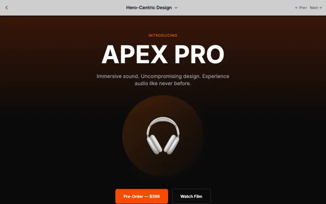
Hero-Centric Design
Puts the hero section front and center with dramatic visuals and minimal distractions. Perfect for products that sell themselves visually.
Landing Page Styles
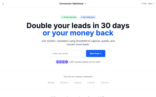
Conversion-Optimized
Every element designed to drive conversions. Strategic CTA placement, urgency triggers, and social proof elements work together.
Landing Page Styles
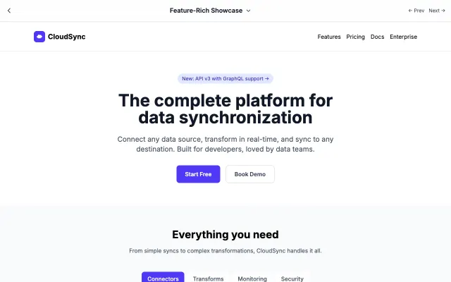
Feature-Rich Showcase
Comprehensive feature presentation for complex products. Organized sections help users understand capabilities at a glance.
Landing Page Styles
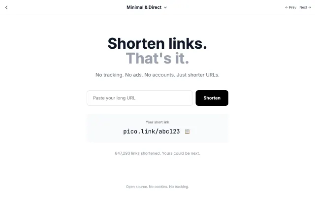
Minimal & Direct
Strips away everything unnecessary. One message, one action, maximum clarity. Perfect for products that speak for themselves.
Landing Page Styles