Shorten links.
That's it.
That's it.
No tracking. No ads. No accounts. Just shorter URLs.
Your short link
pico.link/abc123
847,293 links shortened. Yours could be next.
Strips away everything unnecessary. One message, one action, maximum clarity. Perfect for products that speak for themselves.
Live demo
No tracking. No ads. No accounts. Just shorter URLs.
Your short link
847,293 links shortened. Yours could be next.
Strips away everything unnecessary. One message, one action, maximum clarity. Perfect for products that speak for themselves.
2020s Minimalist
Effects: Subtle hover states, smooth scroll, minimal transitions, focus on readability
:root {
  --color-ink: #000000;
  --color-paper: #FFFFFF;
  --color-muted: #6B7280;
  --color-link: #3B82F6;
  --color-border: #E5E7EB;
}

html {
  scroll-behavior: smooth;
}

body {
  margin: 0;
  background: var(--color-paper);
  color: var(--color-ink);
  font-family: Inter, system-ui, sans-serif;
  line-height: 1.75;
}

.hero {
  max-width: 640px;
  min-height: 100vh;
  margin: 0 auto;
  padding: 0 2rem;
  display: flex;
  flex-direction: column;
  justify-content: center;
  text-align: center;
}

/* Make the headline a real <h1> */
.hero h1 {
  font-size: clamp(2.5rem, 6vw, 3.75rem);
  font-weight: 700;
  line-height: 1.1;
  letter-spacing: -0.025em;
  margin: 0 0 1.5rem;
}

.hero p {
  font-size: 1.25rem;
  color: var(--color-muted);
  margin: 0 0 3rem;
}

.input {
  padding: 1rem 1.5rem;
  font-size: 1.125rem;
  border: 2px solid var(--color-border);
  border-radius: 0.75rem;
}

.input:focus-visible {
  outline: 2px solid var(--color-link);
  outline-offset: 2px;
  border-color: var(--color-ink);
}

.button {
  padding: 1rem 2rem;
  font-size: 1.125rem;
  font-weight: 600;
  color: var(--color-paper);
  background: var(--color-ink);
  border: 0;
  border-radius: 0.75rem;
  cursor: pointer;
  transition: background-color 150ms ease;
}

.button:hover {
  background: #1F2937;
}

.button:focus-visible {
  outline: 2px solid var(--color-link);
  outline-offset: 3px;
}

@media (prefers-reduced-motion: reduce) {
  html {
    scroll-behavior: auto;
  }

  .button {
    transition: none;
  }
}Paste this into Claude Code, Cursor, v0, Lovable or any coding agent to restyle a page in Minimal & Direct.
Apply the Minimal & Direct style to this interface.

What it is: Strips away everything unnecessary. One message, one action, maximum clarity. Perfect for products that speak for themselves.
Look and feel: Single focus, Clean, Fast loading, One CTA, Whitespace, Typography-led.
Colors: primary #000000, #FFFFFF; secondary #6B7280, #3B82F6.
Effects and motion: Subtle hover states, smooth scroll, minimal transitions, focus on readability.

Reference CSS (put these class names on the matching elements, or map them onto existing components and class names; avoid long structural selectors):
```css
:root {
  --color-ink: #000000;
  --color-paper: #FFFFFF;
  --color-muted: #6B7280;
  --color-link: #3B82F6;
  --color-border: #E5E7EB;
}

html {
  scroll-behavior: smooth;
}

body {
  margin: 0;
  background: var(--color-paper);
  color: var(--color-ink);
  font-family: Inter, system-ui, sans-serif;
  line-height: 1.75;
}

.hero {
  max-width: 640px;
  min-height: 100vh;
  margin: 0 auto;
  padding: 0 2rem;
  display: flex;
  flex-direction: column;
  justify-content: center;
  text-align: center;
}

/* Make the headline a real <h1> */
.hero h1 {
  font-size: clamp(2.5rem, 6vw, 3.75rem);
  font-weight: 700;
  line-height: 1.1;
  letter-spacing: -0.025em;
  margin: 0 0 1.5rem;
}

.hero p {
  font-size: 1.25rem;
  color: var(--color-muted);
  margin: 0 0 3rem;
}

.input {
  padding: 1rem 1.5rem;
  font-size: 1.125rem;
  border: 2px solid var(--color-border);
  border-radius: 0.75rem;
}

.input:focus-visible {
  outline: 2px solid var(--color-link);
  outline-offset: 2px;
  border-color: var(--color-ink);
}

.button {
  padding: 1rem 2rem;
  font-size: 1.125rem;
  font-weight: 600;
  color: var(--color-paper);
  background: var(--color-ink);
  border: 0;
  border-radius: 0.75rem;
  cursor: pointer;
  transition: background-color 150ms ease;
}

.button:hover {
  background: #1F2937;
}

.button:focus-visible {
  outline: 2px solid var(--color-link);
  outline-offset: 3px;
}

@media (prefers-reduced-motion: reduce) {
  html {
    scroll-behavior: auto;
  }

  .button {
    transition: none;
  }
}
```

Works best for: Simple products, Apps, Waitlists, Coming soon pages, Single-feature tools.
Avoid it for: Complex products, Multiple offerings, E-commerce, Information-heavy sites. If this product falls into one of those, say so before restyling.

Restructure the layout where this style calls for it, keeping the existing content and behaviour. Use only content already on the page: if a step needs testimonials, pricing, data, images or media that don't exist, skip that step instead of adding placeholders or inventing it.
Meet WCAG AA contrast: where a palette color is too light or bright for text, keep it for backgrounds, borders and large display type and use a darker text color, rather than darkening the whole design. Keep visible focus states, give icon-only controls an accessible name (aria-label) and respect prefers-reduced-motion.Rolling AI coding agents out across a team? Farad Labs runs hands-on AI training.
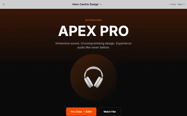
Puts the hero section front and center with dramatic visuals and minimal distractions. Perfect for products that sell themselves visually.
Landing Page Styles
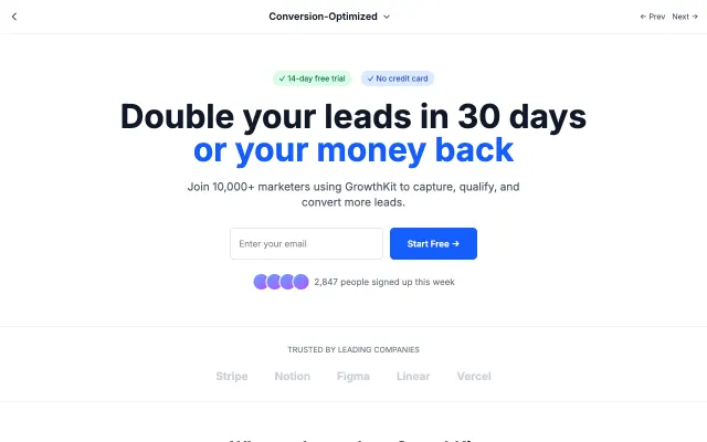
Every element designed to drive conversions. Strategic CTA placement, urgency triggers, and social proof elements work together.
Landing Page Styles

Comprehensive feature presentation for complex products. Organized sections help users understand capabilities at a glance.
Landing Page Styles
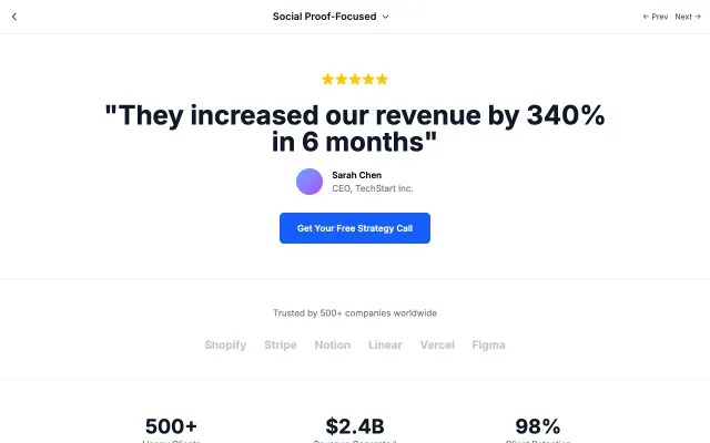
Lets your customers do the selling. Testimonials, case studies, and trust signals take center stage to build credibility.
Landing Page Styles