Conversion-Optimized
Every element designed to drive conversions. Strategic CTA placement, urgency triggers, and social proof elements work together.
Live demo
or your money back
Join 10,000+ marketers using GrowthKit to capture, qualify, and convert more leads.
TRUSTED BY LEADING COMPANIES
Why marketers love GrowthKit
2x More Leads
Smart forms that convert 2x better than traditional forms.
Setup in 5 min
No code required. Just copy, paste, and start capturing.
Lead Scoring
AI-powered scoring so you focus on hot leads first.
About Conversion-Optimized
Every element designed to drive conversions. Strategic CTA placement, urgency triggers, and social proof elements work together.
Era / origin
2020s Growth Marketing
Key characteristics
- CTA focused
- Lead capture
- Urgency
- Social proof
- Benefits-driven
- Trust signals
When to use Conversion-Optimized
- Lead generation
- Sales pages
- SaaS trials
- Course launches
- Webinar signups
When to avoid it
- Brand awareness
- Content marketing
- Portfolio sites
- Informational pages
Common industries
- SaaS
- E-commerce
- Education
- Startup & Tech
Conversion-Optimized color palette
- #2563EB
- #FFFFFF
- #10B981
- #F59E0B
- #EF4444
- #F3F4F6
How to build Conversion-Optimized
Effects: Sticky mobile CTA bar, inline form validation states, subtle CTA hover and press feedback, step progress on multi-step forms
- Reorder existing sections into: hero with offer, inline signup form, logo strip, benefits, testimonials, FAQ, final CTA; skip sections the page lacks
- Turn existing trust claims such as free trial or no credit card into chips directly beside the primary form
- Use one primary CTA label and filled color everywhere, final CTA included; secondary actions use outline buttons
- Repeat the primary CTA after the benefits and at the end only; add a position: sticky CTA bar on mobile
- Validate form fields inline with aria-invalid and aria-describedby error messages
- Keep existing claims and counts as written and add no countdowns or urgency; raise doubts in your reply, not on the page
Use Conversion-Optimized with an AI coding agent
Paste this into Claude Code, Cursor, v0, Lovable or any coding agent to restyle a page in Conversion-Optimized.
Apply the Conversion-Optimized style to this interface.

What it is: Every element designed to drive conversions. Strategic CTA placement, urgency triggers, and social proof elements work together.
Look and feel: CTA focused, Lead capture, Urgency, Social proof, Benefits-driven, Trust signals.
Colors: primary #2563EB, #FFFFFF, #10B981; secondary #F59E0B, #EF4444, #F3F4F6.
Effects and motion: Sticky mobile CTA bar, inline form validation states, subtle CTA hover and press feedback, step progress on multi-step forms.

How to build it:
- Reorder existing sections into: hero with offer, inline signup form, logo strip, benefits, testimonials, FAQ, final CTA; skip sections the page lacks
- Turn existing trust claims such as free trial or no credit card into chips directly beside the primary form
- Use one primary CTA label and filled color everywhere, final CTA included; secondary actions use outline buttons
- Repeat the primary CTA after the benefits and at the end only; add a position: sticky CTA bar on mobile
- Validate form fields inline with aria-invalid and aria-describedby error messages
- Keep existing claims and counts as written and add no countdowns or urgency; raise doubts in your reply, not on the page

Works best for: Lead generation, Sales pages, SaaS trials, Course launches, Webinar signups.
Avoid it for: Brand awareness, Content marketing, Portfolio sites, Informational pages. If this product falls into one of those, say so before restyling.

Restructure the layout where this style calls for it, keeping the existing content and behaviour. Use only content already on the page: if a step needs testimonials, pricing, data, images or media that don't exist, skip that step instead of adding placeholders or inventing it.
Meet WCAG AA contrast: where a palette color is too light or bright for text, keep it for backgrounds, borders and large display type and use a darker text color, rather than darkening the whole design. Keep visible focus states, give icon-only controls an accessible name (aria-label) and respect prefers-reduced-motion.
Rolling AI coding agents out across a team? Farad Labs runs hands-on AI training.
Styles like Conversion-Optimized
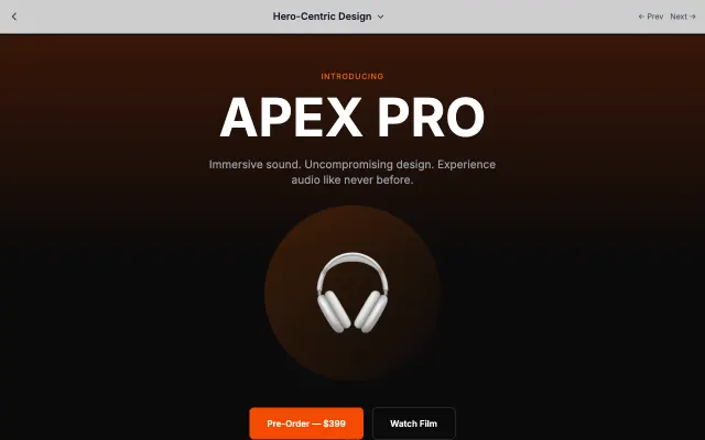
Hero-Centric Design
Puts the hero section front and center with dramatic visuals and minimal distractions. Perfect for products that sell themselves visually.
Landing Page Styles
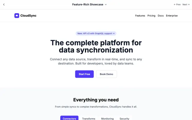
Feature-Rich Showcase
Comprehensive feature presentation for complex products. Organized sections help users understand capabilities at a glance.
Landing Page Styles
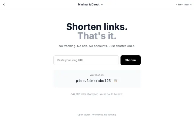
Minimal & Direct
Strips away everything unnecessary. One message, one action, maximum clarity. Perfect for products that speak for themselves.
Landing Page Styles
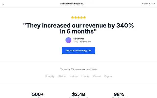
Social Proof-Focused
Lets your customers do the selling. Testimonials, case studies, and trust signals take center stage to build credibility.
Landing Page Styles