We create
experiences
that matter
experiences
that matter
A creative agency specializing in digital experiences, brand identity, and interactive design.
Makes the cursor a primary interaction element with morphing, trails, and magnetic effects.
Live demo
A creative agency specializing in digital experiences, brand identity, and interactive design.
Digital Experience
Brand Identity
Interactive
Animation
Makes the cursor a primary interaction element with morphing, trails, and magnetic effects.
2025+ Interactive
Effects: Cursor scale on hover, magnetic pull to elements, cursor morphing, trail effects
Paste this into Claude Code, Cursor, v0, Lovable or any coding agent to restyle a page in Interactive Cursor Design.
Apply the Interactive Cursor Design style to this interface.

What it is: Makes the cursor a primary interaction element with morphing, trails, and magnetic effects.
Look and feel: Custom cursor, Cursor as tool, Hover effects, Pointer transformation, Magnetic cursor.
Colors: primary #000000, #FFFFFF; secondary #EC4899, #111827.
Effects and motion: Cursor scale on hover, magnetic pull to elements, cursor morphing, trail effects.

How to build it:
- Hide the native pointer with cursor: none only inside @media (hover: hover) and (pointer: fine)
- Render a position: fixed cursor moved with requestAnimationFrame and translate3d; stop the loop once it catches up with the pointer
- Give the cursor mix-blend-mode: difference so it inverts cleanly over light and dark content
- Morph the cursor over real links and buttons only, via attributes like data-cursor="view"; never over static cards or text
- Pull hovered buttons toward the pointer by about 25% of the offset, easing back on pointerleave
- Disable trails and magnetic motion under prefers-reduced-motion and keep native focus outlines for keyboard users

Works best for: Creative portfolios, Interactive experiences, Agency sites, Product showcases.
Avoid it for: Mobile-first (no cursor), Accessibility-critical, Data-heavy dashboards, Forms. If this product falls into one of those, say so before restyling.

Keep the existing content and layout. Restyle it with the colors above, and add the interactions described.
Meet WCAG AA contrast: where a palette color is too light or bright for text, keep it for backgrounds, borders and large display type and use a darker text color, rather than darkening the whole design. Keep visible focus states, give icon-only controls an accessible name (aria-label) and respect prefers-reduced-motion.
Rolling AI coding agents out across a team? Farad Labs runs hands-on AI training.
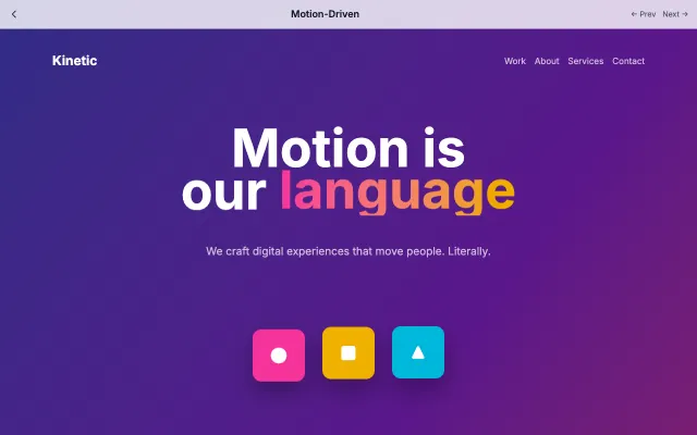
Design where animation is the primary mode of communication. Every interaction has purposeful motion that guides users through the experience.
Motion & Interactive
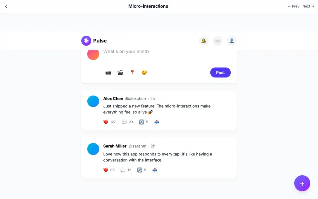
Focuses on small, delightful animations that provide feedback and guide users. Every tap, swipe, and hover has a response.
Motion & Interactive
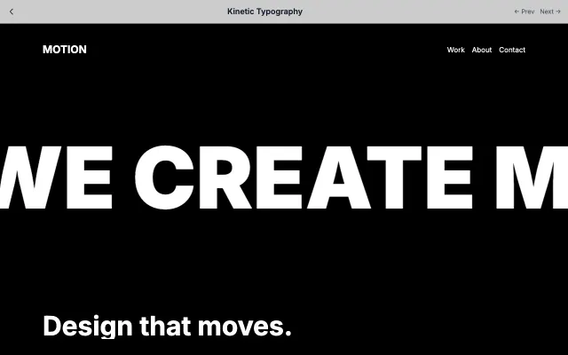
Uses animated typography as the primary visual element. Text moves, morphs, and transforms to tell stories.
Motion & Interactive
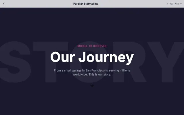
Uses scroll as a narrative device with parallax layers and progressive content reveal. Creates cinematic web experiences.
Motion & Interactive