Kinetic Typography
Uses animated typography as the primary visual element. Text moves, morphs, and transforms to tell stories.
Live demo
Design that moves.
We are a motion design studio that brings brands to life through animation, visual effects, and kinetic experiences.
Brand Animation
Logos that breathe and move
UI Motion
Interfaces that feel alive
Title Sequences
Stories told in seconds
Social Content
Scroll-stopping moments
About Kinetic Typography
Uses animated typography as the primary visual element. Text moves, morphs, and transforms to tell stories.
Era / origin
2020s Modern
Key characteristics
- Motion text
- Animated type
- Moving letters
- Dynamic
- Typing effect
- Morphing
When to use Kinetic Typography
- Hero sections
- Marketing sites
- Video platforms
- Storytelling
- Creative portfolios
When to avoid it
- Long-form content
- Accessibility-critical
- Data interfaces
- Forms
- Elderly users
Common industries
- Entertainment & Media
- Creative & Portfolio
- Startup & Tech
Kinetic Typography color palette
- #1A1A1A
- #FFFFFF
- #FF6B6B
- #4ECDC4
How to build Kinetic Typography in CSS
Effects: Looping text marquees, typewriter reveals on short single lines, gradient-filled text, hover slides and scroll-triggered letter animations (IntersectionObserver or GSAP ScrollTrigger)
:root {
  --kt-ink: #1A1A1A;
  --kt-paper: #FFFFFF;
  --kt-coral: #FF6B6B;
  --kt-teal: #4ECDC4;
}

body {
  background: var(--kt-ink);
  color: var(--kt-paper);
  font-family: "Inter", "Helvetica Neue", sans-serif;
}

/* Put the text in .marquee-track twice (aria-hidden="true" on the copy) so the -50% loop is seamless */
.marquee { overflow: hidden; white-space: nowrap; }

.marquee-track {
  display: inline-block;
  font-size: 15vw;
  font-weight: 900;
  animation: marquee 20s linear infinite;
}

/* Typewriter: short single-line strings only (about 40 characters max), never paragraphs.
   Set --chars to the string's character count. */
.typewriter {
  display: inline-block;
  width: calc(var(--chars, 20) * 1ch);
  overflow: hidden;
  white-space: nowrap;
  border-right: 0.08em solid var(--kt-coral);
  animation: typewriter calc(var(--chars, 20) * 80ms) steps(var(--chars, 20)) forwards;
}

.gradient-text {
  background: linear-gradient(90deg, var(--kt-coral), var(--kt-teal));
  -webkit-background-clip: text;
  background-clip: text;
  color: transparent;
}

/* Letters split into .char spans rise in when JS adds .is-visible (IntersectionObserver or GSAP).
   Set --i (letter index) on each; inside .gradient-text also set --w (word width) and --x (letter offset)
   so every letter shows its slice of one continuous gradient instead of repeating it. */
.char {
  display: inline-block;
  opacity: 0;
  transform: translateY(0.6em);
  transition: opacity 500ms ease, transform 500ms ease;
  transition-delay: calc(var(--i, 0) * 30ms);
}

.is-visible .char { opacity: 1; transform: none; }

.gradient-text .char {
  background-image: inherit;
  background-size: var(--w, 100%) 100%;
  background-position: calc(-1 * var(--x, 0px)) 0;
  -webkit-background-clip: text;
  background-clip: text;
}

.card { padding: 2rem; border: 1px solid #27272A; transition: border-color 150ms ease; }
.card h3 { transition: transform 300ms ease; }
.card:hover h3 { transform: translateX(1rem); }

/* Focus styles only for cards that are links or buttons; don't add tabindex to static cards */
.card:hover,
a.card:focus-visible { border-color: var(--kt-paper); }
a.card:focus-visible { outline: 2px solid var(--kt-teal); outline-offset: 4px; }

@keyframes marquee { to { transform: translateX(-50%); } }
@keyframes typewriter { from { width: 0; } }

@media (prefers-reduced-motion: reduce) {
  .marquee-track,
  .typewriter { animation: none; }
  .char { opacity: 1; transform: none; transition: none; }
  .card h3 { transition: none; }
}Use Kinetic Typography with an AI coding agent
Paste this into Claude Code, Cursor, v0, Lovable or any coding agent to restyle a page in Kinetic Typography.
Apply the Kinetic Typography style to this interface.

What it is: Uses animated typography as the primary visual element. Text moves, morphs, and transforms to tell stories.
Look and feel: Motion text, Animated type, Moving letters, Dynamic, Typing effect, Morphing.
Colors: primary #1A1A1A, #FFFFFF; secondary #FF6B6B, #4ECDC4.
Effects and motion: Looping text marquees, typewriter reveals on short single lines, gradient-filled text, hover slides and scroll-triggered letter animations (IntersectionObserver or GSAP ScrollTrigger).

Reference CSS (put these class names on the matching elements, or map them onto existing components and class names; avoid long structural selectors):
```css
:root {
  --kt-ink: #1A1A1A;
  --kt-paper: #FFFFFF;
  --kt-coral: #FF6B6B;
  --kt-teal: #4ECDC4;
}

body {
  background: var(--kt-ink);
  color: var(--kt-paper);
  font-family: "Inter", "Helvetica Neue", sans-serif;
}

/* Put the text in .marquee-track twice (aria-hidden="true" on the copy) so the -50% loop is seamless */
.marquee { overflow: hidden; white-space: nowrap; }

.marquee-track {
  display: inline-block;
  font-size: 15vw;
  font-weight: 900;
  animation: marquee 20s linear infinite;
}

/* Typewriter: short single-line strings only (about 40 characters max), never paragraphs.
   Set --chars to the string's character count. */
.typewriter {
  display: inline-block;
  width: calc(var(--chars, 20) * 1ch);
  overflow: hidden;
  white-space: nowrap;
  border-right: 0.08em solid var(--kt-coral);
  animation: typewriter calc(var(--chars, 20) * 80ms) steps(var(--chars, 20)) forwards;
}

.gradient-text {
  background: linear-gradient(90deg, var(--kt-coral), var(--kt-teal));
  -webkit-background-clip: text;
  background-clip: text;
  color: transparent;
}

/* Letters split into .char spans rise in when JS adds .is-visible (IntersectionObserver or GSAP).
   Set --i (letter index) on each; inside .gradient-text also set --w (word width) and --x (letter offset)
   so every letter shows its slice of one continuous gradient instead of repeating it. */
.char {
  display: inline-block;
  opacity: 0;
  transform: translateY(0.6em);
  transition: opacity 500ms ease, transform 500ms ease;
  transition-delay: calc(var(--i, 0) * 30ms);
}

.is-visible .char { opacity: 1; transform: none; }

.gradient-text .char {
  background-image: inherit;
  background-size: var(--w, 100%) 100%;
  background-position: calc(-1 * var(--x, 0px)) 0;
  -webkit-background-clip: text;
  background-clip: text;
}

.card { padding: 2rem; border: 1px solid #27272A; transition: border-color 150ms ease; }
.card h3 { transition: transform 300ms ease; }
.card:hover h3 { transform: translateX(1rem); }

/* Focus styles only for cards that are links or buttons; don't add tabindex to static cards */
.card:hover,
a.card:focus-visible { border-color: var(--kt-paper); }
a.card:focus-visible { outline: 2px solid var(--kt-teal); outline-offset: 4px; }

@keyframes marquee { to { transform: translateX(-50%); } }
@keyframes typewriter { from { width: 0; } }

@media (prefers-reduced-motion: reduce) {
  .marquee-track,
  .typewriter { animation: none; }
  .char { opacity: 1; transform: none; transition: none; }
  .card h3 { transition: none; }
}
```

Works best for: Hero sections, Marketing sites, Video platforms, Storytelling, Creative portfolios.
Avoid it for: Long-form content, Accessibility-critical, Data interfaces, Forms, Elderly users. If this product falls into one of those, say so before restyling.

Keep the existing content and layout. Restyle it with the colors and CSS above, and add the interactions described.
Meet WCAG AA contrast: where a palette color is too light or bright for text, keep it for backgrounds, borders and large display type and use a darker text color, rather than darkening the whole design. Keep visible focus states, give icon-only controls an accessible name (aria-label) and respect prefers-reduced-motion.Rolling AI coding agents out across a team? Farad Labs runs hands-on AI training.
Styles like Kinetic Typography
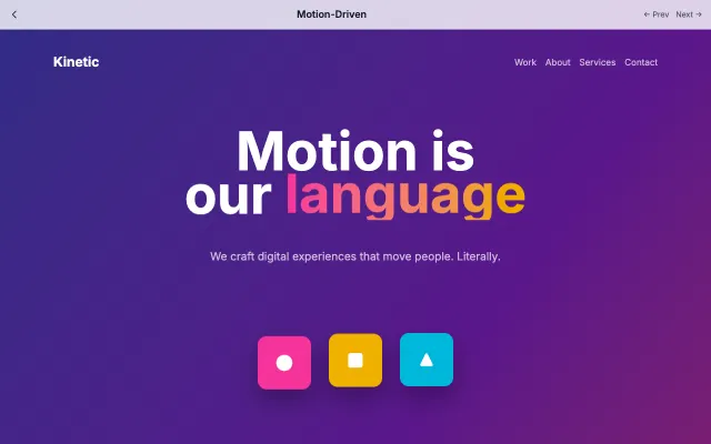
Motion-Driven
Design where animation is the primary mode of communication. Every interaction has purposeful motion that guides users through the experience.
Motion & Interactive
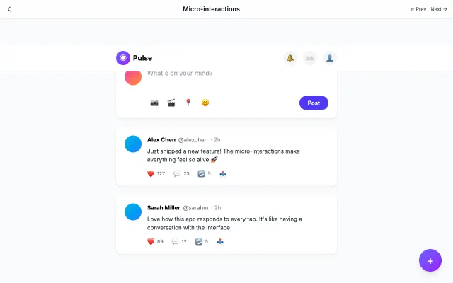
Micro-interactions
Focuses on small, delightful animations that provide feedback and guide users. Every tap, swipe, and hover has a response.
Motion & Interactive
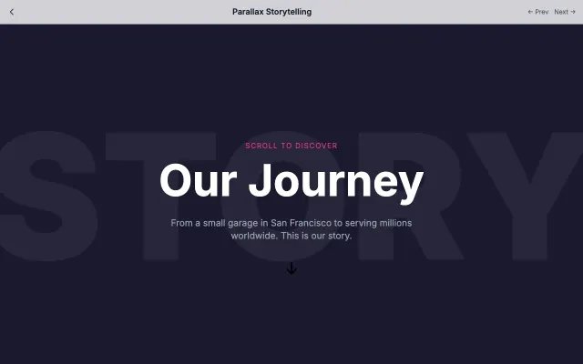
Parallax Storytelling
Uses scroll as a narrative device with parallax layers and progressive content reveal. Creates cinematic web experiences.
Motion & Interactive
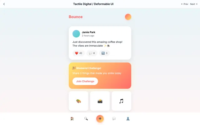
Tactile Digital / Deformable UI
Creates tactile, touchable interfaces with squishy buttons, bounce physics, and material-like responses.
Motion & Interactive