Parallax Storytelling
Uses scroll as a narrative device with parallax layers and progressive content reveal. Creates cinematic web experiences.
Live demo
Scroll to discover
From a small garage in San Francisco to serving millions worldwide. This is our story.
The Beginning
In 2015, three friends with a shared vision started building something different. No investors, no fancy office—just passion and purpose.
The Growth
By 2020, we had 1 million users. Not through growth hacks or viral marketing, but by building something people actually love.
The Future
This is just the beginning. Join us as we write the next chapter together.
About Parallax Storytelling
Uses scroll as a narrative device with parallax layers and progressive content reveal. Creates cinematic web experiences.
Era / origin
2020s Modern
Key characteristics
- Scroll-driven
- Narrative
- Layered scrolling
- Immersive
- Progressive disclosure
When to use Parallax Storytelling
- Brand storytelling
- Product launches
- Case studies
- Portfolios
- Marketing campaigns
When to avoid it
- E-commerce
- Dashboards
- Mobile-first
- SEO-critical
- Motion-sensitive audiences
Common industries
- Creative & Portfolio
- Startup & Tech
- Travel & Tourism
- Nonprofit & Government
Parallax Storytelling color palette
- #1A1A2E
- #16213E
- #0F3460
- #E94560
- #F39C12
How to build Parallax Storytelling in CSS
Effects: Background layers scrolling slower than the foreground, fixed or sticky layers, full-screen chapter sections, scroll-triggered content reveals
:root {
  --night: #1A1A2E;
  --navy: #16213E;
  --deep-blue: #0F3460;
  --rose: #E94560;
  --amber: #F39C12;
  --text: #FFFFFF;
  --text-muted: #9CA3AF; /* on the navy and chapter gradients only */
}

body {
  background: var(--night);
  color: var(--text);
}

/* Depth layers behind the chapters: the far backdrop drifts least, the mid layer more */
.backdrop,
.midground {
  position: fixed;
  inset: 0;
  z-index: 0;
  pointer-events: none;
}

.backdrop {
  --drift: -10vh;
  display: grid;
  place-items: center;
  font-size: 30vw;
  font-weight: 900;
  color: rgb(255 255 255 / 0.05);
}

.midground {
  --drift: -30vh;
  background: radial-gradient(circle at 80% 30%, rgb(233 69 96 / 0.18), transparent 40%);
}

.chapter {
  position: relative;
  z-index: 1;
  min-height: 100vh;
  display: grid;
  place-items: center;
  padding: 0 2rem;
  background: linear-gradient(180deg, transparent, rgb(233 69 96 / 0.2));
}

.chapter + .chapter {
  background: linear-gradient(180deg, rgb(233 69 96 / 0.2), rgb(15 52 96 / 0.5));
}

.chapter-number {
  font-size: 8rem;
  font-weight: 900;
  line-height: 1;
  color: var(--rose);
}

/* Gradient title: inline-block + padding keep descenders from being clipped */
.title {
  display: inline-block;
  padding-bottom: 0.12em;
  line-height: 1.1;
  background: linear-gradient(90deg, var(--rose), var(--amber));
  -webkit-background-clip: text;
  background-clip: text;
  color: transparent;
}

.chapter p {
  max-width: 36rem;
  font-size: 1.125rem;
  color: var(--text-muted);
}

/* Dark text: white fails AA on the amber end of the gradient */
.button {
  padding: 1.25rem 3rem;
  border: 0;
  border-radius: 9999px;
  background: linear-gradient(90deg, var(--rose), var(--amber));
  color: var(--night);
  font-size: 1.25rem;
  font-weight: 700;
}

.button:focus-visible {
  outline: 3px solid var(--text);
  outline-offset: 4px;
}

/* Reveals start dimmed, never invisible, so content still reads in static captures */
@keyframes reveal {
  from { opacity: 0.4; transform: translateY(4rem); }
}

@keyframes drift {
  to { transform: translateY(var(--drift)); }
}

@supports (animation-timeline: view()) {
  .backdrop,
  .midground {
    animation: drift linear both;
    animation-timeline: scroll();
  }

  .reveal {
    animation: reveal linear both;
    animation-timeline: view();
    animation-range: entry 0% entry 60%;
  }
}

@media print, (prefers-reduced-motion: reduce) {
  .backdrop,
  .midground,
  .reveal {
    animation: none;
  }
}Use Parallax Storytelling with an AI coding agent
Paste this into Claude Code, Cursor, v0, Lovable or any coding agent to restyle a page in Parallax Storytelling.
Apply the Parallax Storytelling style to this interface.

What it is: Uses scroll as a narrative device with parallax layers and progressive content reveal. Creates cinematic web experiences.
Look and feel: Scroll-driven, Narrative, Layered scrolling, Immersive, Progressive disclosure.
Colors: primary #1A1A2E, #16213E, #0F3460; secondary #E94560, #F39C12.
Effects and motion: Background layers scrolling slower than the foreground, fixed or sticky layers, full-screen chapter sections, scroll-triggered content reveals.

Reference CSS (put these class names on the matching elements, or map them onto existing components and class names; avoid long structural selectors):
```css
:root {
  --night: #1A1A2E;
  --navy: #16213E;
  --deep-blue: #0F3460;
  --rose: #E94560;
  --amber: #F39C12;
  --text: #FFFFFF;
  --text-muted: #9CA3AF; /* on the navy and chapter gradients only */
}

body {
  background: var(--night);
  color: var(--text);
}

/* Depth layers behind the chapters: the far backdrop drifts least, the mid layer more */
.backdrop,
.midground {
  position: fixed;
  inset: 0;
  z-index: 0;
  pointer-events: none;
}

.backdrop {
  --drift: -10vh;
  display: grid;
  place-items: center;
  font-size: 30vw;
  font-weight: 900;
  color: rgb(255 255 255 / 0.05);
}

.midground {
  --drift: -30vh;
  background: radial-gradient(circle at 80% 30%, rgb(233 69 96 / 0.18), transparent 40%);
}

.chapter {
  position: relative;
  z-index: 1;
  min-height: 100vh;
  display: grid;
  place-items: center;
  padding: 0 2rem;
  background: linear-gradient(180deg, transparent, rgb(233 69 96 / 0.2));
}

.chapter + .chapter {
  background: linear-gradient(180deg, rgb(233 69 96 / 0.2), rgb(15 52 96 / 0.5));
}

.chapter-number {
  font-size: 8rem;
  font-weight: 900;
  line-height: 1;
  color: var(--rose);
}

/* Gradient title: inline-block + padding keep descenders from being clipped */
.title {
  display: inline-block;
  padding-bottom: 0.12em;
  line-height: 1.1;
  background: linear-gradient(90deg, var(--rose), var(--amber));
  -webkit-background-clip: text;
  background-clip: text;
  color: transparent;
}

.chapter p {
  max-width: 36rem;
  font-size: 1.125rem;
  color: var(--text-muted);
}

/* Dark text: white fails AA on the amber end of the gradient */
.button {
  padding: 1.25rem 3rem;
  border: 0;
  border-radius: 9999px;
  background: linear-gradient(90deg, var(--rose), var(--amber));
  color: var(--night);
  font-size: 1.25rem;
  font-weight: 700;
}

.button:focus-visible {
  outline: 3px solid var(--text);
  outline-offset: 4px;
}

/* Reveals start dimmed, never invisible, so content still reads in static captures */
@keyframes reveal {
  from { opacity: 0.4; transform: translateY(4rem); }
}

@keyframes drift {
  to { transform: translateY(var(--drift)); }
}

@supports (animation-timeline: view()) {
  .backdrop,
  .midground {
    animation: drift linear both;
    animation-timeline: scroll();
  }

  .reveal {
    animation: reveal linear both;
    animation-timeline: view();
    animation-range: entry 0% entry 60%;
  }
}

@media print, (prefers-reduced-motion: reduce) {
  .backdrop,
  .midground,
  .reveal {
    animation: none;
  }
}
```

Works best for: Brand storytelling, Product launches, Case studies, Portfolios, Marketing campaigns.
Avoid it for: E-commerce, Dashboards, Mobile-first, SEO-critical, Motion-sensitive audiences. If this product falls into one of those, say so before restyling.

Restructure the layout where this style calls for it, keeping the existing content and behaviour. Use only content already on the page: if a step needs testimonials, pricing, data, images or media that don't exist, skip that step instead of adding placeholders or inventing it.
Meet WCAG AA contrast: where a palette color is too light or bright for text, keep it for backgrounds, borders and large display type and use a darker text color, rather than darkening the whole design. Keep visible focus states, give icon-only controls an accessible name (aria-label) and respect prefers-reduced-motion.Rolling AI coding agents out across a team? Farad Labs runs hands-on AI training.
Styles like Parallax Storytelling
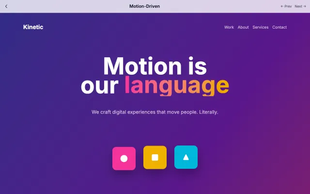
Motion-Driven
Design where animation is the primary mode of communication. Every interaction has purposeful motion that guides users through the experience.
Motion & Interactive
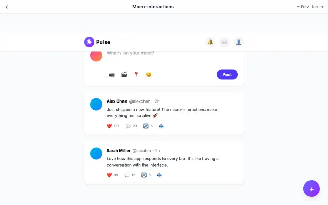
Micro-interactions
Focuses on small, delightful animations that provide feedback and guide users. Every tap, swipe, and hover has a response.
Motion & Interactive
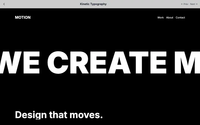
Kinetic Typography
Uses animated typography as the primary visual element. Text moves, morphs, and transforms to tell stories.
Motion & Interactive
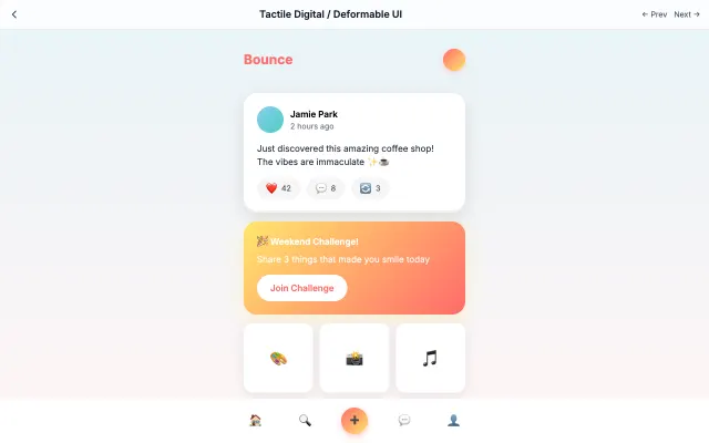
Tactile Digital / Deformable UI
Creates tactile, touchable interfaces with squishy buttons, bounce physics, and material-like responses.
Motion & Interactive