Heatmap Dashboard
Uses color intensity to reveal patterns in large datasets. Perfect for geographic, behavioral, or time-series data.
Live demo
User Activity Heatmap
Geographic Distribution
Top Regions
About Heatmap Dashboard
Uses color intensity to reveal patterns in large datasets. Perfect for geographic, behavioral, or time-series data.
Era / origin
2020s Data Viz
Key characteristics
- Color intensity
- Geographic data
- Behavior patterns
- Activity maps
- Density visualization
- Gradient scales
When to use Heatmap Dashboard
- Geographic data
- User behavior analysis
- Website analytics
- Resource allocation
- Performance monitoring
When to avoid it
- Precise values needed
- Small datasets
- Colorblind-critical
- Print-first
Common industries
- SaaS
- E-commerce
- Real Estate
Heatmap Dashboard color palette
- #1E293B
- #FFFFFF
- #440154
- #3B528B
- #21918C
- #5EC962
- #FDE725
- #22C55E
- #F59E0B
- #3B82F6
- #8B5CF6
How to build Heatmap Dashboard
Effects: Color gradient legends, interactive hover states, zoom controls, time-based animation
- Lead with a full-width day-by-hour matrix: a 24-column by 7-row CSS Grid, with hour labels placed on the same columns
- Color cells with the five-step viridis ramp from the palette and a Low-to-High legend beside the title; never encode with red versus green alone
- Keep cell values already in the UI; if none exist, show a neutral "No data" matrix instead of inventing sample values
- Show exact values in a tooltip on hover and keyboard focus, and outline the active cell
- If the page has regional data, pair a choropleth (the stack's map library, or an inline SVG tile map) with ranked region bars in the heat scale
- Put Today / Week / Month range toggles in the header; dark slate cards make the color scale stand out
Use Heatmap Dashboard with an AI coding agent
Paste this into Claude Code, Cursor, v0, Lovable or any coding agent to restyle a page in Heatmap Dashboard.
Apply the Heatmap Dashboard style to this interface.

What it is: Uses color intensity to reveal patterns in large datasets. Perfect for geographic, behavioral, or time-series data.
Look and feel: Color intensity, Geographic data, Behavior patterns, Activity maps, Density visualization, Gradient scales.
Colors: primary #1E293B, #FFFFFF, #440154, #3B528B, #21918C, #5EC962, #FDE725; secondary #22C55E, #F59E0B, #3B82F6, #8B5CF6.
Effects and motion: Color gradient legends, interactive hover states, zoom controls, time-based animation.

How to build it:
- Lead with a full-width day-by-hour matrix: a 24-column by 7-row CSS Grid, with hour labels placed on the same columns
- Color cells with the five-step viridis ramp from the palette and a Low-to-High legend beside the title; never encode with red versus green alone
- Keep cell values already in the UI; if none exist, show a neutral "No data" matrix instead of inventing sample values
- Show exact values in a tooltip on hover and keyboard focus, and outline the active cell
- If the page has regional data, pair a choropleth (the stack's map library, or an inline SVG tile map) with ranked region bars in the heat scale
- Put Today / Week / Month range toggles in the header; dark slate cards make the color scale stand out

Works best for: Geographic data, User behavior analysis, Website analytics, Resource allocation, Performance monitoring.
Avoid it for: Precise values needed, Small datasets, Colorblind-critical, Print-first. If this product falls into one of those, say so before restyling.

Restructure the layout where this style calls for it, keeping the existing content and behaviour. Use only content already on the page: if a step needs testimonials, pricing, data, images or media that don't exist, skip that step instead of adding placeholders or inventing it.
Meet WCAG AA contrast: where a palette color is too light or bright for text, keep it for backgrounds, borders and large display type and use a darker text color, rather than darkening the whole design. Keep visible focus states, give icon-only controls an accessible name (aria-label) and respect prefers-reduced-motion.
Rolling AI coding agents out across a team? Farad Labs runs hands-on AI training.
Styles like Heatmap Dashboard
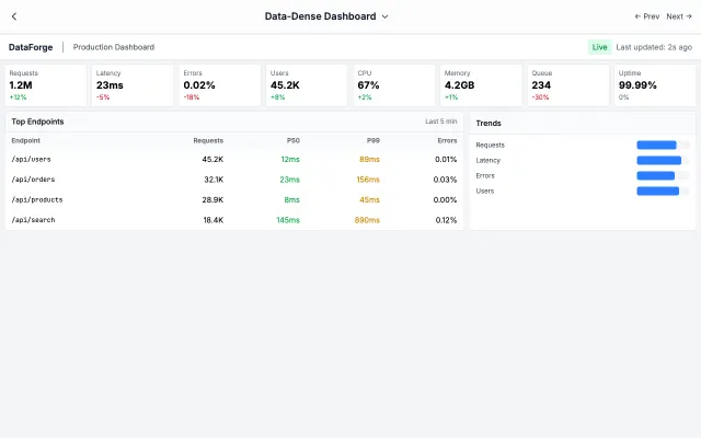
Data-Dense Dashboard
Maximizes information density for power users who need to see everything at once. Every pixel serves a purpose.
BI & Analytics
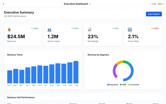
Executive Dashboard
Distills complex data into key metrics. Large numbers, clear trends, and minimal noise for busy executives.
BI & Analytics
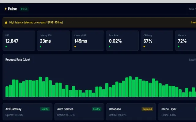
Real-Time Monitoring
Built for operations centers with live-updating metrics, streaming charts, and instant alert visibility.
BI & Analytics
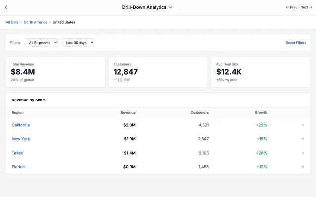
Drill-Down Analytics
Start with the big picture, drill into details. Perfect for analysts who need to explore data at multiple levels.
BI & Analytics