Y2K Aesthetic
Celebrates early 2000s digital optimism with chrome textures, bubblegum colors, and futuristic-retro aesthetics.
Live demo
★ FASHION FOR THE FUTURE ★
HOLO JACKET
$299
CYBER SHADES
$149
PLATFORM BOOTS
$249
✨ FREE SHIPPING ON ORDERS OVER $100 ✨
About Y2K Aesthetic
Celebrates early 2000s digital optimism with chrome textures, bubblegum colors, and futuristic-retro aesthetics.
Era / origin
Y2K 2000s
Key characteristics
- Neon pink
- Chrome
- Metallic
- Bubblegum
- Iridescent
- Glossy
- 2000s
When to use Y2K Aesthetic
- Fashion brands
- Music platforms
- Gen Z brands
- Nostalgia marketing
- Entertainment
When to avoid it
- B2B enterprise
- Healthcare
- Finance
- Elderly users
Common industries
- E-commerce
- Entertainment & Media
- Creative & Portfolio
Y2K Aesthetic color palette
- #FF69B4
- #00FFFF
- #C0C0C0
- #9400D3
- #FFD700
- #FF1493
How to build Y2K Aesthetic in CSS
Effects: linear-gradient metallic, glossy buttons, 3D chrome effects, glow animations
:root {
  --y2k-pink: #FF69B4;
  --y2k-cyan: #00FFFF;
  --y2k-chrome: #C0C0C0;
  --y2k-violet: #9400D3;
  --y2k-gold: #FFD700;
  --y2k-hot-pink: #FF1493;
}

body {
  background: linear-gradient(135deg, var(--y2k-pink), var(--y2k-cyan));
  font-family: "Arial Black", "Helvetica Neue", sans-serif;
}

/* Stacked hard shadows give the chrome-extruded wordmark; set it straight on the gradient, no dark header slab */
.hero-title {
  color: #FFFFFF;
  font-weight: 900;
  text-transform: uppercase;
  text-shadow: 3px 3px 0 var(--y2k-violet), 6px 6px 0 var(--y2k-chrome);
}

.card {
  padding: 1.5rem;
  border-radius: 24px;
  background: linear-gradient(145deg, rgba(255, 255, 255, 0.9), rgba(255, 255, 255, 0.7));
  box-shadow: 0 20px 40px rgba(0, 0, 0, 0.2), inset 0 -5px 20px rgba(0, 0, 0, 0.05);
  color: #6B21A8;
}

.button {
  padding: 0.75rem 1.5rem;
  border: 2px solid rgba(255, 255, 255, 0.7);
  border-radius: 9999px;
  background: linear-gradient(180deg, rgba(255, 255, 255, 0.45) 0%, rgba(255, 255, 255, 0) 50%), linear-gradient(90deg, var(--y2k-hot-pink), var(--y2k-violet));
  color: #FFFFFF;
  font-weight: 800;
  letter-spacing: 0.05em;
  text-shadow: 0 1px 2px rgba(0, 0, 0, 0.35);
  transition: filter 150ms ease, transform 150ms ease;
}

.button:hover {
  filter: drop-shadow(0 0 12px var(--y2k-cyan));
}

.button:active {
  transform: scale(0.97);
}

/* Two-tone ring: gold inner glow, violet outer line, visible on white cards and on the gradient */
.button:focus-visible,
.card:focus-visible {
  outline: 3px solid var(--y2k-violet);
  outline-offset: 3px;
  box-shadow: 0 0 0 3px var(--y2k-gold);
}

/* Slow pulsing glow for a featured card or the wordmark */
.glow {
  animation: y2k-glow 2.4s ease-in-out infinite alternate;
}

@keyframes y2k-glow {
  from { filter: drop-shadow(0 0 4px var(--y2k-cyan)); }
  to { filter: drop-shadow(0 0 16px var(--y2k-hot-pink)); }
}

.badge {
  padding: 0.25rem 0.75rem;
  border-radius: 9999px;
  background: linear-gradient(135deg, #FFFFFF, var(--y2k-chrome) 50%, #FFFFFF);
  color: var(--y2k-violet);
  font-weight: 700;
}

@media (prefers-reduced-motion: reduce) {
  .glow { animation: none; }
  .button { transition: none; }
  .button:active { transform: none; }
}Use Y2K Aesthetic with an AI coding agent
Paste this into Claude Code, Cursor, v0, Lovable or any coding agent to restyle a page in Y2K Aesthetic.
Apply the Y2K Aesthetic style to this interface.

What it is: Celebrates early 2000s digital optimism with chrome textures, bubblegum colors, and futuristic-retro aesthetics.
Look and feel: Neon pink, Chrome, Metallic, Bubblegum, Iridescent, Glossy, 2000s.
Colors: primary #FF69B4, #00FFFF, #C0C0C0, #9400D3; secondary #FFD700, #FF1493.
Effects and motion: linear-gradient metallic, glossy buttons, 3D chrome effects, glow animations.

Reference CSS (put these class names on the matching elements, or map them onto existing components and class names; avoid long structural selectors):
```css
:root {
  --y2k-pink: #FF69B4;
  --y2k-cyan: #00FFFF;
  --y2k-chrome: #C0C0C0;
  --y2k-violet: #9400D3;
  --y2k-gold: #FFD700;
  --y2k-hot-pink: #FF1493;
}

body {
  background: linear-gradient(135deg, var(--y2k-pink), var(--y2k-cyan));
  font-family: "Arial Black", "Helvetica Neue", sans-serif;
}

/* Stacked hard shadows give the chrome-extruded wordmark; set it straight on the gradient, no dark header slab */
.hero-title {
  color: #FFFFFF;
  font-weight: 900;
  text-transform: uppercase;
  text-shadow: 3px 3px 0 var(--y2k-violet), 6px 6px 0 var(--y2k-chrome);
}

.card {
  padding: 1.5rem;
  border-radius: 24px;
  background: linear-gradient(145deg, rgba(255, 255, 255, 0.9), rgba(255, 255, 255, 0.7));
  box-shadow: 0 20px 40px rgba(0, 0, 0, 0.2), inset 0 -5px 20px rgba(0, 0, 0, 0.05);
  color: #6B21A8;
}

.button {
  padding: 0.75rem 1.5rem;
  border: 2px solid rgba(255, 255, 255, 0.7);
  border-radius: 9999px;
  background: linear-gradient(180deg, rgba(255, 255, 255, 0.45) 0%, rgba(255, 255, 255, 0) 50%), linear-gradient(90deg, var(--y2k-hot-pink), var(--y2k-violet));
  color: #FFFFFF;
  font-weight: 800;
  letter-spacing: 0.05em;
  text-shadow: 0 1px 2px rgba(0, 0, 0, 0.35);
  transition: filter 150ms ease, transform 150ms ease;
}

.button:hover {
  filter: drop-shadow(0 0 12px var(--y2k-cyan));
}

.button:active {
  transform: scale(0.97);
}

/* Two-tone ring: gold inner glow, violet outer line, visible on white cards and on the gradient */
.button:focus-visible,
.card:focus-visible {
  outline: 3px solid var(--y2k-violet);
  outline-offset: 3px;
  box-shadow: 0 0 0 3px var(--y2k-gold);
}

/* Slow pulsing glow for a featured card or the wordmark */
.glow {
  animation: y2k-glow 2.4s ease-in-out infinite alternate;
}

@keyframes y2k-glow {
  from { filter: drop-shadow(0 0 4px var(--y2k-cyan)); }
  to { filter: drop-shadow(0 0 16px var(--y2k-hot-pink)); }
}

.badge {
  padding: 0.25rem 0.75rem;
  border-radius: 9999px;
  background: linear-gradient(135deg, #FFFFFF, var(--y2k-chrome) 50%, #FFFFFF);
  color: var(--y2k-violet);
  font-weight: 700;
}

@media (prefers-reduced-motion: reduce) {
  .glow { animation: none; }
  .button { transition: none; }
  .button:active { transform: none; }
}
```

Works best for: Fashion brands, Music platforms, Gen Z brands, Nostalgia marketing, Entertainment.
Avoid it for: B2B enterprise, Healthcare, Finance, Elderly users. If this product falls into one of those, say so before restyling.

Change the visual design only: keep the existing layout, content and behaviour.
Keep visible focus states, give icon-only controls an accessible name (aria-label) and respect prefers-reduced-motion.Rolling AI coding agents out across a team? Farad Labs runs hands-on AI training.
Styles like Y2K Aesthetic
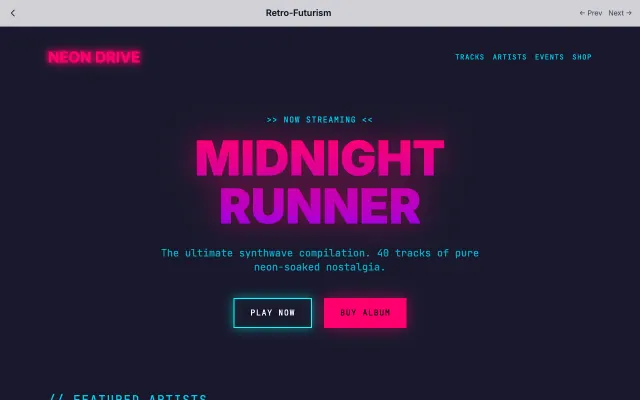
Retro-Futurism
Combines 1980s retrofuturistic aesthetics with modern web technology. Features neon colors, synthwave vibes, and CRT-style effects.
Retro & Nostalgia
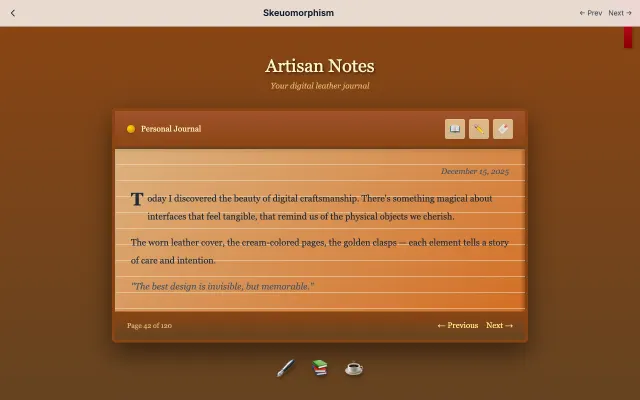
Skeuomorphism
Uses real-world textures and metaphors to make digital interfaces feel familiar. Think leather textures, wood grain, and realistic shadows.
Retro & Nostalgia
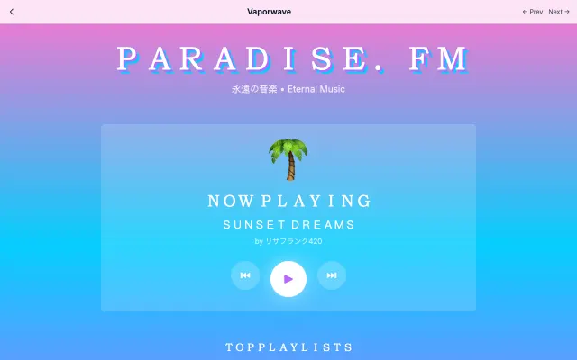
Vaporwave
A visual celebration of 80s-90s computer aesthetics with sunset gradients, glitch effects, and dreamy atmospheres.
Retro & Nostalgia
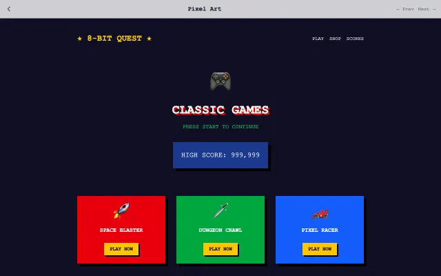
Pixel Art
Celebrates the aesthetics of early video games with pixelated graphics, limited palettes, and 8-bit charm.
Retro & Nostalgia