Bento Box Grid
Inspired by Japanese bento boxes, this layout uses modular cards of varying sizes to create visual hierarchy and interest.
Live demo
Introducing
The complete design system for modern apps. Beautiful. Flexible. Powerful.
Design Tokens
Consistent styling across all components
Themes
Light & Dark
Responsive
Every screen
Lightning Fast
Built for performance
50+ Components
Full Docs
Ready to start?
npm install mosaic-ui
About Bento Box Grid
Inspired by Japanese bento boxes, this layout uses modular cards of varying sizes to create visual hierarchy and interest.
Era / origin
2020s Apple
Key characteristics
- Modular cards
- Asymmetric grid
- Varied sizes
- Apple-style
- Dashboard tiles
When to use Bento Box Grid
- Dashboards
- Product pages
- Portfolios
- Apple-style marketing
- Feature showcases
When to avoid it
- Dense data tables
- Text-heavy content
- Real-time monitoring
Common industries
- SaaS
- E-commerce
- Creative & Portfolio
- Startup & Tech
Bento Box Grid color palette
- #FFFFFF
- #F5F5F5
- #007AFF
- #34C759
How to build Bento Box Grid in CSS
Effects: CSS grid of tiles spanning one or two columns and rows, 24px rounded corners, soft shadows, subtle hover scale (1.02) on tiles that link somewhere
:root {
  --bento-white: #FFFFFF;
  --bento-canvas: #F5F5F5;
  --bento-blue: #007AFF; /* fills, icons and focus rings; white text uses #0A55C4 */
  --bento-green: #34C759;
  --bento-ink: #1D1D1F;
  --bento-muted: #6E6E73;
}

.grid {
  display: grid;
  grid-template-columns: repeat(4, 1fr);
  grid-auto-rows: minmax(200px, auto);
  gap: 16px;
  background: var(--bento-canvas);
}

.card {
  display: flex;
  flex-direction: column;
  justify-content: space-between;
  padding: 1.5rem;
  border-radius: 24px;
  background: var(--bento-white);
  color: var(--bento-ink);
  box-shadow: 0 1px 2px rgba(0, 0, 0, 0.05);
  transition: transform 150ms ease, box-shadow 150ms ease;
}

/* Only tiles that link somewhere lift on hover */
a.card:hover,
.card:has(a, button):hover {
  transform: scale(1.02);
  box-shadow: 0 10px 15px -3px rgba(0, 0, 0, 0.1), 0 4px 6px -4px rgba(0, 0, 0, 0.1);
}

/* Varied spans are what make it a bento: one hero tile, a few wide ones, the rest single */
.card--hero {
  grid-column: span 2;
  grid-row: span 2;
  background: linear-gradient(135deg, #0A55C4, #5856D6);
  color: #FFFFFF;
}

.card--wide {
  grid-column: span 2;
}

.card--accent {
  background: var(--bento-green);
  color: var(--bento-ink);
}

.card p {
  margin: 0;
  color: var(--bento-muted);
}

.card--hero p {
  color: rgba(255, 255, 255, 0.85);
}

.button {
  padding: 0.75rem 1.5rem;
  border: 0;
  border-radius: 12px;
  background: var(--bento-ink);
  color: #FFFFFF;
  font-weight: 600;
}

a.card:focus-visible,
.card a:focus-visible,
.button:focus-visible {
  outline: 3px solid var(--bento-blue);
  outline-offset: 3px;
}

@media (max-width: 640px) {
  .grid {
    grid-template-columns: repeat(2, 1fr);
    grid-auto-rows: minmax(150px, auto);
    gap: 12px;
  }
}

@media (prefers-reduced-motion: reduce) {
  .card {
    transition: none;
  }
}Use Bento Box Grid with an AI coding agent
Paste this into Claude Code, Cursor, v0, Lovable or any coding agent to restyle a page in Bento Box Grid.
Apply the Bento Box Grid style to this interface.

What it is: Inspired by Japanese bento boxes, this layout uses modular cards of varying sizes to create visual hierarchy and interest.
Look and feel: Modular cards, Asymmetric grid, Varied sizes, Apple-style, Dashboard tiles.
Colors: primary #FFFFFF, #F5F5F5; secondary #007AFF, #34C759.
Effects and motion: CSS grid of tiles spanning one or two columns and rows, 24px rounded corners, soft shadows, subtle hover scale (1.02) on tiles that link somewhere.

Reference CSS (put these class names on the matching elements, or map them onto existing components and class names; avoid long structural selectors):
```css
:root {
  --bento-white: #FFFFFF;
  --bento-canvas: #F5F5F5;
  --bento-blue: #007AFF; /* fills, icons and focus rings; white text uses #0A55C4 */
  --bento-green: #34C759;
  --bento-ink: #1D1D1F;
  --bento-muted: #6E6E73;
}

.grid {
  display: grid;
  grid-template-columns: repeat(4, 1fr);
  grid-auto-rows: minmax(200px, auto);
  gap: 16px;
  background: var(--bento-canvas);
}

.card {
  display: flex;
  flex-direction: column;
  justify-content: space-between;
  padding: 1.5rem;
  border-radius: 24px;
  background: var(--bento-white);
  color: var(--bento-ink);
  box-shadow: 0 1px 2px rgba(0, 0, 0, 0.05);
  transition: transform 150ms ease, box-shadow 150ms ease;
}

/* Only tiles that link somewhere lift on hover */
a.card:hover,
.card:has(a, button):hover {
  transform: scale(1.02);
  box-shadow: 0 10px 15px -3px rgba(0, 0, 0, 0.1), 0 4px 6px -4px rgba(0, 0, 0, 0.1);
}

/* Varied spans are what make it a bento: one hero tile, a few wide ones, the rest single */
.card--hero {
  grid-column: span 2;
  grid-row: span 2;
  background: linear-gradient(135deg, #0A55C4, #5856D6);
  color: #FFFFFF;
}

.card--wide {
  grid-column: span 2;
}

.card--accent {
  background: var(--bento-green);
  color: var(--bento-ink);
}

.card p {
  margin: 0;
  color: var(--bento-muted);
}

.card--hero p {
  color: rgba(255, 255, 255, 0.85);
}

.button {
  padding: 0.75rem 1.5rem;
  border: 0;
  border-radius: 12px;
  background: var(--bento-ink);
  color: #FFFFFF;
  font-weight: 600;
}

a.card:focus-visible,
.card a:focus-visible,
.button:focus-visible {
  outline: 3px solid var(--bento-blue);
  outline-offset: 3px;
}

@media (max-width: 640px) {
  .grid {
    grid-template-columns: repeat(2, 1fr);
    grid-auto-rows: minmax(150px, auto);
    gap: 12px;
  }
}

@media (prefers-reduced-motion: reduce) {
  .card {
    transition: none;
  }
}
```

Works best for: Dashboards, Product pages, Portfolios, Apple-style marketing, Feature showcases.
Avoid it for: Dense data tables, Text-heavy content, Real-time monitoring. If this product falls into one of those, say so before restyling.

Restructure the layout where this style calls for it, keeping the existing content and behaviour. Use only content already on the page: if a step needs testimonials, pricing, data, images or media that don't exist, skip that step instead of adding placeholders or inventing it.
Meet WCAG AA contrast: where a palette color is too light or bright for text, keep it for backgrounds, borders and large display type and use a darker text color, rather than darkening the whole design. Keep visible focus states, give icon-only controls an accessible name (aria-label) and respect prefers-reduced-motion.Rolling AI coding agents out across a team? Farad Labs runs hands-on AI training.
Styles like Bento Box Grid
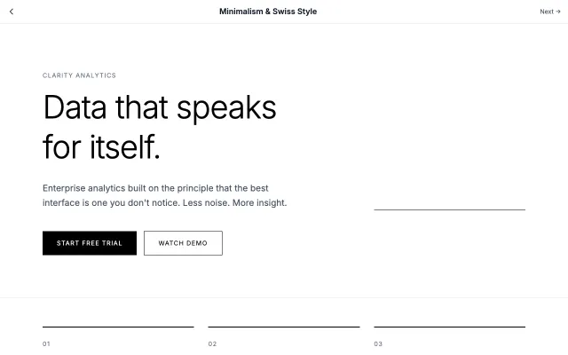
Minimalism & Swiss Style
Rooted in the Swiss International Style of the 1950s, this approach emphasizes clarity, readability, and objectivity. Uses grid-based layouts, sans-serif typography, and generous white space to create functional, timeless designs.
Modern SaaS
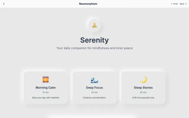
Neumorphism
A modern evolution of skeuomorphism that creates soft, extruded plastic-like interfaces. Uses subtle shadows and highlights to simulate depth while maintaining a minimal aesthetic.
Modern SaaS
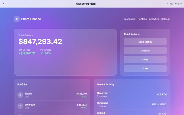
Glassmorphism
Inspired by frosted glass, this style creates depth through transparency and blur effects. Perfect for layered interfaces where content hierarchy is important.
Modern SaaS
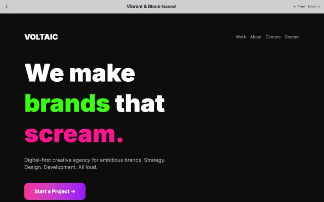
Vibrant & Block-based
High-energy design with bold color blocks, geometric shapes, and vibrant palettes. Creates excitement and draws attention through visual contrast.
Modern SaaS