Jamie Park
2 hours ago
Just discovered this amazing coffee shop! The vibes are immaculate ✨☕
🎉 Weekend Challenge!
Share 3 things that made you smile today
Creates tactile, touchable interfaces with squishy buttons, bounce physics, and material-like responses.
Live demo
Jamie Park
2 hours ago
Just discovered this amazing coffee shop! The vibes are immaculate ✨☕
🎉 Weekend Challenge!
Share 3 things that made you smile today
Creates tactile, touchable interfaces with squishy buttons, bounce physics, and material-like responses.
2025+ Tactile Era
Effects: Press deformation (scale + squish), bounce-back (cubic-bezier), material response
:root {
  --coral: #FF6B6B;
  --sunshine: #FFE66D;
  --sky: #87CEEB;
  --teal: #4ECDC4;
  --bubblegum: #FF9ECD;
  --ink: #1F2937;
  --muted: #4B5563;
  --spring: cubic-bezier(0.68, -0.55, 0.265, 1.55);
}

body {
  background: linear-gradient(180deg, #E8F4F8 0%, #FFF5F5 100%);
  color: var(--ink);
  font-family: system-ui, sans-serif;
}

.card {
  background: #FFFFFF;
  border-radius: 1.5rem;
  padding: 1.5rem;
  /* Inset bottom shadow gives the soft, pressable "clay" thickness */
  box-shadow: 0 10px 30px rgba(0, 0, 0, 0.1), inset 0 -4px 0 rgba(0, 0, 0, 0.05);
  transition: transform 0.15s var(--spring);
}

.card:active {
  transform: scale(0.97);
}

.button {
  border: 0;
  border-radius: 9999px;
  padding: 0.75rem 1.5rem;
  background: #FFFFFF;
  color: #C81E1E;
  font-weight: 600;
  box-shadow: 0 4px 12px rgba(255, 107, 107, 0.3), inset 0 -3px 0 rgba(0, 0, 0, 0.06);
  transition: transform 0.15s var(--spring);
}

.button:hover {
  animation: squish-bounce 0.5s var(--spring);
}

.button:active {
  transform: scale(0.95);
}

.button:focus-visible {
  outline: 3px solid var(--ink);
  outline-offset: 3px;
}

/* Jelly: glossy top sheen and a soft radial highlight over the candy gradient */
.button--primary {
  background:
    radial-gradient(ellipse 60% 45% at 35% 20%, rgba(255, 255, 255, 0.65), transparent 70%),
    linear-gradient(135deg, var(--coral), var(--sunshine));
  color: var(--ink);
  box-shadow: 0 6px 16px rgba(255, 107, 107, 0.4), inset 0 6px 8px rgba(255, 255, 255, 0.6), inset 0 -4px 0 rgba(0, 0, 0, 0.08);
}

@keyframes squish-bounce {
  0%, 100% { transform: scale(1, 1); }
  30% { transform: scale(1.1, 0.9); }
  60% { transform: scale(0.95, 1.05); }
}

@media (prefers-reduced-motion: reduce) {
  .button:hover {
    animation: none;
  }
}Paste this into Claude Code, Cursor, v0, Lovable or any coding agent to restyle a page in Tactile Digital / Deformable UI.
Apply the Tactile Digital / Deformable UI style to this interface.

What it is: Creates tactile, touchable interfaces with squishy buttons, bounce physics, and material-like responses.
Look and feel: Jelly buttons, Clay, Squishy, Deformable, Bouncy, Physical.
Colors: primary #FF6B6B, #FFE66D, #87CEEB; secondary #4ECDC4, #FF9ECD.
Effects and motion: Press deformation (scale + squish), bounce-back (cubic-bezier), material response.

Reference CSS (put these class names on the matching elements, or map them onto existing components and class names; avoid long structural selectors):
```css
:root {
  --coral: #FF6B6B;
  --sunshine: #FFE66D;
  --sky: #87CEEB;
  --teal: #4ECDC4;
  --bubblegum: #FF9ECD;
  --ink: #1F2937;
  --muted: #4B5563;
  --spring: cubic-bezier(0.68, -0.55, 0.265, 1.55);
}

body {
  background: linear-gradient(180deg, #E8F4F8 0%, #FFF5F5 100%);
  color: var(--ink);
  font-family: system-ui, sans-serif;
}

.card {
  background: #FFFFFF;
  border-radius: 1.5rem;
  padding: 1.5rem;
  /* Inset bottom shadow gives the soft, pressable "clay" thickness */
  box-shadow: 0 10px 30px rgba(0, 0, 0, 0.1), inset 0 -4px 0 rgba(0, 0, 0, 0.05);
  transition: transform 0.15s var(--spring);
}

.card:active {
  transform: scale(0.97);
}

.button {
  border: 0;
  border-radius: 9999px;
  padding: 0.75rem 1.5rem;
  background: #FFFFFF;
  color: #C81E1E;
  font-weight: 600;
  box-shadow: 0 4px 12px rgba(255, 107, 107, 0.3), inset 0 -3px 0 rgba(0, 0, 0, 0.06);
  transition: transform 0.15s var(--spring);
}

.button:hover {
  animation: squish-bounce 0.5s var(--spring);
}

.button:active {
  transform: scale(0.95);
}

.button:focus-visible {
  outline: 3px solid var(--ink);
  outline-offset: 3px;
}

/* Jelly: glossy top sheen and a soft radial highlight over the candy gradient */
.button--primary {
  background:
    radial-gradient(ellipse 60% 45% at 35% 20%, rgba(255, 255, 255, 0.65), transparent 70%),
    linear-gradient(135deg, var(--coral), var(--sunshine));
  color: var(--ink);
  box-shadow: 0 6px 16px rgba(255, 107, 107, 0.4), inset 0 6px 8px rgba(255, 255, 255, 0.6), inset 0 -4px 0 rgba(0, 0, 0, 0.08);
}

@keyframes squish-bounce {
  0%, 100% { transform: scale(1, 1); }
  30% { transform: scale(1.1, 0.9); }
  60% { transform: scale(0.95, 1.05); }
}

@media (prefers-reduced-motion: reduce) {
  .button:hover {
    animation: none;
  }
}
```

Works best for: Modern mobile apps, Playful brands, Entertainment, Gaming UI, Consumer products.
Avoid it for: Enterprise software, Data dashboards, Accessibility-critical, Professional tools. If this product falls into one of those, say so before restyling.

Change the visual design only: keep the existing layout, content and behaviour.
Meet WCAG AA contrast: where a palette color is too light or bright for text, keep it for backgrounds, borders and large display type and use a darker text color, rather than darkening the whole design. Keep visible focus states, give icon-only controls an accessible name (aria-label) and respect prefers-reduced-motion.Rolling AI coding agents out across a team? Farad Labs runs hands-on AI training.
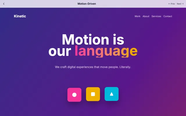
Design where animation is the primary mode of communication. Every interaction has purposeful motion that guides users through the experience.
Motion & Interactive
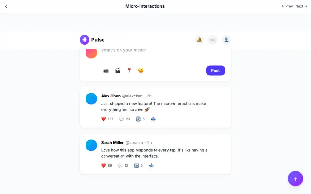
Focuses on small, delightful animations that provide feedback and guide users. Every tap, swipe, and hover has a response.
Motion & Interactive
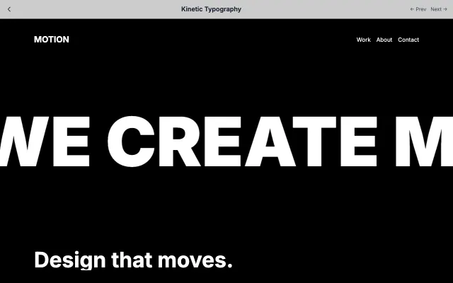
Uses animated typography as the primary visual element. Text moves, morphs, and transforms to tell stories.
Motion & Interactive

Uses scroll as a narrative device with parallax layers and progressive content reveal. Creates cinematic web experiences.
Motion & Interactive