⚠️
Service Alert
Blue Line: Minor delays (5-10 min) due to signal work. Audio announcements available.
Plan Your Trip
Goes beyond basic accessibility to create truly universal experiences. Considers all users including those with disabilities, elderly, and those in challenging environments.
Live demo
Blue Line: Minor delays (5-10 min) due to signal work. Audio announcements available.
Goes beyond basic accessibility to create truly universal experiences. Considers all users including those with disabilities, elderly, and those in challenging environments.
Universal
Effects: Thick high-contrast focus rings (3-4px), large text and 48px+ touch targets, labels and icons alongside color, reduced-motion options
:root {
  --inc-navy: #1E3A8A;
  --inc-green: #166534;
  --inc-red: #DC2626;
  --inc-amber: #F59E0B;
  --inc-text: #111827;
  --inc-muted: #374151;
  --inc-border: #6B7280;
}

body {
  background: #FFFFFF;
  color: var(--inc-text);
  font-family: "Atkinson Hyperlegible", system-ui, sans-serif;
  font-size: 1.125rem;
  line-height: 1.6;
}

a {
  color: var(--inc-navy);
  text-decoration: underline;
  text-underline-offset: 0.2em;
}

.field {
  width: 100%;
  min-height: 3.5rem;
  padding: 1rem;
  border: 2px solid var(--inc-border);
  border-radius: 8px;
  font-size: 1.125rem;
}

.button {
  min-height: 3.5rem;
  padding: 1rem 1.5rem;
  border: 2px solid transparent;
  border-radius: 8px;
  background: var(--inc-navy);
  color: #FFFFFF;
  font-size: 1.25rem;
  font-weight: 700;
}

.button:hover {
  background: #172554;
  text-decoration: underline;
}

/* Thick, high-contrast focus ring on every interactive element */
a:focus-visible,
.field:focus-visible,
.button:focus-visible,
input[type="checkbox"]:focus-visible {
  outline: 4px solid var(--inc-navy);
  outline-offset: 3px;
}

input[type="checkbox"] {
  width: 1.5rem;
  height: 1.5rem;
  accent-color: var(--inc-navy);
}

.alert {
  padding: 1rem;
  border-left: 6px solid var(--inc-amber);
  border-radius: 0 8px 8px 0;
  background: #FEF3C7;
  color: var(--inc-text);
}

.error-message {
  color: var(--inc-red);
  font-weight: 600;
}

/* Group related checkboxes or radios in a <fieldset> with a <legend> */
fieldset {
  padding: 1rem 1.5rem;
  border: 2px solid var(--inc-border);
  border-radius: 8px;
}

legend {
  padding: 0 0.5rem;
  font-weight: 700;
}

/* Wrap nav links on small screens; only add a menu toggle if you also script it */
.nav {
  display: flex;
  flex-wrap: wrap;
  gap: 0.5rem 1.5rem;
}

@media (prefers-reduced-motion: reduce) {
  *,
  *::before,
  *::after {
    animation-duration: 0.01ms !important;
    transition-duration: 0.01ms !important;
    scroll-behavior: auto !important;
  }
}Paste this into Claude Code, Cursor, v0, Lovable or any coding agent to restyle a page in Inclusive Design.
Apply the Inclusive Design style to this interface.

What it is: Goes beyond basic accessibility to create truly universal experiences. Considers all users including those with disabilities, elderly, and those in challenging environments.
Look and feel: Accessible, Color-blind friendly, High contrast, Large touch targets, Universal.
Colors: primary #1E3A8A, #166534; secondary #DC2626, #F59E0B.
Effects and motion: Thick high-contrast focus rings (3-4px), large text and 48px+ touch targets, labels and icons alongside color, reduced-motion options.

Reference CSS (put these class names on the matching elements, or map them onto existing components and class names; avoid long structural selectors):
```css
:root {
  --inc-navy: #1E3A8A;
  --inc-green: #166534;
  --inc-red: #DC2626;
  --inc-amber: #F59E0B;
  --inc-text: #111827;
  --inc-muted: #374151;
  --inc-border: #6B7280;
}

body {
  background: #FFFFFF;
  color: var(--inc-text);
  font-family: "Atkinson Hyperlegible", system-ui, sans-serif;
  font-size: 1.125rem;
  line-height: 1.6;
}

a {
  color: var(--inc-navy);
  text-decoration: underline;
  text-underline-offset: 0.2em;
}

.field {
  width: 100%;
  min-height: 3.5rem;
  padding: 1rem;
  border: 2px solid var(--inc-border);
  border-radius: 8px;
  font-size: 1.125rem;
}

.button {
  min-height: 3.5rem;
  padding: 1rem 1.5rem;
  border: 2px solid transparent;
  border-radius: 8px;
  background: var(--inc-navy);
  color: #FFFFFF;
  font-size: 1.25rem;
  font-weight: 700;
}

.button:hover {
  background: #172554;
  text-decoration: underline;
}

/* Thick, high-contrast focus ring on every interactive element */
a:focus-visible,
.field:focus-visible,
.button:focus-visible,
input[type="checkbox"]:focus-visible {
  outline: 4px solid var(--inc-navy);
  outline-offset: 3px;
}

input[type="checkbox"] {
  width: 1.5rem;
  height: 1.5rem;
  accent-color: var(--inc-navy);
}

.alert {
  padding: 1rem;
  border-left: 6px solid var(--inc-amber);
  border-radius: 0 8px 8px 0;
  background: #FEF3C7;
  color: var(--inc-text);
}

.error-message {
  color: var(--inc-red);
  font-weight: 600;
}

/* Group related checkboxes or radios in a <fieldset> with a <legend> */
fieldset {
  padding: 1rem 1.5rem;
  border: 2px solid var(--inc-border);
  border-radius: 8px;
}

legend {
  padding: 0 0.5rem;
  font-weight: 700;
}

/* Wrap nav links on small screens; only add a menu toggle if you also script it */
.nav {
  display: flex;
  flex-wrap: wrap;
  gap: 0.5rem 1.5rem;
}

@media (prefers-reduced-motion: reduce) {
  *,
  *::before,
  *::after {
    animation-duration: 0.01ms !important;
    transition-duration: 0.01ms !important;
    scroll-behavior: auto !important;
  }
}
```

Works best for: Public services, Education, Healthcare, Finance, Government.

Change the visual design only: keep the existing layout, content and behaviour.
Meet WCAG AA contrast: where a palette color is too light or bright for text, keep it for backgrounds, borders and large display type and use a darker text color, rather than darkening the whole design. Keep visible focus states, give icon-only controls an accessible name (aria-label) and respect prefers-reduced-motion.Rolling AI coding agents out across a team? Farad Labs runs hands-on AI training.
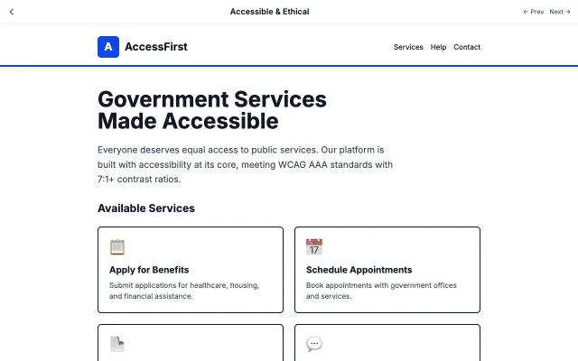
Prioritizes accessibility and ethical considerations above all else. Ensures everyone can use the interface regardless of ability or device.
Accessibility & Ethical
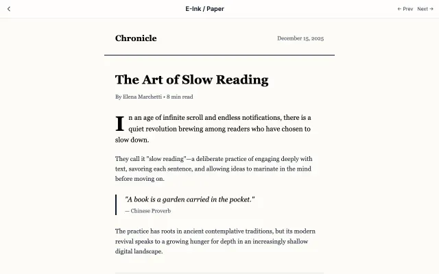
Mimics the experience of reading on paper or e-ink displays. High contrast, no animations, and distraction-free.
Accessibility & Ethical
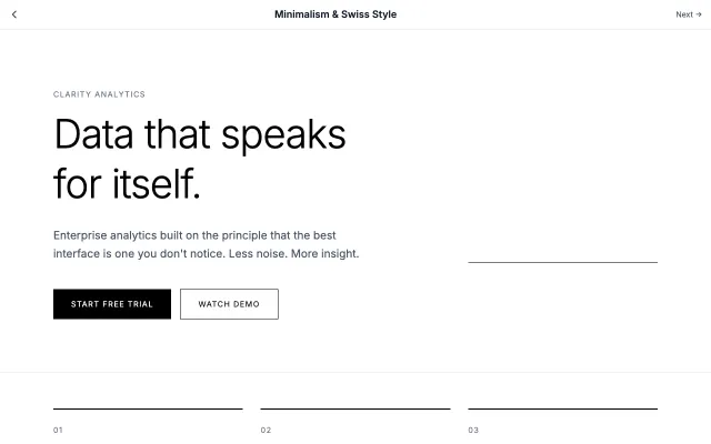
Rooted in the Swiss International Style of the 1950s, this approach emphasizes clarity, readability, and objectivity. Uses grid-based layouts, sans-serif typography, and generous white space to create functional, timeless designs.
Modern SaaS
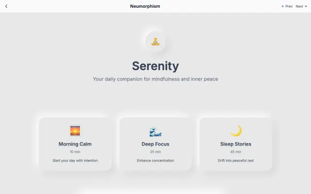
A modern evolution of skeuomorphism that creates soft, extruded plastic-like interfaces. Uses subtle shadows and highlights to simulate depth while maintaining a minimal aesthetic.
Modern SaaS