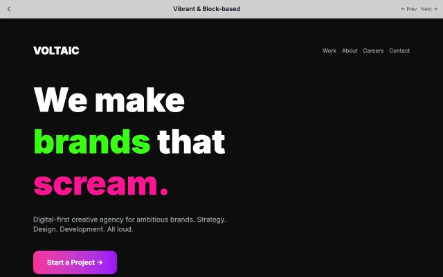
Soft UI Evolution

The next evolution of neumorphism with improved accessibility and contrast. Maintains the soft aesthetic while meeting WCAG standards.

Palette & CSS ↓

Live demo

💚
Vitality
Good morning, Sarah!

Here's your health summary for today

🏃

8,423

Steps

🔥

420

Calories

💧

6/8

Glasses

😴

7h 42m

Sleep

75%Daily Goal

Great progress!

You're 75% toward your daily health goal. Keep it up!

Today's Activities

🚶

Morning Walk

7:00 AM

30 min
🧘

Yoga Session

8:00 AM

45 min
🍳

Healthy Breakfast

9:00 AM

350 cal

About Soft UI Evolution

The next evolution of neumorphism with improved accessibility and contrast. Maintains the soft aesthetic while meeting WCAG standards.

Era / origin

2020s Modern

Key characteristics

  • Evolved soft UI
  • Better contrast
  • Modern aesthetics
  • Subtle depth
  • Accessibility-focused

When to use Soft UI Evolution

  • Modern enterprise apps
  • SaaS platforms
  • Health/wellness
  • Modern business tools

When to avoid it

  • Extreme minimalism
  • Critical performance
  • Bold, high-energy brands

Common industries

  • SaaS
  • Healthcare
  • Corporate & B2B
  • Fitness & Wellness

Soft UI Evolution color palette

  • #F0F4F8
  • #D1D9E6
  • #FFFFFF
  • #2563EB
  • #22C55E
  • #EA580C

How to build Soft UI Evolution in CSS

Effects: Soft dual shadows (white top-left, cool grey bottom-right), inset wells for grouped content, 200-300ms transitions, visible focus rings, WCAG AA contrast

CSS · 79 lines
:root {
  --soft-bg: #F0F4F8;
  --soft-shadow: #D1D9E6;
  --soft-light: #FFFFFF;
  --soft-blue: #2563EB;
  --soft-green: #22C55E;  /* icons, rings, progress fills only */
  --soft-orange: #EA580C; /* icons, rings, progress fills only */
  --soft-green-text: #15803D;
  --soft-orange-text: #C2410C;
  --soft-text: #1F2937;
  --soft-muted: #4B5563;
}

body {
  background: var(--soft-bg);
  color: var(--soft-text);
}

.surface {
  padding: 1.5rem;
  border-radius: 1rem;
  background: var(--soft-bg);
  box-shadow: -6px -6px 15px var(--soft-light), 6px 6px 15px var(--soft-shadow);
}

/* Pressed-in well for grouped or secondary content; nest at most one level (surface > well) */
.well {
  padding: 1.5rem;
  border-radius: 1rem;
  background: var(--soft-bg);
  box-shadow: inset -4px -4px 10px var(--soft-light), inset 4px 4px 10px var(--soft-shadow);
}

.muted {
  color: var(--soft-muted);
}

/* Coloured metrics: bright accent for the ring or bar, darker shade for the number */
.stat--up { color: var(--soft-green-text); }
.stat--warn { color: var(--soft-orange-text); }

.meter {
  height: 0.5rem;
  border-radius: 9999px;
  background: linear-gradient(90deg, var(--soft-green) var(--value, 60%), transparent 0);
  box-shadow: inset 2px 2px 4px var(--soft-shadow), inset -2px -2px 4px var(--soft-light);
}

.button {
  padding: 0.75rem 1.5rem;
  border: 1px solid rgba(209, 217, 230, 0.6);
  border-radius: 12px;
  background: var(--soft-bg);
  color: var(--soft-blue);
  font-weight: 600;
  box-shadow: -4px -4px 10px var(--soft-light), 4px 4px 10px var(--soft-shadow);
  transition: box-shadow 250ms ease, transform 250ms ease;
}

.button:hover {
  box-shadow: -6px -6px 14px var(--soft-light), 6px 6px 14px var(--soft-shadow);
  transform: translateY(-1px);
}

.button:active {
  box-shadow: inset -3px -3px 8px var(--soft-light), inset 3px 3px 8px var(--soft-shadow);
  transform: none;
}

.button:focus-visible {
  outline: 3px solid var(--soft-blue);
  outline-offset: 3px;
}

@media (prefers-reduced-motion: reduce) {
  .button {
    transition: none;
  }
}

Use Soft UI Evolution with an AI coding agent

Paste this into Claude Code, Cursor, v0, Lovable or any coding agent to restyle a page in Soft UI Evolution.

AI prompt · 95 lines
Apply the Soft UI Evolution style to this interface.

What it is: The next evolution of neumorphism with improved accessibility and contrast. Maintains the soft aesthetic while meeting WCAG standards.
Look and feel: Evolved soft UI, Better contrast, Modern aesthetics, Subtle depth, Accessibility-focused.
Colors: primary #F0F4F8, #D1D9E6, #FFFFFF; secondary #2563EB, #22C55E, #EA580C.
Effects and motion: Soft dual shadows (white top-left, cool grey bottom-right), inset wells for grouped content, 200-300ms transitions, visible focus rings, WCAG AA contrast.

Reference CSS (put these class names on the matching elements, or map them onto existing components and class names; avoid long structural selectors):
```css
:root {
  --soft-bg: #F0F4F8;
  --soft-shadow: #D1D9E6;
  --soft-light: #FFFFFF;
  --soft-blue: #2563EB;
  --soft-green: #22C55E;  /* icons, rings, progress fills only */
  --soft-orange: #EA580C; /* icons, rings, progress fills only */
  --soft-green-text: #15803D;
  --soft-orange-text: #C2410C;
  --soft-text: #1F2937;
  --soft-muted: #4B5563;
}

body {
  background: var(--soft-bg);
  color: var(--soft-text);
}

.surface {
  padding: 1.5rem;
  border-radius: 1rem;
  background: var(--soft-bg);
  box-shadow: -6px -6px 15px var(--soft-light), 6px 6px 15px var(--soft-shadow);
}

/* Pressed-in well for grouped or secondary content; nest at most one level (surface > well) */
.well {
  padding: 1.5rem;
  border-radius: 1rem;
  background: var(--soft-bg);
  box-shadow: inset -4px -4px 10px var(--soft-light), inset 4px 4px 10px var(--soft-shadow);
}

.muted {
  color: var(--soft-muted);
}

/* Coloured metrics: bright accent for the ring or bar, darker shade for the number */
.stat--up { color: var(--soft-green-text); }
.stat--warn { color: var(--soft-orange-text); }

.meter {
  height: 0.5rem;
  border-radius: 9999px;
  background: linear-gradient(90deg, var(--soft-green) var(--value, 60%), transparent 0);
  box-shadow: inset 2px 2px 4px var(--soft-shadow), inset -2px -2px 4px var(--soft-light);
}

.button {
  padding: 0.75rem 1.5rem;
  border: 1px solid rgba(209, 217, 230, 0.6);
  border-radius: 12px;
  background: var(--soft-bg);
  color: var(--soft-blue);
  font-weight: 600;
  box-shadow: -4px -4px 10px var(--soft-light), 4px 4px 10px var(--soft-shadow);
  transition: box-shadow 250ms ease, transform 250ms ease;
}

.button:hover {
  box-shadow: -6px -6px 14px var(--soft-light), 6px 6px 14px var(--soft-shadow);
  transform: translateY(-1px);
}

.button:active {
  box-shadow: inset -3px -3px 8px var(--soft-light), inset 3px 3px 8px var(--soft-shadow);
  transform: none;
}

.button:focus-visible {
  outline: 3px solid var(--soft-blue);
  outline-offset: 3px;
}

@media (prefers-reduced-motion: reduce) {
  .button {
    transition: none;
  }
}
```

Works best for: Modern enterprise apps, SaaS platforms, Health/wellness, Modern business tools.
Avoid it for: Extreme minimalism, Critical performance, Bold, high-energy brands. If this product falls into one of those, say so before restyling.

Change the visual design only: keep the existing layout, content and behaviour.
Meet WCAG AA contrast: where a palette color is too light or bright for text, keep it for backgrounds, borders and large display type and use a darker text color, rather than darkening the whole design. Keep visible focus states, give icon-only controls an accessible name (aria-label) and respect prefers-reduced-motion.
Rolling AI coding agents out across a team? Farad Labs runs hands-on AI training.