Flat Design
Emerged in the early 2010s as a reaction to skeuomorphism. Uses simple 2D elements, bold colors, and no shadows or gradients.
Live demo
Simply.
The task manager that gets out of your way. No fancy features, just what you need to stay organized.
Everything you need, nothing you don't
Simple Lists
Create lists for projects, personal tasks, or daily routines.
Smart Reminders
Get notified at the right time, in the right place.
Team Sync
Share lists with your team and collaborate in real-time.
Works Everywhere
iOS, Android, Web, and desktop apps that stay in sync.
Recurring Tasks
Set it and forget it. Tasks repeat automatically.
Progress Tracking
See how much you have accomplished at a glance.
Today's Tasks
3 of 5 completedReady to get organized?
Join 2 million people who use Taskr every day.
About Flat Design
Emerged in the early 2010s as a reaction to skeuomorphism. Uses simple 2D elements, bold colors, and no shadows or gradients.
Era / origin
2010s Modern
Key characteristics
- 2D
- Minimalist
- Bold colors
- No shadows
- Clean lines
- Icon-heavy
When to use Flat Design
- Web apps
- Mobile apps
- Cross-platform
- Startup MVPs
- SaaS
- Dashboards
When to avoid it
- Complex 3D
- Premium/luxury
- Artistic portfolios
- Immersive experiences
Common industries
- SaaS
- E-commerce
- Corporate & B2B
- Startup & Tech
Flat Design color palette
- #FF5722
- #2196F3
- #4CAF50
- #FFC107
- #9C27B0
- #00BCD4
How to build Flat Design in CSS
Effects: No gradients/shadows, simple hover (color/opacity shift), fast loading
:root {
  /* Bright palette: icon tiles, fills and accents (pair with dark text) */
  --flat-orange: #FF5722;
  --flat-blue: #2196F3;
  --flat-green: #4CAF50;
  --flat-amber: #FFC107;
  --flat-purple: #9C27B0;
  --flat-cyan: #00BCD4;
  /* -dark variants: surfaces behind white text */
  --flat-orange-dark: #BF360C;
  --flat-blue-dark: #1976D2;
  --flat-green-dark: #2E7D32;
  --flat-cyan-dark: #00838F;
  --flat-bg: #F3F4F6;
  --flat-surface: #FFFFFF;
  --flat-border: #E5E7EB;
  --flat-text: #1F2937;
  --flat-muted: #4B5563;
}

body {
  background: var(--flat-bg);
  color: var(--flat-text);
  font-family: Roboto, "Helvetica Neue", Arial, sans-serif;
}

h1,
h2,
h3 {
  font-weight: 700;
  color: var(--flat-text);
}

.card {
  padding: 1.5rem;
  background: var(--flat-surface);
  border: 1px solid var(--flat-border);
  border-radius: 8px;
  box-shadow: none;
}

/* Single-colour glyphs or currentColor SVG on solid tiles */
.icon-tile {
  display: grid;
  place-items: center;
  width: 3rem;
  height: 3rem;
  border-radius: 8px;
  background: var(--flat-blue);
  color: #FFFFFF;
}

/* Existing emoji icons: wrap them and flatten to a white silhouette */
.icon-tile .emoji {
  filter: grayscale(1) brightness(10);
}

.button {
  padding: 1rem 2rem;
  border: none;
  border-radius: 6px;
  background: var(--flat-blue-dark);
  color: #FFFFFF;
  font-weight: 500;
  box-shadow: none;
  transition: background-color 150ms ease;
}

.button:hover {
  background: #1565C0;
}

.button:active {
  background: #0D47A1;
}

.button:focus-visible {
  outline: 3px solid var(--flat-text);
  outline-offset: 2px;
}

.button-secondary {
  background: var(--flat-border);
  color: var(--flat-text);
}

.button-secondary:hover {
  background: #D1D5DB;
}

@media (prefers-reduced-motion: reduce) {
  .button {
    transition: none;
  }
}Use Flat Design with an AI coding agent
Paste this into Claude Code, Cursor, v0, Lovable or any coding agent to restyle a page in Flat Design.
Apply the Flat Design style to this interface.

What it is: Emerged in the early 2010s as a reaction to skeuomorphism. Uses simple 2D elements, bold colors, and no shadows or gradients.
Look and feel: 2D, Minimalist, Bold colors, No shadows, Clean lines, Icon-heavy.
Colors: primary #FF5722, #2196F3, #4CAF50, #FFC107; secondary #9C27B0, #00BCD4.
Effects and motion: No gradients/shadows, simple hover (color/opacity shift), fast loading.

Reference CSS (put these class names on the matching elements, or map them onto existing components and class names; avoid long structural selectors):
```css
:root {
  /* Bright palette: icon tiles, fills and accents (pair with dark text) */
  --flat-orange: #FF5722;
  --flat-blue: #2196F3;
  --flat-green: #4CAF50;
  --flat-amber: #FFC107;
  --flat-purple: #9C27B0;
  --flat-cyan: #00BCD4;
  /* -dark variants: surfaces behind white text */
  --flat-orange-dark: #BF360C;
  --flat-blue-dark: #1976D2;
  --flat-green-dark: #2E7D32;
  --flat-cyan-dark: #00838F;
  --flat-bg: #F3F4F6;
  --flat-surface: #FFFFFF;
  --flat-border: #E5E7EB;
  --flat-text: #1F2937;
  --flat-muted: #4B5563;
}

body {
  background: var(--flat-bg);
  color: var(--flat-text);
  font-family: Roboto, "Helvetica Neue", Arial, sans-serif;
}

h1,
h2,
h3 {
  font-weight: 700;
  color: var(--flat-text);
}

.card {
  padding: 1.5rem;
  background: var(--flat-surface);
  border: 1px solid var(--flat-border);
  border-radius: 8px;
  box-shadow: none;
}

/* Single-colour glyphs or currentColor SVG on solid tiles */
.icon-tile {
  display: grid;
  place-items: center;
  width: 3rem;
  height: 3rem;
  border-radius: 8px;
  background: var(--flat-blue);
  color: #FFFFFF;
}

/* Existing emoji icons: wrap them and flatten to a white silhouette */
.icon-tile .emoji {
  filter: grayscale(1) brightness(10);
}

.button {
  padding: 1rem 2rem;
  border: none;
  border-radius: 6px;
  background: var(--flat-blue-dark);
  color: #FFFFFF;
  font-weight: 500;
  box-shadow: none;
  transition: background-color 150ms ease;
}

.button:hover {
  background: #1565C0;
}

.button:active {
  background: #0D47A1;
}

.button:focus-visible {
  outline: 3px solid var(--flat-text);
  outline-offset: 2px;
}

.button-secondary {
  background: var(--flat-border);
  color: var(--flat-text);
}

.button-secondary:hover {
  background: #D1D5DB;
}

@media (prefers-reduced-motion: reduce) {
  .button {
    transition: none;
  }
}
```

Works best for: Web apps, Mobile apps, Cross-platform, Startup MVPs, SaaS, Dashboards.
Avoid it for: Complex 3D, Premium/luxury, Artistic portfolios, Immersive experiences. If this product falls into one of those, say so before restyling.

Change the visual design only: keep the existing layout, content and behaviour.
Meet WCAG AA contrast: where a palette color is too light or bright for text, keep it for backgrounds, borders and large display type and use a darker text color, rather than darkening the whole design. Keep visible focus states, give icon-only controls an accessible name (aria-label) and respect prefers-reduced-motion.Rolling AI coding agents out across a team? Farad Labs runs hands-on AI training.
Styles like Flat Design
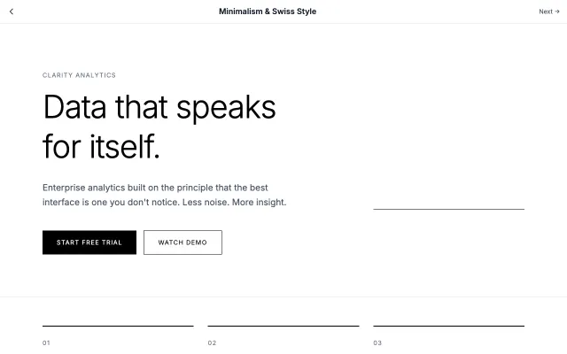
Minimalism & Swiss Style
Rooted in the Swiss International Style of the 1950s, this approach emphasizes clarity, readability, and objectivity. Uses grid-based layouts, sans-serif typography, and generous white space to create functional, timeless designs.
Modern SaaS
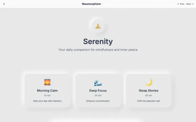
Neumorphism
A modern evolution of skeuomorphism that creates soft, extruded plastic-like interfaces. Uses subtle shadows and highlights to simulate depth while maintaining a minimal aesthetic.
Modern SaaS
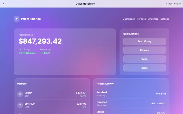
Glassmorphism
Inspired by frosted glass, this style creates depth through transparency and blur effects. Perfect for layered interfaces where content hierarchy is important.
Modern SaaS
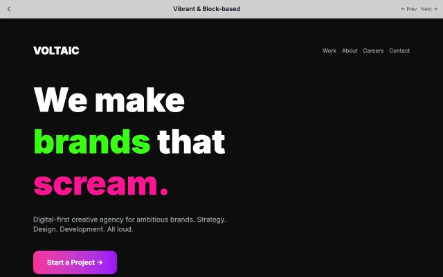
Vibrant & Block-based
High-energy design with bold color blocks, geometric shapes, and vibrant palettes. Creates excitement and draws attention through visual contrast.
Modern SaaS