Product Launch Q4
Marketing Campaign • 12 tasks remaining
To Do
Task 1
Due in 1 days
Design
Task 2
Due in 2 days
Design
In Progress
Task 3
Due in 2 days
Design
Task 4
Due in 3 days
Design
Done
Task 5
Due in 3 days
Design
Task 6
Due in 4 days
Design
Creates visual hierarchy through overlapping elements and elevation shadows. Gives interfaces a 3D paper-stack feel.
Live demo
Marketing Campaign • 12 tasks remaining
Due in 1 days
Due in 2 days
Due in 2 days
Due in 3 days
Due in 3 days
Due in 4 days
Creates visual hierarchy through overlapping elements and elevation shadows. Gives interfaces a 3D paper-stack feel.
2020s Modern
Effects: Offset backing sheets behind cards, a four-step shadow elevation scale, z-index stacking, cards lifting on hover
:root {
  --layer-surface: #FFFFFF;
  --layer-canvas: #F5F5F5;
  --layer-edge: #E0E0E0;
  --layer-indigo: #6366F1;
  --layer-blue: #3B82F6;
  --elevation-1: 0 1px 2px rgba(0, 0, 0, 0.05);
  --elevation-2: 0 4px 6px -1px rgba(0, 0, 0, 0.1), 0 2px 4px -2px rgba(0, 0, 0, 0.1);
  --elevation-3: 0 10px 15px -3px rgba(0, 0, 0, 0.1), 0 4px 6px -4px rgba(0, 0, 0, 0.1);
  --elevation-4: 0 20px 25px -5px rgba(0, 0, 0, 0.1), 0 8px 10px -6px rgba(0, 0, 0, 0.1);
}

body {
  background: var(--layer-canvas);
  color: #111827;
}

/* Hard offset shadows draw the two sheets peeking out behind the main surface */
.stack {
  padding: 2rem;
  border-radius: 24px;
  background: var(--layer-surface);
  box-shadow: -8px -8px 0 #E0E7FF, -16px -16px 0 #C7D2FE, var(--elevation-4);
}

.card {
  position: relative;
  padding: 1rem;
  border: 1px solid var(--layer-edge);
  border-radius: 12px;
  background: var(--layer-surface);
  box-shadow: 4px 4px 0 var(--layer-edge), var(--elevation-1);
  transition: box-shadow 150ms ease, transform 150ms ease;
}

.card:hover {
  transform: translateY(-2px);
  box-shadow: 4px 4px 0 var(--layer-edge), var(--elevation-3);
}

/* Focus ring on whatever is interactive: links, buttons, focusable cards */
:is(a, button, .button, [tabindex]):focus-visible {
  outline: 3px solid var(--layer-indigo);
  outline-offset: 3px;
}

.button {
  padding: 0.75rem 1.25rem;
  border: 0;
  border-radius: 12px;
  background: #4F46E5;
  color: #FFFFFF;
  font-weight: 600;
  box-shadow: var(--elevation-3);
}

@media (prefers-reduced-motion: reduce) {
  .card {
    transition: none;
  }

  .card:hover {
    transform: none;
  }
}Paste this into Claude Code, Cursor, v0, Lovable or any coding agent to restyle a page in Dimensional Layering.
Apply the Dimensional Layering style to this interface.

What it is: Creates visual hierarchy through overlapping elements and elevation shadows. Gives interfaces a 3D paper-stack feel.
Look and feel: Depth, Overlapping, Z-index, Layers, 3D, Shadows, Elevation, Floating.
Colors: primary #FFFFFF, #F5F5F5, #E0E0E0; secondary #6366F1, #3B82F6.
Effects and motion: Offset backing sheets behind cards, a four-step shadow elevation scale, z-index stacking, cards lifting on hover.

Reference CSS (put these class names on the matching elements, or map them onto existing components and class names; avoid long structural selectors):
```css
:root {
  --layer-surface: #FFFFFF;
  --layer-canvas: #F5F5F5;
  --layer-edge: #E0E0E0;
  --layer-indigo: #6366F1;
  --layer-blue: #3B82F6;
  --elevation-1: 0 1px 2px rgba(0, 0, 0, 0.05);
  --elevation-2: 0 4px 6px -1px rgba(0, 0, 0, 0.1), 0 2px 4px -2px rgba(0, 0, 0, 0.1);
  --elevation-3: 0 10px 15px -3px rgba(0, 0, 0, 0.1), 0 4px 6px -4px rgba(0, 0, 0, 0.1);
  --elevation-4: 0 20px 25px -5px rgba(0, 0, 0, 0.1), 0 8px 10px -6px rgba(0, 0, 0, 0.1);
}

body {
  background: var(--layer-canvas);
  color: #111827;
}

/* Hard offset shadows draw the two sheets peeking out behind the main surface */
.stack {
  padding: 2rem;
  border-radius: 24px;
  background: var(--layer-surface);
  box-shadow: -8px -8px 0 #E0E7FF, -16px -16px 0 #C7D2FE, var(--elevation-4);
}

.card {
  position: relative;
  padding: 1rem;
  border: 1px solid var(--layer-edge);
  border-radius: 12px;
  background: var(--layer-surface);
  box-shadow: 4px 4px 0 var(--layer-edge), var(--elevation-1);
  transition: box-shadow 150ms ease, transform 150ms ease;
}

.card:hover {
  transform: translateY(-2px);
  box-shadow: 4px 4px 0 var(--layer-edge), var(--elevation-3);
}

/* Focus ring on whatever is interactive: links, buttons, focusable cards */
:is(a, button, .button, [tabindex]):focus-visible {
  outline: 3px solid var(--layer-indigo);
  outline-offset: 3px;
}

.button {
  padding: 0.75rem 1.25rem;
  border: 0;
  border-radius: 12px;
  background: #4F46E5;
  color: #FFFFFF;
  font-weight: 600;
  box-shadow: var(--elevation-3);
}

@media (prefers-reduced-motion: reduce) {
  .card {
    transition: none;
  }

  .card:hover {
    transform: none;
  }
}
```

Works best for: Dashboards, Card layouts, Modals, Navigation, Product showcases, SaaS.
Avoid it for: Print-style layouts, Simple blogs, Low-end devices, Flat design requirements. If this product falls into one of those, say so before restyling.

Change the visual design only: keep the existing layout, content and behaviour.
Meet WCAG AA contrast: where a palette color is too light or bright for text, keep it for backgrounds, borders and large display type and use a darker text color, rather than darkening the whole design. Keep visible focus states, give icon-only controls an accessible name (aria-label) and respect prefers-reduced-motion.Rolling AI coding agents out across a team? Farad Labs runs hands-on AI training.
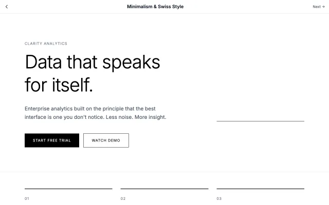
Rooted in the Swiss International Style of the 1950s, this approach emphasizes clarity, readability, and objectivity. Uses grid-based layouts, sans-serif typography, and generous white space to create functional, timeless designs.
Modern SaaS
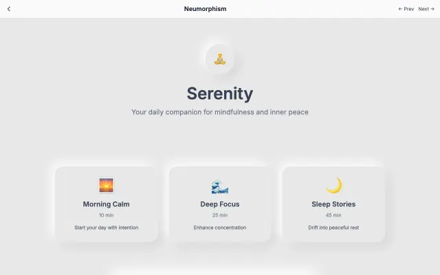
A modern evolution of skeuomorphism that creates soft, extruded plastic-like interfaces. Uses subtle shadows and highlights to simulate depth while maintaining a minimal aesthetic.
Modern SaaS
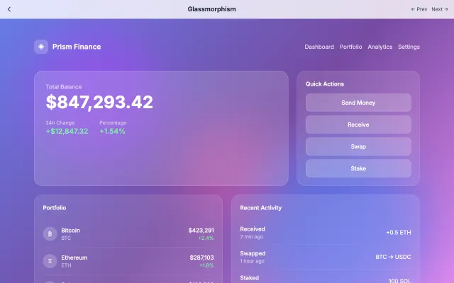
Inspired by frosted glass, this style creates depth through transparency and blur effects. Perfect for layered interfaces where content hierarchy is important.
Modern SaaS
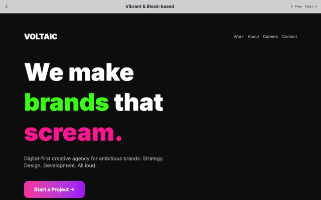
High-energy design with bold color blocks, geometric shapes, and vibrant palettes. Creates excitement and draws attention through visual contrast.
Modern SaaS