Aurora UI
Inspired by the Northern Lights, featuring flowing gradients and smooth color transitions. Creates a premium, modern feel with dynamic backgrounds.
Live demo
with you
100 million tracks. Personalized playlists. Lossless audio. Start your free trial today.
Featured Playlists
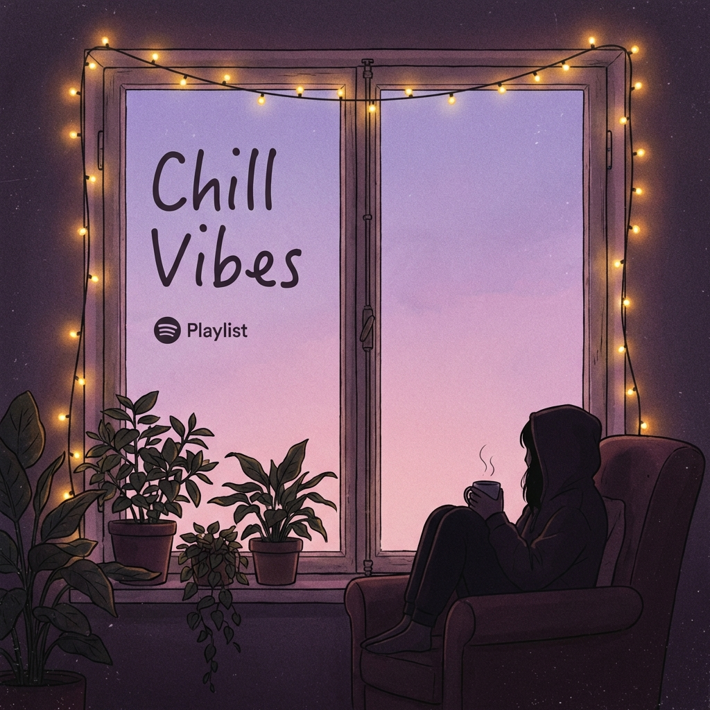
Chill Vibes
50 tracks

Focus Flow
40 tracks
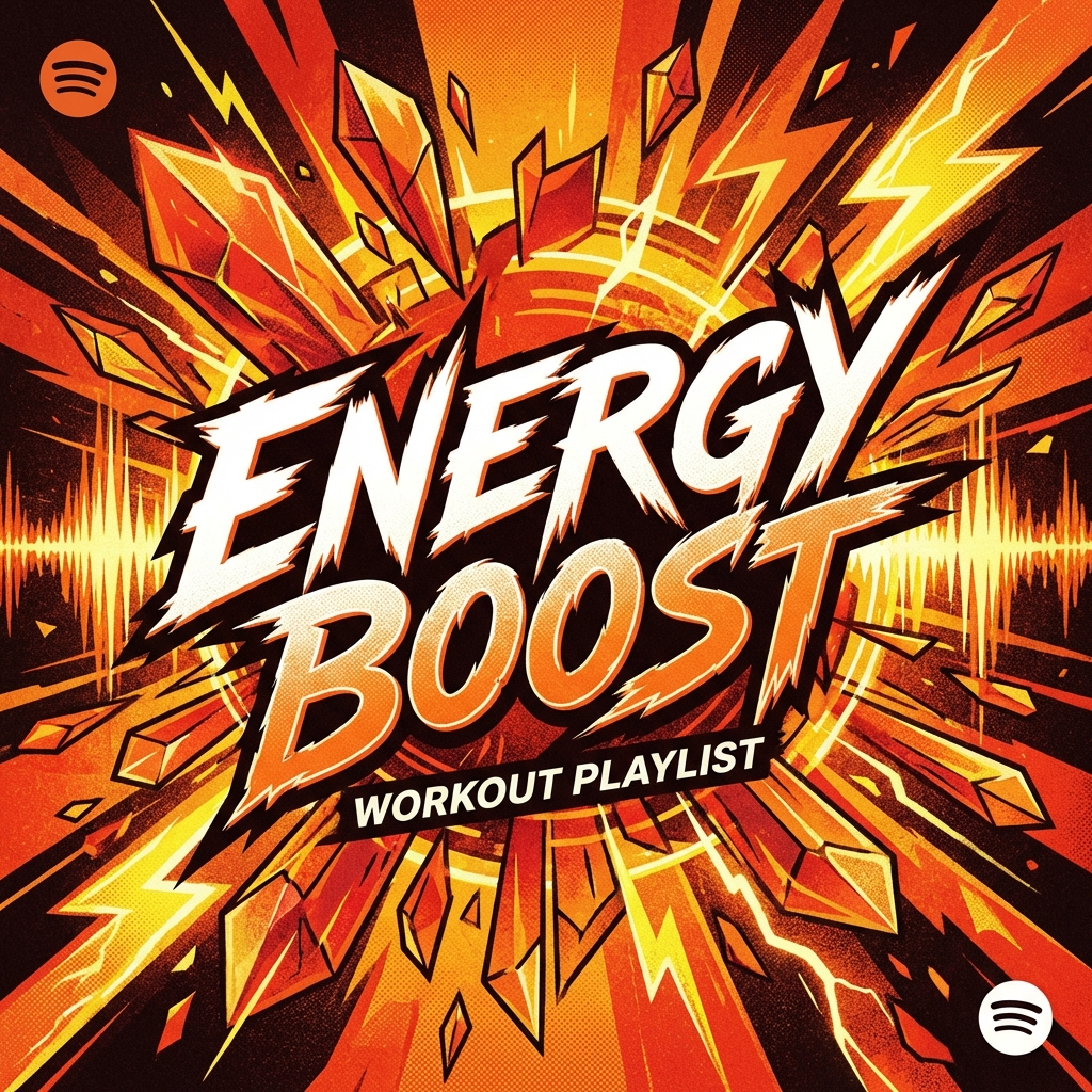
Energy Boost
35 tracks
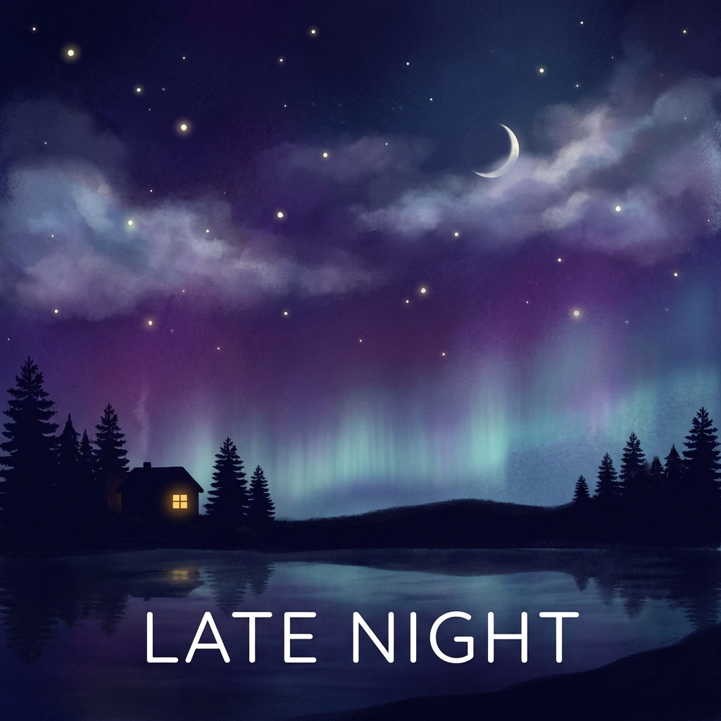
Late Night
45 tracks
Now Playing
Electric Dreams
Aurora Symphony
About Aurora UI
Inspired by the Northern Lights, featuring flowing gradients and smooth color transitions. Creates a premium, modern feel with dynamic backgrounds.
Era / origin
2020s Modern
Key characteristics
- Vibrant gradients
- Smooth blend
- Northern Lights effect
- Mesh gradient
- Luminous
When to use Aurora UI
- Modern SaaS
- Creative agencies
- Music platforms
- Premium products
- Hero sections
When to avoid it
- Data-heavy dashboards
- Critical accessibility
- Content-heavy sites
Common industries
- SaaS
- Entertainment & Media
- Creative & Portfolio
- Travel & Tourism
- Luxury & Premium
Aurora UI color palette
- #0080FF
- #FF1493
- #00FFFF
- #8B00FF
- #20B2AA
How to build Aurora UI in CSS
Effects: Large flowing CSS/SVG gradients, subtle 8-12s animations, depth via color layering
:root {
  --aurora-blue: #0080FF;
  --aurora-pink: #FF1493;
  --aurora-cyan: #00FFFF;
  --aurora-violet: #8B00FF;
  --aurora-teal: #20B2AA;
  --aurora-text-shadow: 0 1px 2px rgba(0, 0, 0, 0.35), 0 4px 16px rgba(0, 0, 0, 0.25);
}

/* Whole page glows: violet sky with bright cyan, pink and teal light; no dark scrims */
body {
  background:
    radial-gradient(40rem 30rem at 10% 0%, rgb(0 255 255 / 0.55), transparent 70%),
    radial-gradient(36rem 28rem at 90% 15%, rgb(255 20 147 / 0.6), transparent 70%),
    radial-gradient(44rem 32rem at 50% 100%, rgb(32 178 170 / 0.5), transparent 70%),
    linear-gradient(160deg, var(--aurora-violet), var(--aurora-blue));
  background-attachment: fixed;
  color: #FFFFFF;
  text-shadow: var(--aurora-text-shadow);
}

/* Oversized gradient drifts slowly to mimic the northern lights; full-bleed band */
.hero {
  position: relative;
  overflow: hidden;
  background: linear-gradient(-45deg, var(--aurora-blue), var(--aurora-violet), var(--aurora-pink), var(--aurora-cyan), var(--aurora-blue));
  background-size: 400% 400%;
  color: #FFFFFF;
  animation: aurora 12s ease infinite;
}

@keyframes aurora {
  0%,
  100% {
    background-position: 0% 50%;
  }
  50% {
    background-position: 100% 50%;
  }
}

.hero h1 {
  font-weight: 700;
  text-shadow: 0 4px 12px rgba(0, 0, 0, 0.3);
}

.card {
  padding: 2rem;
  border: 1px solid rgba(255, 255, 255, 0.3);
  border-radius: 1.5rem;
  background: rgba(255, 255, 255, 0.15);
  -webkit-backdrop-filter: blur(20px);
  backdrop-filter: blur(20px);
}

.button {
  padding: 1rem 2rem;
  border: 1px solid rgba(255, 255, 255, 0.4);
  border-radius: 9999px;
  background: rgba(255, 255, 255, 0.2);
  -webkit-backdrop-filter: blur(16px);
  backdrop-filter: blur(16px);
  color: #FFFFFF;
  font-weight: 600;
  transition: background-color 150ms ease;
}

.button:hover {
  background: rgba(255, 255, 255, 0.3);
}

/* Primary action, e.g. play or sign up: solid white so it stands out */
.button--solid {
  background: #FFFFFF;
  color: #7E22CE;
  text-shadow: none;
}

.button:focus-visible,
a:focus-visible {
  outline: 3px solid #FFFFFF;
  outline-offset: 3px;
  box-shadow: 0 0 0 6px rgba(11, 11, 43, 0.6);
}

@media (prefers-reduced-motion: reduce) {
  .hero {
    animation: none;
  }
}Use Aurora UI with an AI coding agent
Paste this into Claude Code, Cursor, v0, Lovable or any coding agent to restyle a page in Aurora UI.
Apply the Aurora UI style to this interface.

What it is: Inspired by the Northern Lights, featuring flowing gradients and smooth color transitions. Creates a premium, modern feel with dynamic backgrounds.
Look and feel: Vibrant gradients, Smooth blend, Northern Lights effect, Mesh gradient, Luminous.
Colors: primary #0080FF, #FF1493, #00FFFF; secondary #8B00FF, #20B2AA.
Effects and motion: Large flowing CSS/SVG gradients, subtle 8-12s animations, depth via color layering.

Reference CSS (put these class names on the matching elements, or map them onto existing components and class names; avoid long structural selectors):
```css
:root {
  --aurora-blue: #0080FF;
  --aurora-pink: #FF1493;
  --aurora-cyan: #00FFFF;
  --aurora-violet: #8B00FF;
  --aurora-teal: #20B2AA;
  --aurora-text-shadow: 0 1px 2px rgba(0, 0, 0, 0.35), 0 4px 16px rgba(0, 0, 0, 0.25);
}

/* Whole page glows: violet sky with bright cyan, pink and teal light; no dark scrims */
body {
  background:
    radial-gradient(40rem 30rem at 10% 0%, rgb(0 255 255 / 0.55), transparent 70%),
    radial-gradient(36rem 28rem at 90% 15%, rgb(255 20 147 / 0.6), transparent 70%),
    radial-gradient(44rem 32rem at 50% 100%, rgb(32 178 170 / 0.5), transparent 70%),
    linear-gradient(160deg, var(--aurora-violet), var(--aurora-blue));
  background-attachment: fixed;
  color: #FFFFFF;
  text-shadow: var(--aurora-text-shadow);
}

/* Oversized gradient drifts slowly to mimic the northern lights; full-bleed band */
.hero {
  position: relative;
  overflow: hidden;
  background: linear-gradient(-45deg, var(--aurora-blue), var(--aurora-violet), var(--aurora-pink), var(--aurora-cyan), var(--aurora-blue));
  background-size: 400% 400%;
  color: #FFFFFF;
  animation: aurora 12s ease infinite;
}

@keyframes aurora {
  0%,
  100% {
    background-position: 0% 50%;
  }
  50% {
    background-position: 100% 50%;
  }
}

.hero h1 {
  font-weight: 700;
  text-shadow: 0 4px 12px rgba(0, 0, 0, 0.3);
}

.card {
  padding: 2rem;
  border: 1px solid rgba(255, 255, 255, 0.3);
  border-radius: 1.5rem;
  background: rgba(255, 255, 255, 0.15);
  -webkit-backdrop-filter: blur(20px);
  backdrop-filter: blur(20px);
}

.button {
  padding: 1rem 2rem;
  border: 1px solid rgba(255, 255, 255, 0.4);
  border-radius: 9999px;
  background: rgba(255, 255, 255, 0.2);
  -webkit-backdrop-filter: blur(16px);
  backdrop-filter: blur(16px);
  color: #FFFFFF;
  font-weight: 600;
  transition: background-color 150ms ease;
}

.button:hover {
  background: rgba(255, 255, 255, 0.3);
}

/* Primary action, e.g. play or sign up: solid white so it stands out */
.button--solid {
  background: #FFFFFF;
  color: #7E22CE;
  text-shadow: none;
}

.button:focus-visible,
a:focus-visible {
  outline: 3px solid #FFFFFF;
  outline-offset: 3px;
  box-shadow: 0 0 0 6px rgba(11, 11, 43, 0.6);
}

@media (prefers-reduced-motion: reduce) {
  .hero {
    animation: none;
  }
}
```

Works best for: Modern SaaS, Creative agencies, Music platforms, Premium products, Hero sections.
Avoid it for: Data-heavy dashboards, Critical accessibility, Content-heavy sites. If this product falls into one of those, say so before restyling.

Change the visual design only: keep the existing layout, content and behaviour.
Keep visible focus states, give icon-only controls an accessible name (aria-label) and respect prefers-reduced-motion.Rolling AI coding agents out across a team? Farad Labs runs hands-on AI training.
Styles like Aurora UI
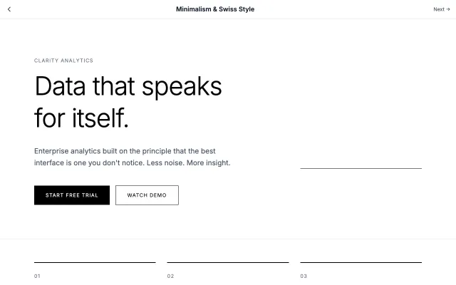
Minimalism & Swiss Style
Rooted in the Swiss International Style of the 1950s, this approach emphasizes clarity, readability, and objectivity. Uses grid-based layouts, sans-serif typography, and generous white space to create functional, timeless designs.
Modern SaaS
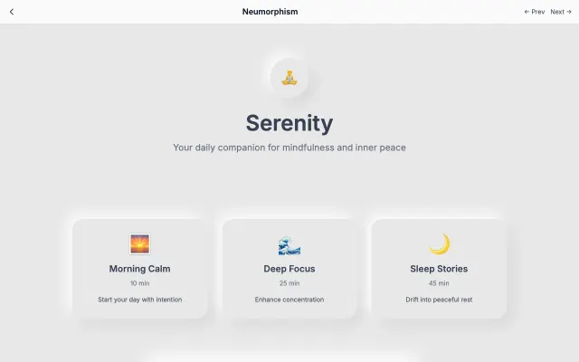
Neumorphism
A modern evolution of skeuomorphism that creates soft, extruded plastic-like interfaces. Uses subtle shadows and highlights to simulate depth while maintaining a minimal aesthetic.
Modern SaaS
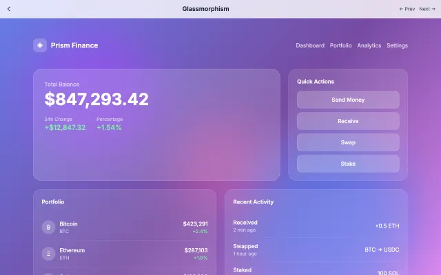
Glassmorphism
Inspired by frosted glass, this style creates depth through transparency and blur effects. Perfect for layered interfaces where content hierarchy is important.
Modern SaaS
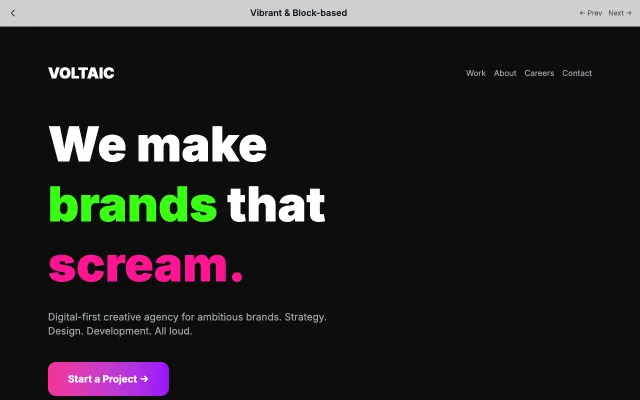
Vibrant & Block-based
High-energy design with bold color blocks, geometric shapes, and vibrant palettes. Creates excitement and draws attention through visual contrast.
Modern SaaS